Kuika's PA Interaction Buttons element enables the bulk management of user tasks within Process Automation (PA) processes. It is used to manage the approval and rejection processes for multiple tasks belonging to the same process at once.
The PA Interaction Buttons element can be used to speed up user interaction and reduce workload in processes with heavy task flows.
The PA Interaction Buttons element is currently only supported in web projects.
Add the PA Interaction Buttons Element
Log in to the Kuika platform.
Select the project you want to work on from the Apps screen.
Enter the UI Design module.
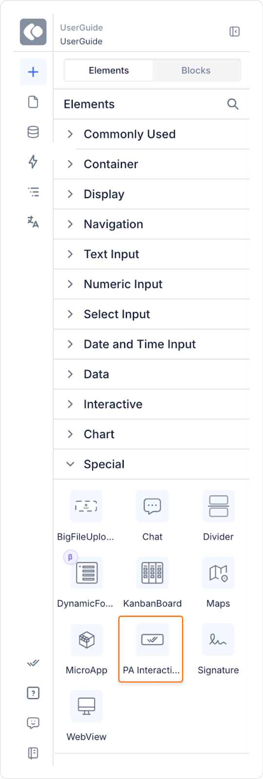
In the Elements panel on the left side, find the PA Interaction Buttons element under the Process Automation category.
Drag and drop the element onto your screen.
This element only works on screens linked to a process that contains User Interaction. If no interaction is defined in the relevant task, the buttons will not be displayed automatically.
How Do PA Interaction Buttons Work?
The PA Interaction Buttons element operates based on the value passed to it via the SetValueOf action whenever a row is selected in a tasks (User Tasks) table.
The element has no additional visible properties; it behaves entirely based on the value provided to it.
This value is the list of selected tasks in the table. The element identifies the interactions that these selected tasks have in common and creates a button only for these common interactions.
When the user clicks one of these buttons, the element attempts to execute the relevant interaction on all selected tasks. The result of the operation, whether successful or not, is communicated to the user via a notification for each task.
Buttons are not created in the following cases:
If the relevant interaction is not defined in any of the selected tasks,
Even if the interaction is defined, if there are BO parameters in the outputMapping and no default mail values are defined for these parameters.
This element is currently only available on the web; mobile support has not yet been activated.
When multiple User Tasks belonging to the same process are selected, only the common interactions of these tasks appear on the PA Interaction Buttons.
Using these buttons, the user can perform batch operations on all selected tasks that require common interactions.
If tasks belonging to different processes are selected and they have no common interactions, the element does not render any buttons.
When the operation is complete, the system automatically updates the status of each task and notifies the user of the results.
Behavior and Restrictions
If no interaction is defined for the relevant task, the buttons are invisible.
For tasks belonging to the same process, interaction buttons are listed.
For tasks in different processes, if there is no common interaction, the buttons are not displayed.
Step by Step: Creating a Batch Processing Screen with PA Interaction Buttons
1. Prepare the Task Table
In the UI Design module, open the screen where you will display your Process Automation tasks.
Add a Table element to the screen.
Link the table to the output of the relevant “Get My Tasks” or similar PA action.
In the table settings:
Configure the Selection mode to Multiselect (so that multiple rows can be selected).
The columns should include the following fields:
Process no
Process name
Step name / Step description
Assigned user / Due date, etc.
2. Add the PA Interaction Buttons Element
In the left panel, drag and drop the Elements → Special → PA Interaction Buttons element just below the task table.
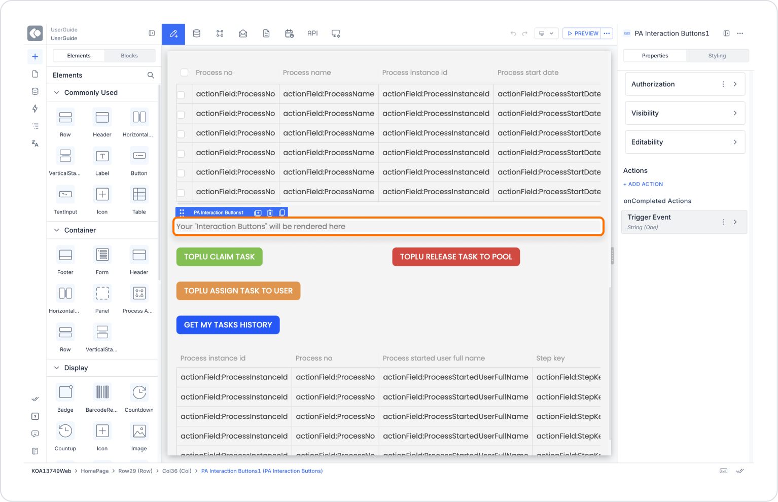
In the design screen, you will only see a placeholder text inside this element: “Your Interaction Buttons will be rendered here.” This text will be replaced with actual buttons in Preview.
3. Link the Table Selection to PA Interaction Buttons (SetValueOf)
For PA Interaction Buttons to work, you need to send the selected rows from the table to the element's value field.
Select the task table.
Add an action that will trigger when the row selection for the table changes:
Add a SetValueOf action under this event:
Component to Change: PA Interactions Button
Value:Selected Rows on the table (list of selected tasks)
With this setting:
As the user selects tasks in the table
The list of selected tasks is sent to the PA Interaction Buttons element
The element uses this list to generate the appropriate buttons.
4. Test in Preview Mode
Save the screen and switch to Preview mode.
Select at least one task from the task table.
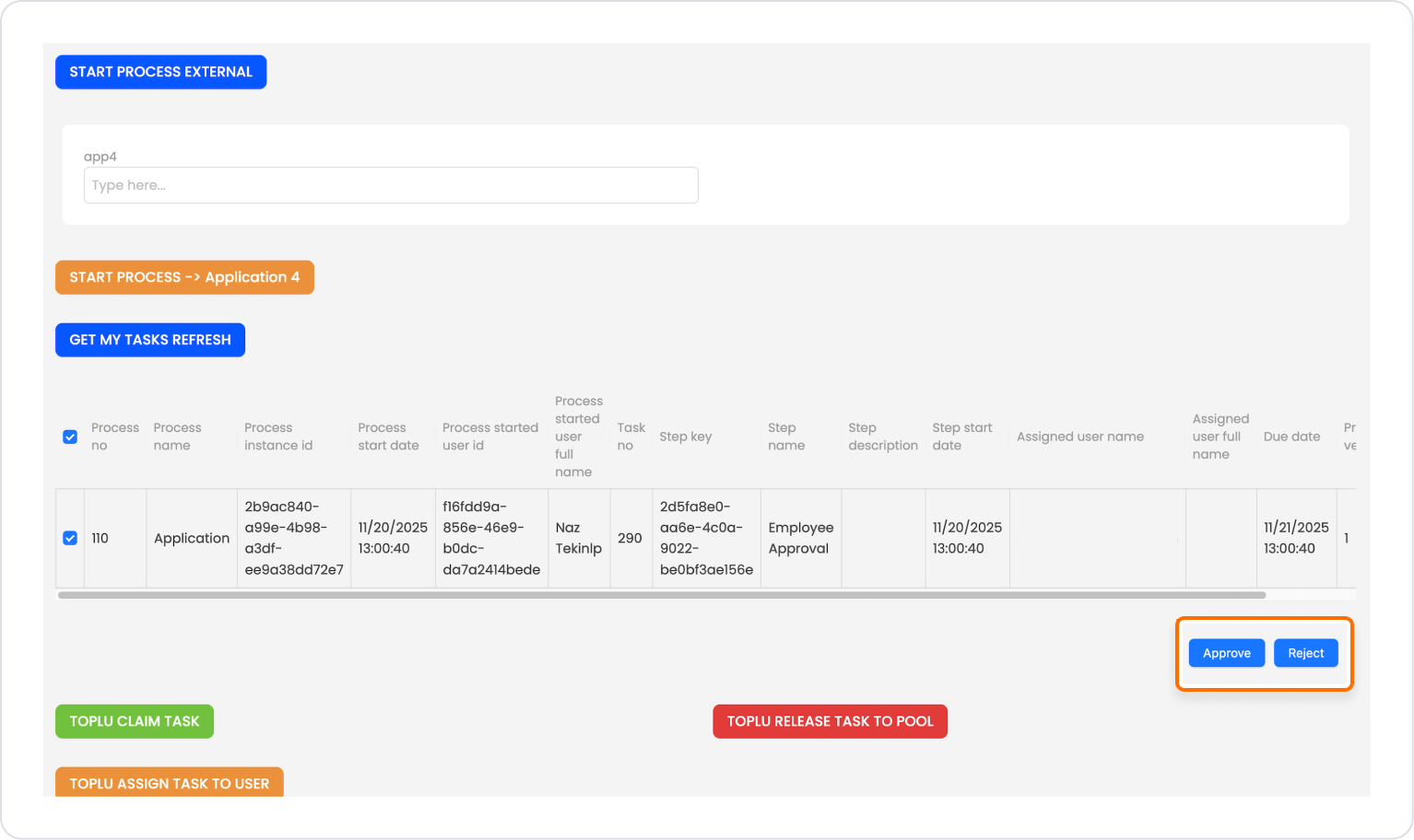
Dynamic buttons are generated in the PA Interaction Buttons area based on the interactions associated with the selected task.
5. Observe the Bulk Operation
Select multiple rows (User Tasks belonging to the same process).
You will see that the buttons are updated according to common interactions:
Common ones: e.g., actions that can be applied to multiple tasks at the same time (such as Approve, Reject, Complete)
Non-common ones: e.g., Reject, which is only available in some tasks, is not visible.
For example, when you click the Approve button:
The Approve interaction is triggered in all selected tasks.
As a result of the operation, success/error information for each task is displayed to the user via notification.
The statuses of the tasks are automatically updated.
Element Settings and Customization
Authorization
To manage access control at the element level, you can use the Authorization section in the Properties panel.
Access Types
Anonymous
Allows all users to view the element without logging in.
Restricted
Restricts access to only verified users or specific roles.
Everyone: When enabled, all logged-in users can access the element.
Roles: The roles allowed to access the element are selected here. To edit the role list, click the gear (⚙️) icon next to the Roles field to open the Role Management window. From this window, you can add new roles, create folders, or manage existing roles.
Unauthorized Behavior (Hide / Disable)
If the user does not have the required role, you can specify how the element should behave in the Choose field:
Hide: If the user is not authorized, the element is completely hidden and does not appear on the screen.
Disable: The element remains visible but becomes unclickable / unusable.
This setting is used to manage how unauthorized users encounter the element.
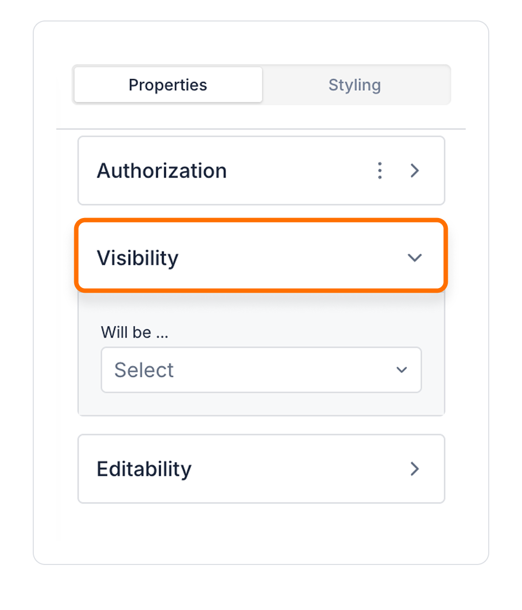
Visibility
Always Visible: Element is always visible.
Hidden: Element is hidden.
Sometimes Visible: The element is visible depending on a specific condition.
To configure the setting:
Select the element on the screen.
Open the Properties panel on the right edge.
In the Visibility field, select an option according to your needs.
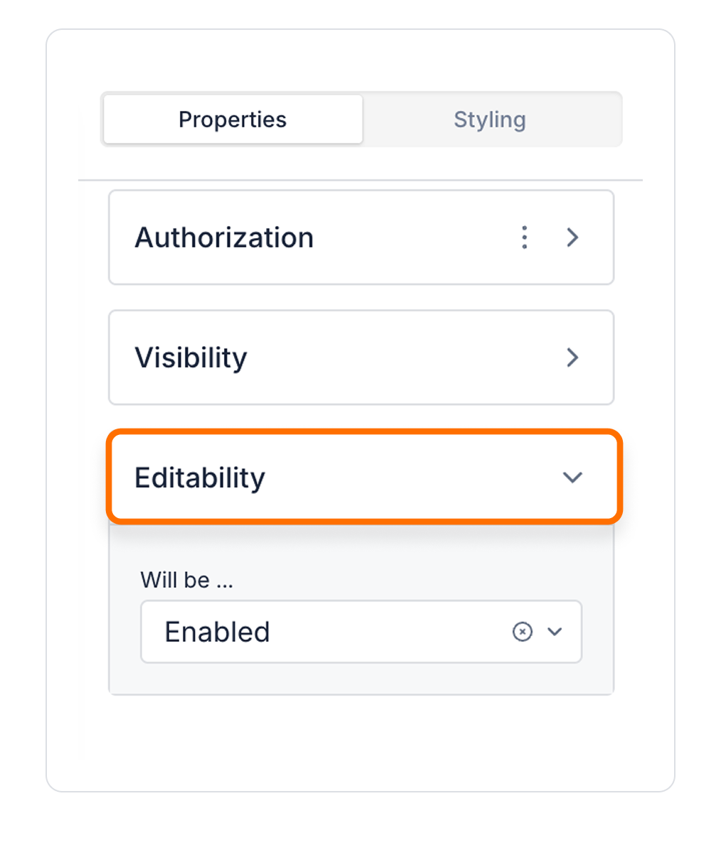
Editability
Enabled: Elements can be edited.
Disabled: Element cannot be edited.
Sometimes Enabled: The element can be edited or uneditable according to certain conditions.
Interface Design with Style Panel
By customizing your elements with the Styling Panel, you can create impressive interfaces for your web and mobile applications. In this section, you can configure the following settings:
Layout: Sizing, alignment and padding settings. Settings include Size, Min Size and Align.
Text: Font, style, color, size and spacing settings.
Fill: Customize the background with color or images.
Border: Add borders and corner radius settings.
Shadow: Add a shadow effect to add depth to elements.
By following these steps, you can configure the Area Chart element to suit your needs.


