The Gauge Chart element allows you to quickly visualize the current status of a single measurement or how close you are to a specified target. It is usually displayed in a half-circle or full-circle shape with a pointer. It is used for performance indicators, KPI tracking, and target comparisons.
The Gauge Chart element is only supported in web applications.
Areas of Use
KPI tracking (e.g., what percentage of the sales target has been achieved),
Risk/health indicators (e.g., system resource usage, error rate),
Target comparisons, etc.
Sales Target Tracking
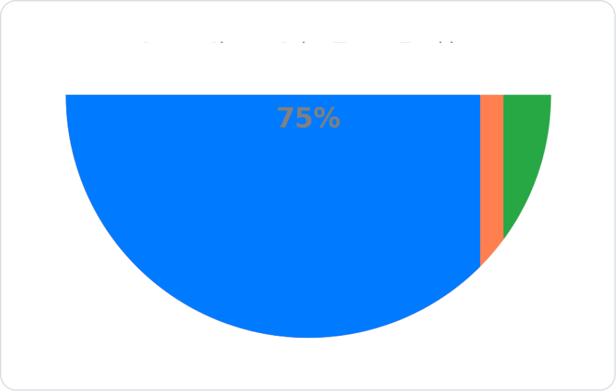
An e-commerce company has set a monthly sales target of 100,000 ₺. Thanks to Gauge Chart, users can easily see the current sales amount and how close they are to the target with the needle.
Connecting the Data Source
Go to the Datasources module.
Click the + icon next to the Tables heading and name the table “KPIData”.
Create the following table.
Click SQL Actions and name the action “KPIData” via SQL Actions.
Use the following SQL example:
SELECT ‘Sales Target’ AS Metric, 75000AS CurrentValue, 100000AS MaxValue
Alternatively, you can also create it with C#.
UI Design Module Operations
Click the Add Action button on the right side of the application screen.
Select the Custom > KPIData action.
Add the Gauge Chart element.
From the Properties panel Value field, select the KPIData action with the Symbol Picker.
Using Properties in the Scenario Context
Max
Description: Determines the maximum value to be displayed.
Example: 100000 (sales target).
Value
Description: Represents the current value; the needle displays this value.
Example: 75000 (actual sales).
Colors
Description: Determines the color areas on the gauge.
Usage: Success → Green (#28a745), Warning → Orange (#FF7F50), Danger → Red (#dc3545).
Hide Percentage
Description: Determines whether percentage values are displayed.
Example: If enabled, only the pointer is visible, and the percentage information is hidden.
When the Scenario Step is Complete
The target (Max) on the Gauge Chart is set to 100,000 ₺.
The pointer indicates the current value (Value) = 75,000 ₺.
Color bands are used to visualize the level of the needle (e.g., 0–50% red, 50–80% orange, 80–100% green).
The user can see at a glance whether the target has been reached.
Limitations
Gauge Chart is only supported in web applications.
The Gauge Chart element does not work on mobile devices.
Tips and Best Practices
If the maximum value (Max) is not defined correctly, the needle may appear in the wrong position.
Choosing contrasting color ranges improves readability.
Adding too many Gauge Charts to the same screen can create visual clutter; the ideal number is between 1 and 3.