User Manual

Donut Chart Usage Scenario

Donut Chart Usage Scenario

The Donut Chart element is a stylish and intuitive way to visualize data in percentage form. With its hollow center, the chart clearly displays each category’s share within the total. It is commonly used for market share analysis, budget allocations, customer segmentations, and other proportional data presentations.

Supported on both web and mobile applications.

Use Cases

  • Market share analysis
  • Visualizing budget allocations
  • Customer segmentation
  • Resource and department-based ratios

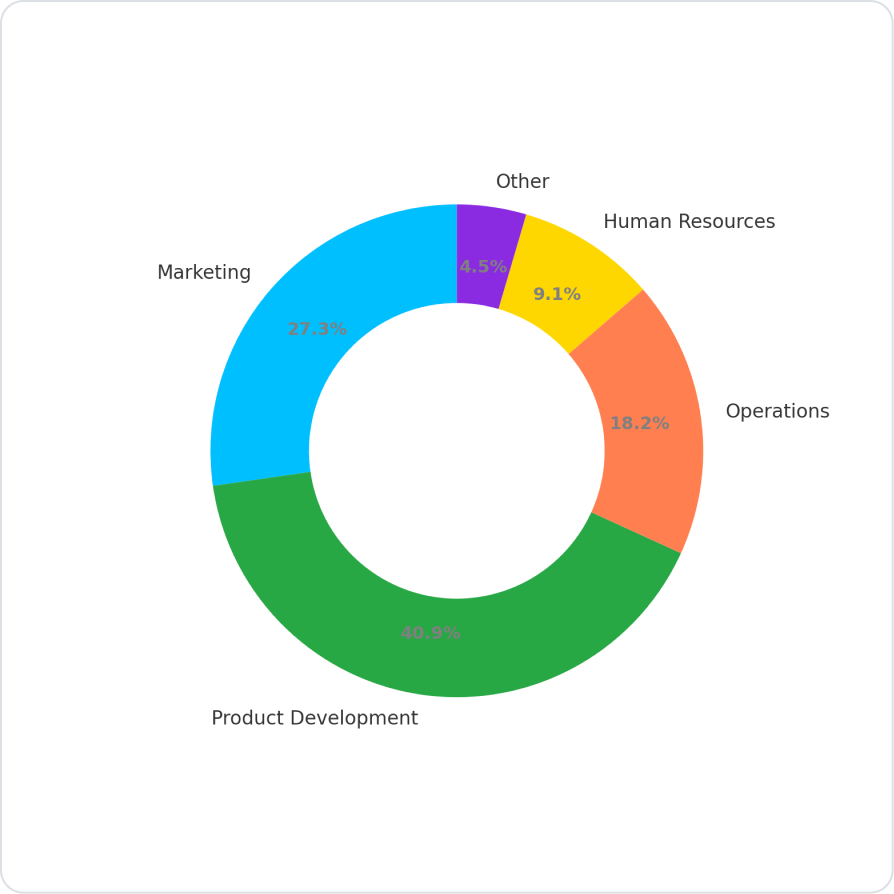
Budget Allocation Scenario

A company’s annual budget is divided into different items (Marketing, Product Development, Operations, Human Resources, Other). With a Donut Chart, users can visually compare the proportions of these items within the total budget.

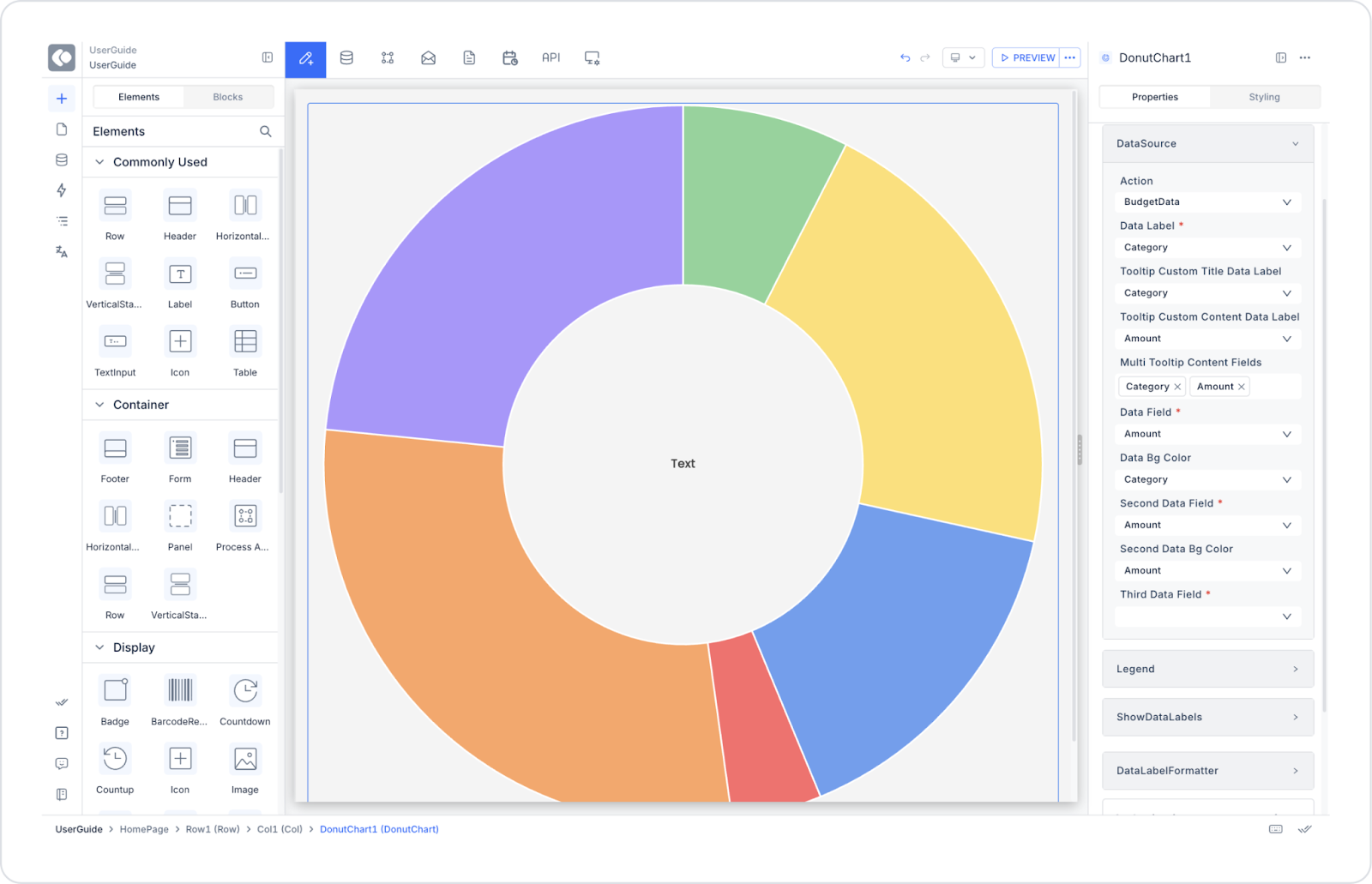
Connecting the Data Source

  1. Go to the Datasources module.
  2. Click the + icon next to Tables and name the table “BudgetData.”
  3. Create the following table.
  1. Then, go to SQL Actions and create an action named “BudgetData.”
    • You can also create it with C#.

SQL Example:

SELECT 'Marketing' AS Category, 300000 AS AmountUNION ALLSELECT 'Product Development', 450000UNION ALLSELECT 'Operations', 200000UNION ALLSELECT 'Human Resources', 100000UNION ALLSELECT 'Other', 50000

UI Design Module Steps

  1. On the application screen, click the Add Action button on the right panel.
  2. Select Custom > BudgetData.
  3. Add a Donut Chart element.
  4. In the Properties panel → Datasource section, select BudgetData.

Properties in Scenario Context

  • Datasource
    • Description: Defines the data source for the chart.
    • How to use: Select the created table or API result.
    • Example: Select “BudgetData.”
  • Data Label
    • Description: Displays data labels on each slice.
    • Example: “Marketing, Operations, HR…”
  • Tooltip Custom Title Data Label
    • Description: Field to display as the tooltip title.
    • Example: Tooltip → “Product Development”
  • Tooltip Custom Content Data Label
    • Description: Field to display as tooltip content.
    • Example: “Amount: ₺450,000”
  • Multi Tooltip Content Fields
    • Description: Allows showing multiple fields in the same tooltip.
    • Example Tooltip:
      • Category: Marketing  
      • Amount: ₺300,000  
      • Share: %25  
  • Data Field
    • Description: Represents the main data series.
    • Example: Amount (Budget Value).
  • Data Bg Color
    • Description: Defines the slice colors for each category.
    • Example: Marketing → Blue (#00BFFF), Operations → Green (#28a745).
  • Second Data Field / Second Data Bg Color
    • Description: Used to add a second series.
    • Example: Previous year’s budget → Orange (#FF7F50).
  • Third Data Field / Third Data Bg Color
    • Description: Optional third series.
  • Legend
    • Description: Displays the category names.
    • Options: top, bottom, left, right.
  • Show Data Labels (Web only)
    • Description: Displays data labels on slices.
  • Data Label Formatter
    • Description: Defines the number format of labels.
    • Options:
      • Money → ₺10,000
      • Percent → %45
      • Fractional-2 → 12.34
      • Fractional-5 → 12.34567

Scenario Result

  • Each category is displayed as a separate slice on the Donut Chart.
  • Slice sizes are determined by the Amount value.
  • Tooltips show the category name, amount, and percentage share.
  • Users can easily analyze the proportion of each category within the total.

Limitations

  • “Show Data Labels” and “Data Label Formatter” work only in web applications.
  • On mobile, percentages can only be viewed via tooltips.

Tips & Best Practices

Without a datasource, other properties will not be active.
  • Use high-contrast colors, especially for slices with similar values.
  • Too many categories can clutter the chart.
  • Ideal number of categories: 4–8.
No items found.

Other Related Content

No items found.

Glossary

No items found.

Alt Başlıklar