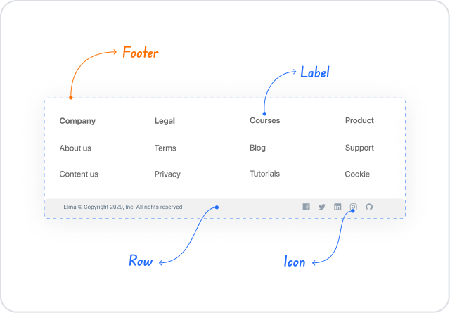
Kuika's Footer element is located at the bottom of the page in the user interface and completes the overall layout of the page. It is used to create a tabbar menu with copyright information, additional explanations, links, or icons.
Supported in web and mobile applications.
Areas of Use
Display copyright information,
Add links to privacy policy and terms of use,
Provide additional explanations at the bottom of the page,
Place social media icons or short menus,
Design a tabbar menu on mobile, etc.
Use of Features in Scenario Context
Static content: You can add copyright, description, or fixed information.
Icons: Social media or tabbar menu icons can be added.
Design: Background color, font, and alignment can be adjusted.
Scenario: Tabbar Menu
To allow users to quickly access the main sections in a mobile application, 4 icons are added to the Footer:
🏠 Home
🔍 Search
❤️ Favorites
👤 Profile
This gives the Footer a navigation menu function.
Limitations
Only one Footer can be used per application.
Adding too much content can make the Footer look cluttered.
The Footer height should be kept limited on mobile (ideally 50–60px).
Tips and Best Practices
The Footer should always be designed minimally.
Add short and clear labels to the icons in the Tabbar menu.
Choose high contrast for the background and text color.
For the web, the Footer should always remain fixed at the bottom of the screen on long pages.


