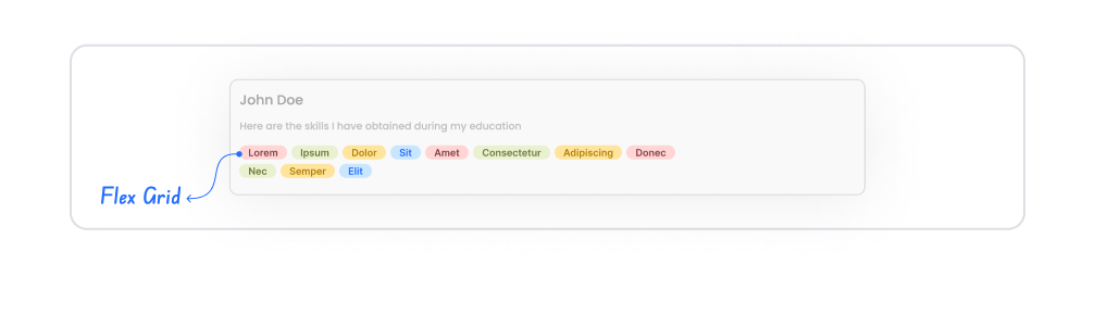
The Flex Grid element is a powerful layout element that allows you to display content in a flexible and adaptable grid layout within your application. It is used to display elements of different sizes, proportions, and alignments in an organized structure. Flex Grid works with the “responsive layout” logic, a modern design approach, enabling content to automatically align and arrange itself according to screen width.
This element allows you to dynamically and aesthetically organize multiple items such as cards, product lists, image galleries, or information boxes. It is frequently used in listing screens with grid structures, dashboard areas, or flexible card layouts.
The Flex Grid element is supported in web and mobile applications.
1.1. Common Use Cases
Creating product lists. Used in e-commerce applications to display product cards in an organized and scalable grid structure.
Designing a visual gallery or media wall. You can flexibly position image, video, or card-based content in different sizes.
Creating dashboard card layouts. Used to place performance cards, metric boxes, or analytical content within a modular grid.
Listing blogs or news cards. You can present different content types (title, image, description) to the user in a grid format.
Content management on screens requiring responsive layout. It can be used to create a dynamic layout that automatically adapts to mobile, tablet, and web screens.
2. Key Features
Flexible Grid Layout. Content automatically realigns according to screen width, providing a more organized appearance.
Responsive behavior. Automatically adapts to mobile, tablet, and web screens; the number of columns can be changed according to device size.
Dynamic content support. You can automatically list data received via datasources or actions in a grid structure.
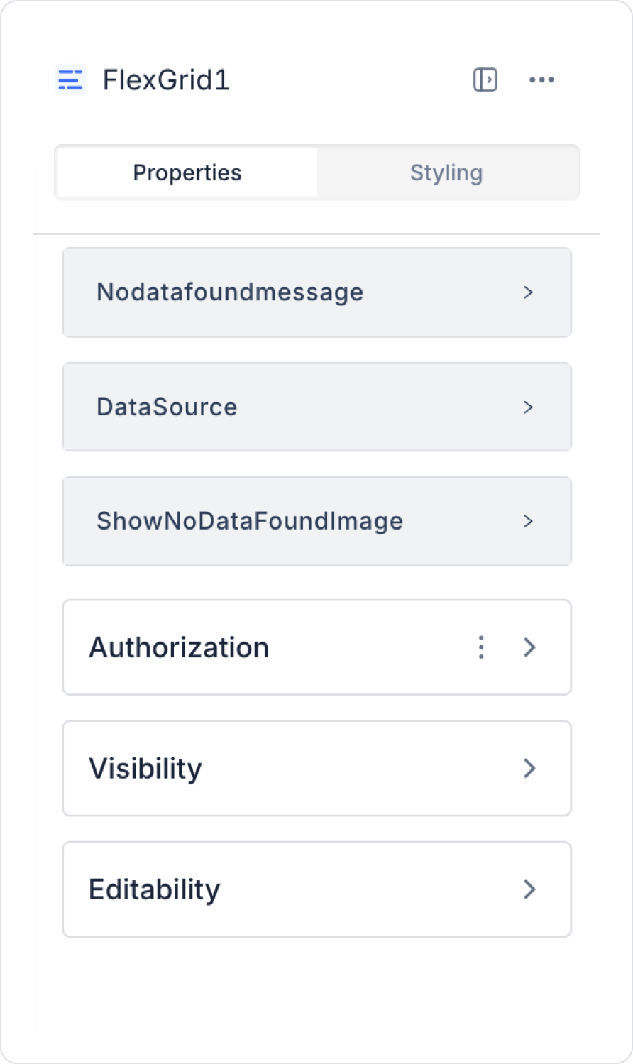
2.1. Flex Grid Element Properties
When you select the Flex Grid element, you can configure settings such as data management, content display behavior, and empty state management via the Properties panel on the right.
Data and Content Settings
Data Source: Specifies the source of the data to be displayed in the Flex Grid. List data coming from data sources or actions is automatically rendered in a grid structure. (E.g., product list, news cards, user cards)
Empty State Settings
No Data Found Message: Defines the message to be shown to the user when no results are returned from the data source. E.g., “No records found.”
Show No Data Found Image: Allows you to add a custom image to be displayed when there is no data. This feature is especially useful for improving the user experience on empty screens.
2.2 Actions That Can Be Added to Elements
Since the Flex Grid element functions as a listing or layout component, it does not support adding any triggers or actions. User interactions are managed directly through the UI elements placed within the grid, not through the Flex Grid itself. Therefore:
onClick,
onChange,
or any other action cannot be defined for the Flex Grid.
If you want to trigger a user interaction, you can attach actions to elements such as Button, Panel, or Image that you add to the Flex Grid.
3. How to Use the Flex Grid Element?
In this section, we will cover the end-to-end use of the Flex Grid element through example scenarios.
Scenario: Central Bank Currency Display
In this scenario, the application presents users with the latest exchange rate data published by the Central Bank of the Republic of Turkey (CBRT). The application processes exchange rate information obtained from the CBRT source at specific intervals or upon user request and displays it on the screen.
Users can track the buying and selling values of basic currencies such as the dollar and euro on a single screen. Thanks to this structure, financial data is obtained from a reliable source and presented to the user in a simple, understandable, and comparable format.
In the scenario:
When the application is opened, the exchange rates published by the Central Bank are listed on the screen.
The user views the current values for basic currencies such as the dollar and euro on a single screen.
Exchange rate information is displayed in a simple list or card structure.
Since the data is obtained from a reliable source, a reference exchange rate view is presented to the user.
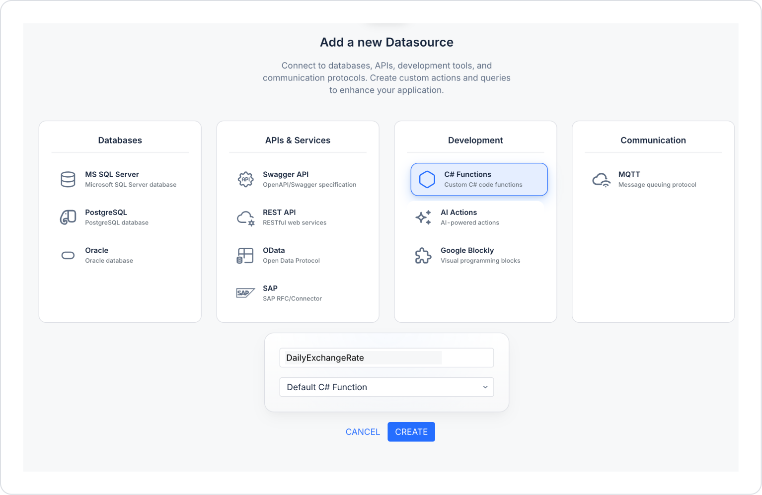
Step 1 - Creating the Data Source
Add a new C# function in the DataSources module:
Go to the Datasources module.
Then click the add icon next to Sources.
On the page that opens, select the C# Functions field and create one named ‘DailyExchangeRate’:
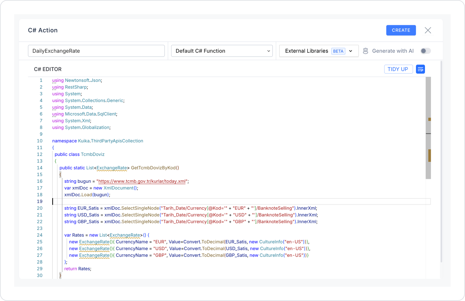
Delete the code in the newly opened field and add the following C# code instead, then press the CREATE button in the upper right corner.
using Newtonsoft.Json;
using RestSharp;
using System;
using System.Collections.Generic;
using System.Data;
using Microsoft.Data.SqlClient;
using System.Xml;
using System.Globalization;
namespace Kuika.ThirdPartyApisCollection
{
public classTcmbDoviz{
public static List<ExchangeRate> GetTcmbDovizByKod(){
string bugun = “https://www.tcmb.gov.tr/kurlar/today.xml”;var xmlDoc = new XmlDocument();
xmlDoc.Load(bugun);
string EUR_Satis = xmlDoc.SelectSingleNode(“Tarih_Date/Currency[@Kod=‘” + ‘EUR’ + “’]/BanknoteSelling”).InnerXml;
string USD_Selling = xmlDoc.SelectSingleNode(“Tarih_Date/Currency[@Kod=‘” + ‘USD’ + “’]/BanknoteSelling”).InnerXml;
string GBP_Selling = xmlDoc.SelectSingleNode(“Date/Currency[@Code=‘” + ‘GBP’ + “’]/BanknoteSelling”).InnerXml;
var Rates = new List<ExchangeRate>() {
newExchangeRate(){ CurrencyName = “EUR/TRY”, Value=Convert.ToDecimal(EUR_Satis, new CultureInfo(“en-US”))},
newExchangeRate(){ CurrencyName = “USD/TRY”, Value=Convert. ToDecimal(USD_Satis, new CultureInfo(“en-US”))},
newExchangeRate(){ CurrencyName = “GBP/TRY”, Value=Convert.ToDecimal(GBP_Satis, new CultureInfo(“en-US”))}
};
return Rates;
}
}
public classExchangeRate{
public string CurrencyName { get; set; }
public decimal Value { get; set; }
}
}
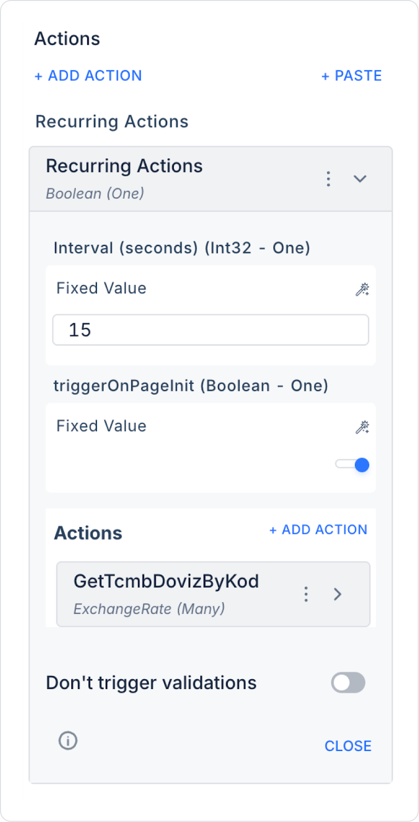
Step 2 - Add Action
Initially:
Open the UI Design module.
Add the Add Action > Recurring Action action to the page.
Use 15 seconds as the refresh value within the action.
Set the triggerOnPageInit field to true so that it runs at the start of the page.
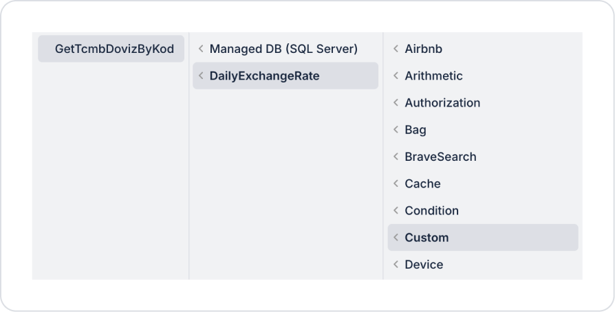
Define Add Actions > Custom > DailyExchangeRate > GetTcmbDovizByKod in the Actions field.
Step 3 - Adding Elements and Editing Styles
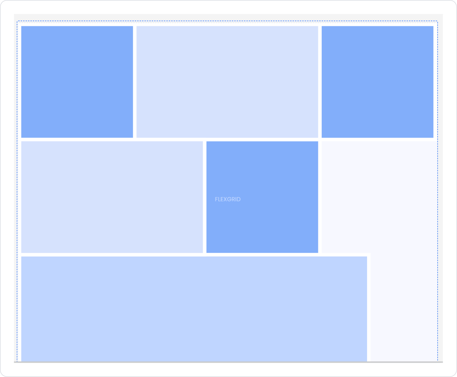
From the left side panel, drag and drop the Elements > Data > FlexGrid element onto the page.
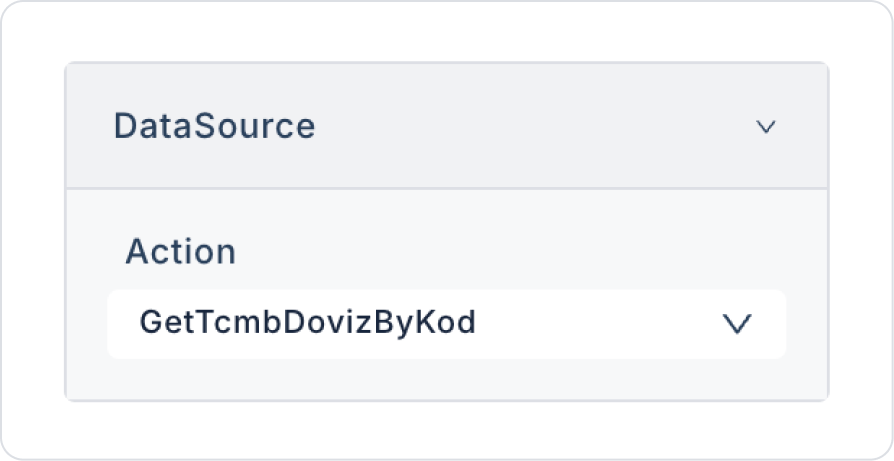
Within the FlexGrid element, connect the GetTcmbDovizByKod action to the FlexGrid > Properties > DataSource field.
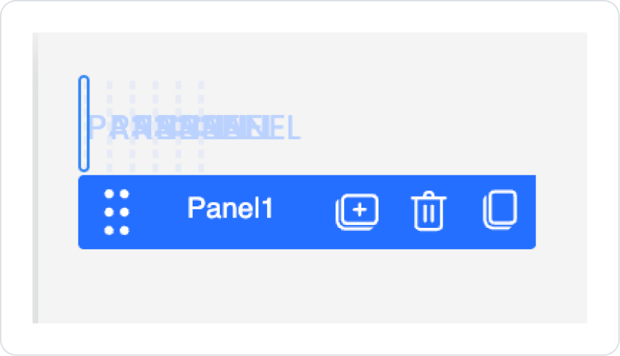
Drag and drop the Elements > Display > Panel element into the FlexGrid.
In the Panel element, select horizontal center alignment in the Panel > Styling > Layout > Align field.
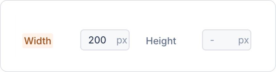
Set the Panel element size to Panel > Styling > Layout > Width > 200 px.
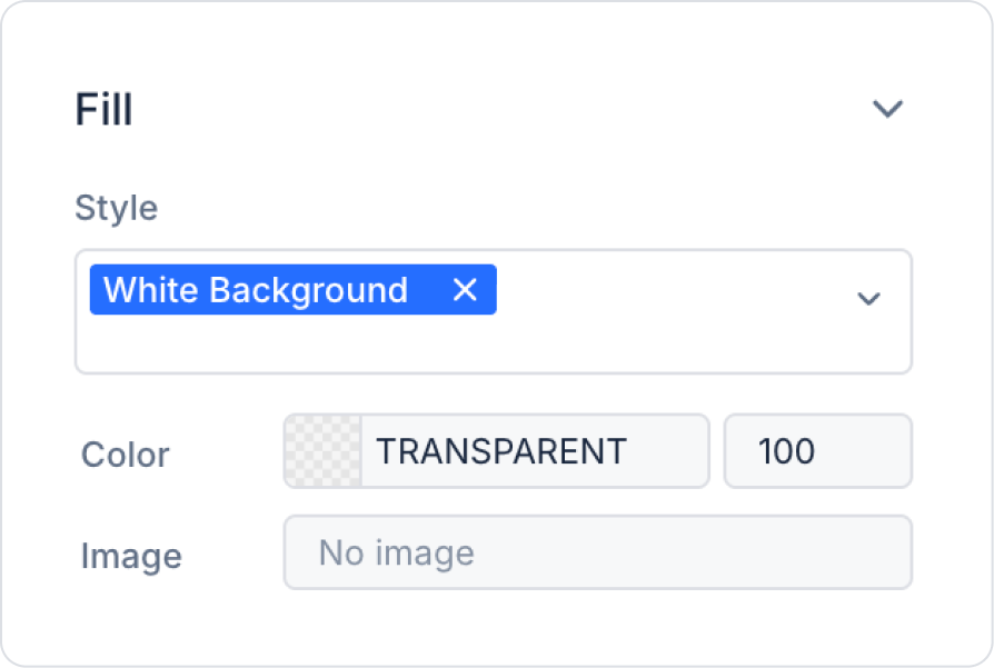
Set the background color to Panel > Styling > Fill > Style > White Background.
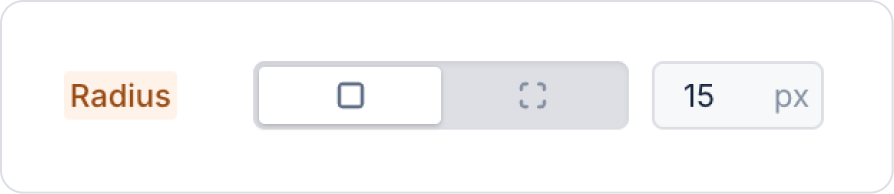
Set the borders to Panel > Styling > Border > Radius > 15 px.
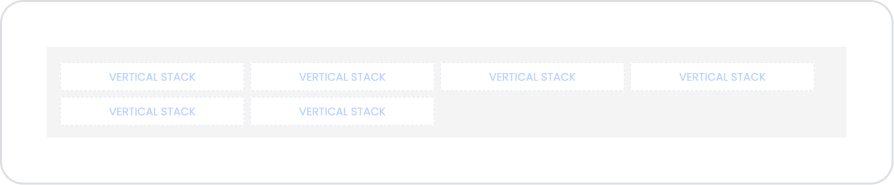
Drag and drop the Elements > Container > VerticalStack element into the Panel element.
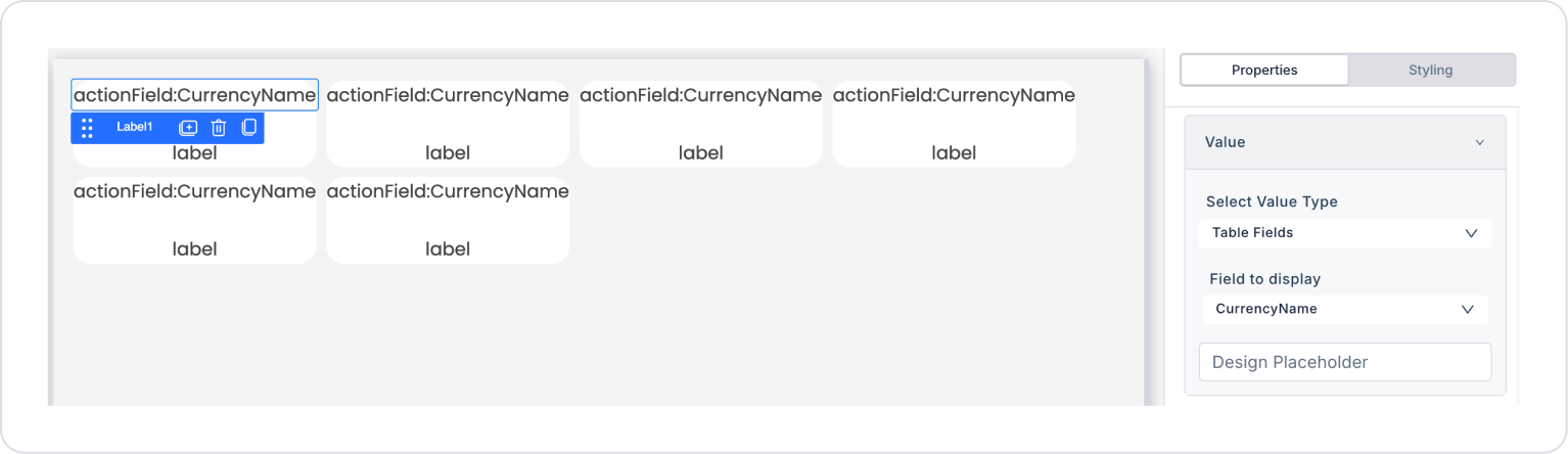
Drag and drop the Elements > Display > Label element into the VerticalStack element.
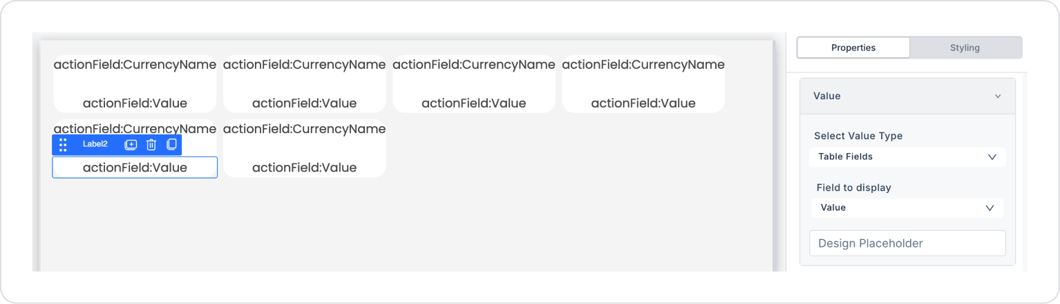
Drag and drop another Elements > Display > Label element below the Label element.
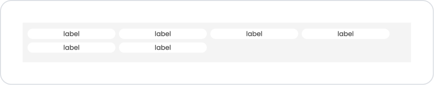
Define the first Label element as Label > Properties > Value > Field to display > CurrencyName.
Set the second Label element to Label > Properties > Value > Field to display > Value.
Preview:
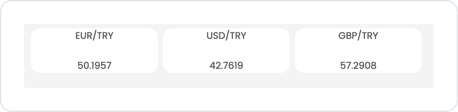
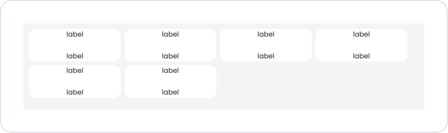
When the application is tested, the exchange rates are displayed side by side within the card structure. Each card displays the relevant currency pair (EUR/TRY, USD/TRY, GBP/TRY) at the top, with the current exchange rate shown clearly and legibly below.
This structure allows users to compare different exchange rates on a single screen and quickly access rate information with a simple, organized view.
4. Common Properties
Some fields on the Flex Grid element are used commonly across all UI elements. Therefore, detailed explanations of the following properties can be found in the relevant general guide pages:
Size the grid to fit the content. Cards or elements within the Flex Grid may have different widths; therefore, consider content sizes when designing the grid structure.
Consider mobile compatibility. Since elements in the grid structure will be stacked vertically on narrow screens, ensure that content is readable on mobile devices.
Make empty data situations user-friendly. You can make empty screens more understandable by using the No Data Found Message and Show No Data Found Image settings.
Provide sufficient padding and margin for elements within the grid. Cards that are too close together negatively impact the user experience.
6. Limitations
The Flex Grid element does not support actions. User interactions must be managed through elements added to the grid.
Responsive behavior depends on the size of the content. Very wide cards can cause alignment problems on small screens.
Inconsistent appearance may occur in complex layouts. Content with different heights can disrupt the grid appearance.


