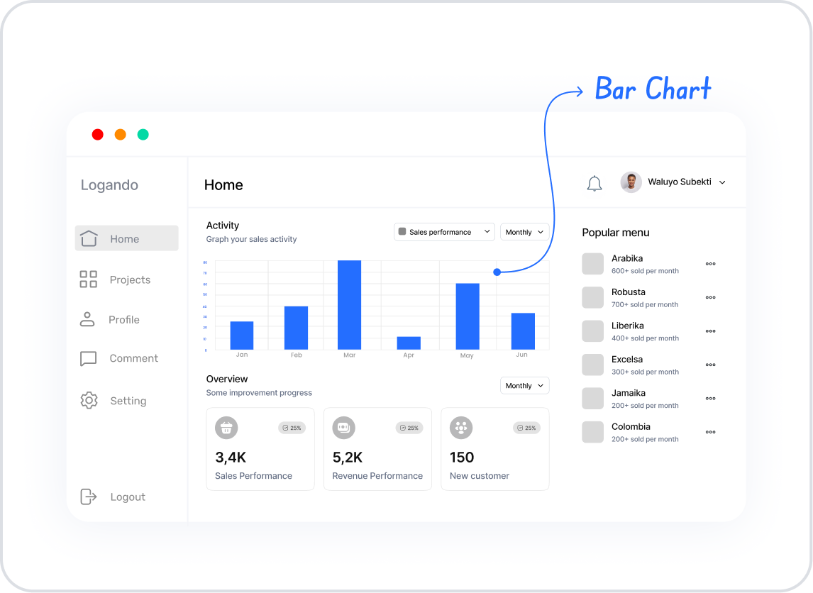
The Bar Chart element is one of the most effective ways to visualize comparisons across different categories. The height of each bar represents the total or amount for a category. It is used for sales data, survey results, performance analysis, and categorical data visualizations.
Supported on both web and mobile applications. Use Cases
Comparing sales amounts by categories Displaying survey results as percentages Visualizing budget allocations by department Sales Comparison Scenario In an e-commerce application, the Bar Chart is used to show the monthly sales of different product categories. With this chart, users can easily see which category sold the most.
Connecting the Data Source
Go to the Datasources module. Click the + icon next to Tables and name the table “CategorySales.” Create the following table. Then, go to SQL Actions and create an action named “CategorySales.” You can also create it with C#. SQL Example:
SELECT 'Electronics' AS Category, CAST ( 2500 AS BIGINT ) AS SalesCount, 500000.00 AS SalesRevenueUNION ALLSELECT 'Clothing' , CAST ( 1800 AS BIGINT ), 300000.00 UNION ALLSELECT 'Furniture' , CAST ( 1200 AS BIGINT ), 280000.00 UNION ALLSELECT 'Cosmetics' , CAST ( 900 AS BIGINT ), 150000.00 UNION ALLSELECT 'Sports' , CAST ( 600 AS BIGINT ), 100000.00 UI Design Module Steps
On the application screen, click the Add Action button on the right panel. Select Custom > CategorySales. Add a Bar Chart element. In the Properties panel → Datasource section → Actions, select CategorySales. Properties in Scenario Context
Datasource Description: Defines the data source for the chart.How to use: Select the created table or API result.Example: Select “CategorySales.”Data Label Description: Displays labels above the bars.Example: “Electronics, Clothing, Furniture…”Tooltip Custom Title Data Label Description: Field to display as the tooltip title.Example: Tooltip → “Furniture”Tooltip Custom Content Data Label Description: Field to display as tooltip content.Example: “Sales Revenue: ₺280,000”Multi Tooltip Content Fields Description: Allows showing multiple fields in the same tooltip.Example Tooltip: Sales: 1200 Revenue: ₺280,000 Target Line Field Description: Used to display a target line on the bar chart.Example: “Target Sales: 2000”Data Field Description: Represents the main data series.Example: Sales count (SalesCount).Data Bg Color Description: Defines the bar color for the main series.Example: Electronics → Blue (#00BFFF).Second Data Field / Second Data Bg Color Description: Used to add a second series (e.g., Sales Revenue).Example: Sales Revenue → Green (#28a745).Third Data Field / Third Data Bg Color Description: Optional third series.Example: Profitability → Orange (#FF7F50).Legend Description: Displays the series names.Options: top, bottom, left, right.Left Axis / Right Axis Description: Show or hide the left/right axis.Begin At Zero Description: Starts the chart from zero.Max Y Axis Value Description: Manually define the maximum Y-axis value.Show Data Labels Description: Displays data labels above the bars.Data Label Formatter Description: Defines the format of labels.Options: Money → ₺10,000 Money TI → ₺10K Percent → %45 Fractional-2 → 12.34 Fractional-5 → 12.34567 Bar Thickness Description: Defines the bar thickness.Line Color / Line Thickness / Line Dot Width Description: Customize the style of target or reference lines.Line Label Color / Position Description: Define the color and position of line labels.Scenario Result
Category names (Electronics, Clothing, Furniture…) are displayed on the X-axis. Sales counts or revenue values are displayed on the Y-axis. Bars are filled with the selected colors. Users can easily compare across categories. Limitations
“Show Data Labels” and “Data Label Formatter” only work in web applications. On mobile, data points are visible only via tooltips. Tips & Best Practices
If you define properties before adding a datasource, other settings will not be visible. Use high-contrast colors between bars. Adding too many categories can make the chart cluttered. Ideal category count: 5–10. 


