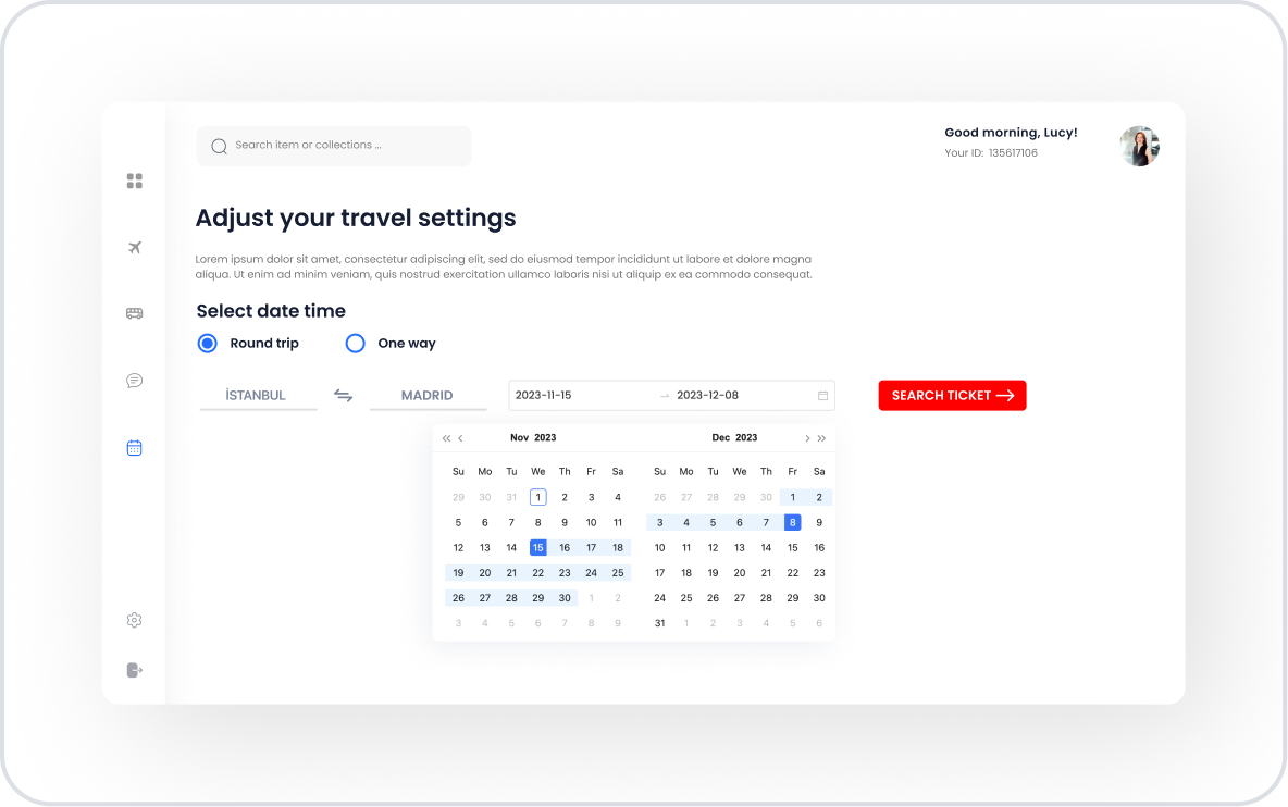
The Date Range element allows users to select a time range consisting of a start and end date. It plays a critical role in all applications that require form validation, perform time-based calculations, or filter records according to a specific period.
The user creates a valid time range by selecting two dates via the datepicker; the element is both visually easy to use and minimizes incorrect date entries.
The Date Range element is supported in web and mobile applications.
1.1. Common Use Cases
The Date Range element is a standard solution for many use cases requiring a date range:
Reporting and filtering operations: Used to filter list or table data according to a specific time range. Example: Orders, log records, visitor data.
Leave, vacation, or work schedule planning: Users can create a leave form by selecting the start and end dates.
Reservation periods: Start and end dates are mandatory in processes such as hotel, car rental, and salon reservations.
Billing and calculation periods: The user selects the period for which the fee will be calculated (e.g., 01.01–31.01).
Periodic analyses: Viewing reports such as KPIs, sales, performance, and costs for a specific range.
2. Key Features
Use with manual entry or calendar selector. Users can either type the range directly or easily mark it on the calendar, providing flexibility.
Customizable date format. Different format options such as DD/MM/YYYY, MM/DD/YYYY, YYYY/MM/DD can be used to match the application's general date structure.
Clear support. With the Allow Clear feature, users can reset the selected date range with a single click.
Trigger actions based on user selections. Thanks to the onChange trigger, actions like filtering, updating charts, and refreshing lists can be automatically executed when the date range changes.
Responsive design. Works seamlessly on both web and mobile interfaces; integrates with the native date picker on mobile devices.
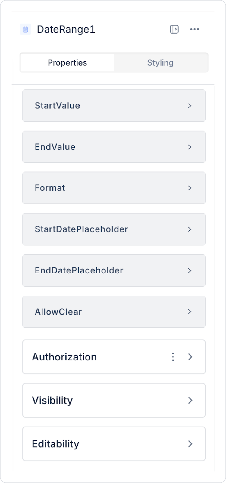
2.1. Date Range Element Properties
All settings for the Date Range element are configured via the Properties panel on the right. Each feature is explained in detail below:
Start Value: You can set the start value of the date range as a static date or assign a dynamic value using the Symbol Picker.
End Value: You can enter the end value of the date range statically or assign a dynamic value using the Symbol Picker.
Start Date Placeholder: Provides information to the user about the field where they must enter the start date. For example, “Select Start Date”.
End Date Placeholder: Informs the user about the field where they must enter the end date. For example, “Select End Date”.
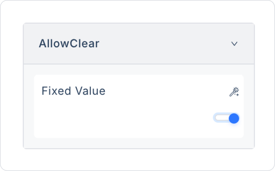
Allow Clear: Allows users to clear their selected dates with a single click. Entries can be reset using the Delete (X) icon that appears in the right corner.
Format: Determines the date format in which the date range will be displayed in the user interface. Both the start and end dates will be displayed in the same format selected from the dropdown list. Supported formats are:
DD/MM/YYYY (e.g., 31/12/2026)
MM/DD/YYYY (e.g., 12/31/2026)
YYYY/MM/DD (e.g., 2026/12/31)
YYYY/DD/MM (e.g., 2026/31/12)
D M Y (e.g., 31 12 2026)
DD.MM.YYYY (e.g., 31.12.2026)
2.2. Actions That Can Be Added to Elements
The Date Range element allows you to trigger an action when the user changes the date range. There is only one trigger in this element:
OnChange
This action is triggered when the user changes the start or end date. All interactive usage scenarios of the Date Range element are managed through this trigger.
Usage Scenarios:
Filter tables, lists, or charts based on the selected date range
Reload data when the date range changes on reporting screens
Updating the visibility of a panel based on the date range
How the Action Works:
When OnChange is triggered, the start and end dates are automatically passed to the action parameters.
These values can be retrieved via the Symbol Picker and used in SQL or REST calls.
OnChange is also triggered when the date range is cleared, allowing filters to be reset.
3. How to Use the Date Range Element?
In this section, we will cover the end-to-end use of the Date Range element through example scenarios.
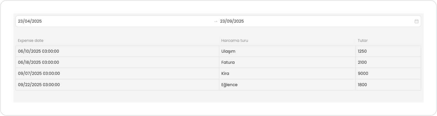
Scenario: Displaying Expenses Between Specific Dates
In a personal finance or expense tracking application, users want to view their expenses for a specific date range on a single screen. The Date Range element is used in this scenario to select which date range's data will be listed.
In the scenario:
The user can filter expenses for the relevant period by specifying the start and end dates.
The expense type, amount, and expense date information for the selected date range is listed in the table.
The Date Range element allows date selection to be performed in a flexible, understandable, and controlled manner.
Both date range selection and listing operations on a single page provide a practical user experience.
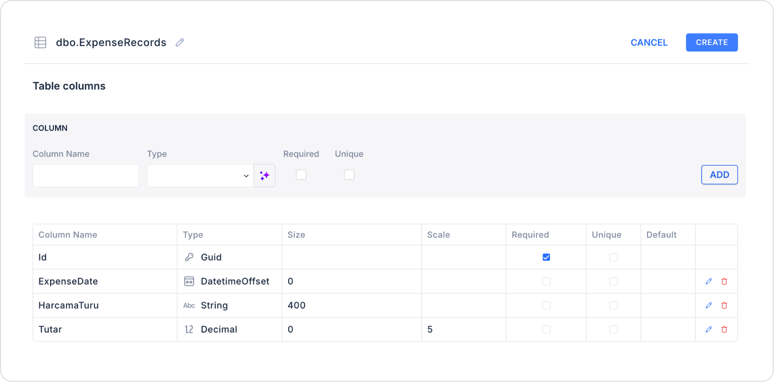
Step 1 - Creating a Data Source
Creating a table in the DataSources module:
Go to the Datasources module.
Then go to the Tables tab.
Create a new table named “ExpenseRecords”.
The table structure to be set up is as follows:
Important Field Names:
ExpenseDate: Holds the date information when the expense occurred. This field is used as the basis for filtering and period-based reporting.
ExpenseType: Indicates the category of the expense (e.g., Rent, Groceries, Transportation, Bills). Used in charts, summary tables, and category-based analysis.
Amount: Specifies the monetary value of the expense. The main field used to calculate totals, averages, and comparative financial analysis.
Step 2 - Defining the Necessary Actions
To display and save data in the interface:
Two actions will be used in this scenario.
Add a new action from the Actions > New SQL Action tab in the Datasources module.
Action that Adds Sample Data (InsertExpenseRecords): To test the application with sample data, add the following SQL action and press the TEST button.
INSERT INTO ExpenseRecords (Id, ExpenseDate, ExpenseType, Amount)
-- MARCH 2025SELECT NEWID(), CAST(‘2025-03-05’ AS date), N'Rent', 8200 UNION ALL
SELECT NEWID(), CAST(‘2025-03-12’ AS date), N'Groceries', 2800 UNION ALL
-- JUNE 2025SELECT NEWID(), CAST(‘2025-06-10’ AS date), N'Transportation', 1250 UNION ALL
SELECT NEWID(), CAST(‘2025-06-18’ AS date), N'Invoice', 2100 UNION ALL
-- SEPTEMBER 2025SELECT NEWID(), CAST(‘2025-09-07’ AS date), N'Rent', 9000 UNION ALL
SELECT NEWID(), CAST(‘2025-09-22’ AS date), N'Entertainment',1800;
When applying, delete the ExpenseRecords part, rewrite ExpenseRecords, and press Enter. This will add the correct schema name in front of the table name.
Action that Filters and Provides Data (GetExpensesByDateRange):
SELECT *
FROM ExpenseRecords
WHERE ExpenseDate >= @StartDate
AND ExpenseDate <= @EndDate
ORDER BY ExpenseDate;
When applying, delete the ExpenseRecords part, rewrite ExpenseRecords, and press Enter.
This will add the correct schema name before the table name.
Step 3 - Adding Elements and Actions
Drag and drop the Elements > Date and Time Input > DateRange element onto the page.
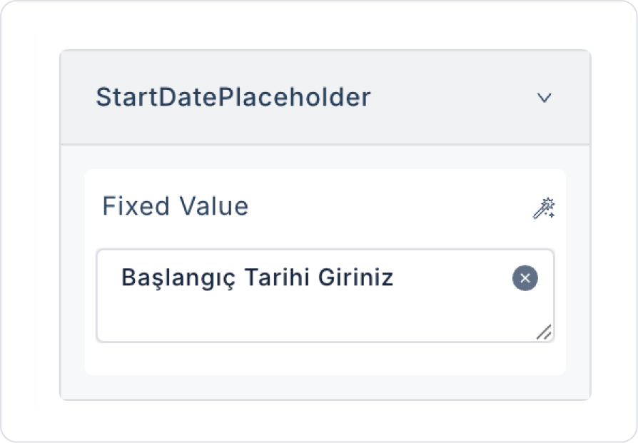
In the Date Range element, add the text “Enter Start Date” to the DateRange > Properties > StartDatePlaceholder > “Enter Start Date” field.
In the Date Range element, add the text “Enter End Date” to the DateRange > Properties > EndDatePlaceholder field.
To allow preferences to be cleared, set DateTimeRange > Properties > AllowClear to On.
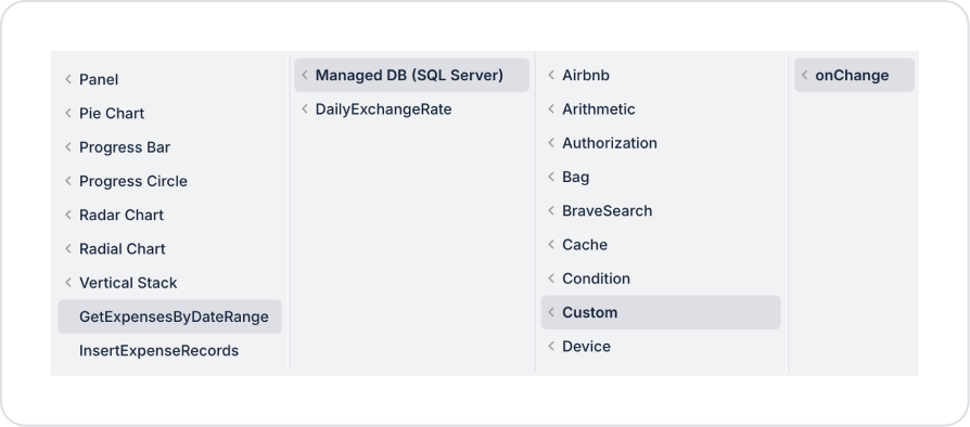
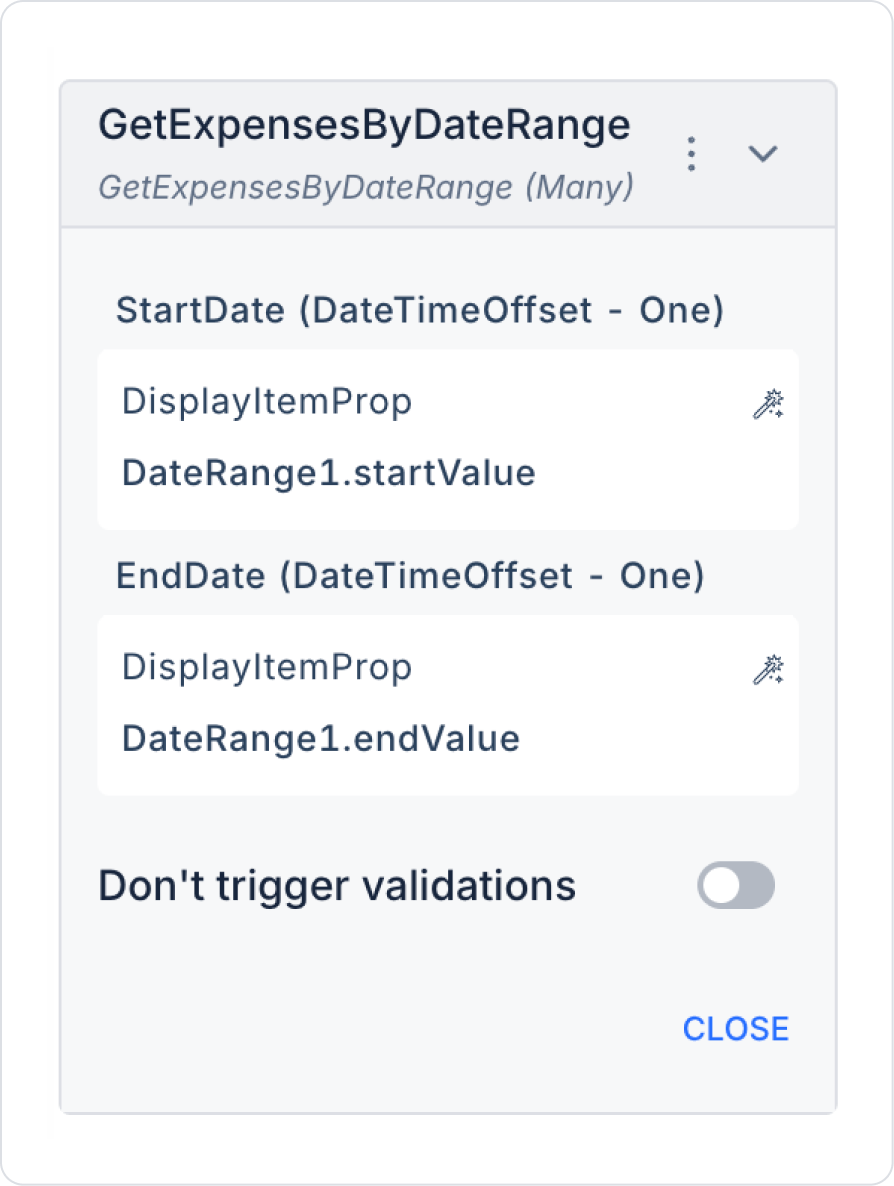
Add an action while the Date Range element is selected to retrieve the list after the dates are selected. DateRange > Add Action > onChange > Custom > Managed DB > GetExpensesByDateRange.
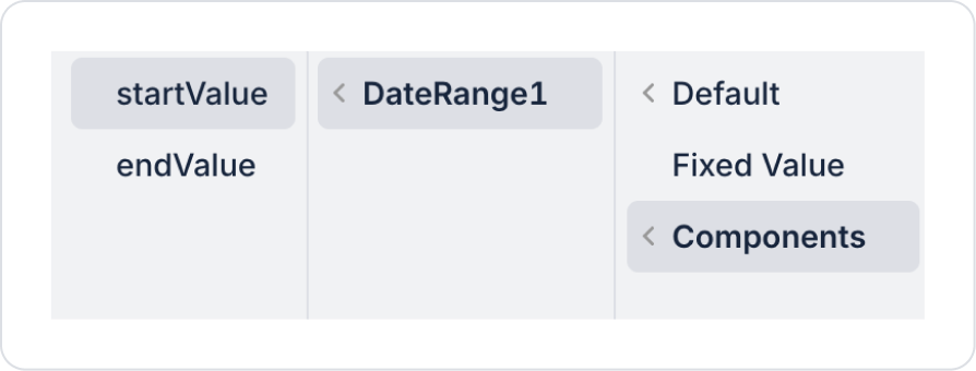
In the action, define the start date parameter as GetExpensesByDateRange > Components > DateRange > startValue.
In the action, define the end date parameter as GetExpensesByDateRange > Components > DateRange > endValue.
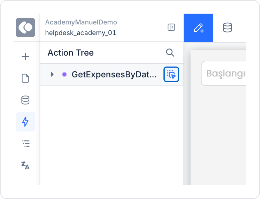
To use the action directly as a ready table, navigate to the ActionTree area in the left side panel and drag the nearby blue icon of the GetExpensesByDateRange action onto the page.
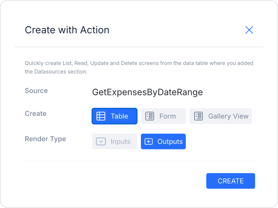
In the screen that opens, select the Table and Outputs fields and press Create.
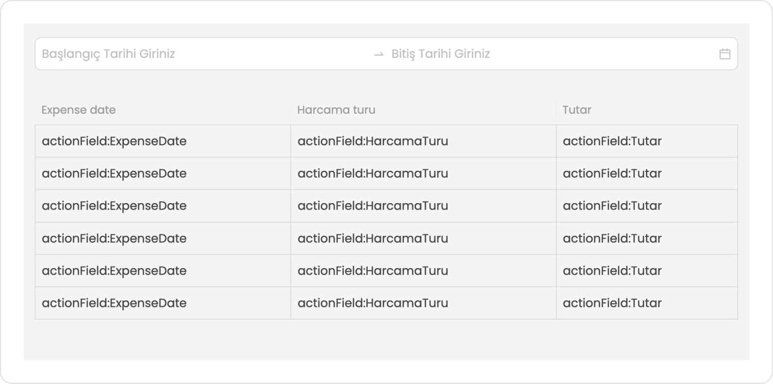
The screen content should look like the following in the final state.
Preview:
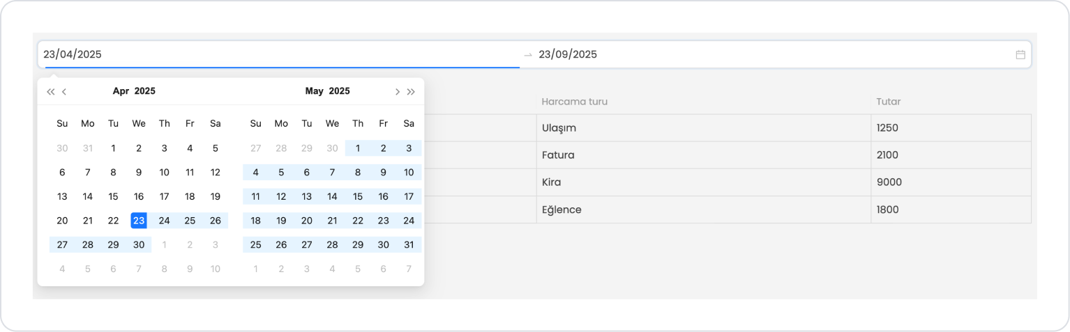
When the application first opens, the Date Range (start–end date) field at the top is displayed as empty, and the user is prompted to select the date range for which they want to filter expenses. In this case, the table is displayed as empty or with sample fields to indicate that it is waiting for data.
When the user specifies a date range, the expense type, amount, and expense date information for the selected start and end dates are automatically listed in the table. This allows the user to review all expenses for a specific period in a single screen in an organized and understandable manner.
When hovering over the Date Range element, the selected date range can be easily cleared by clicking the X icon on its right side.
4. Common Properties
Some fields on the Date Range element are used in common across all UI elements. Therefore, detailed explanations of the following properties can be found in the relevant general guide pages:
Always keep dates in a valid format. Ensure that all date values used in the application are in datetime or at least YYYY-MM-DD format. Incorrect formats can cause errors in filtering and comparison operations.
Always verify the start and end dates. If Start Value > End Value, the Date Range returns empty or your actions produce incorrect results. Therefore, additional checks are recommended in SQL or API queries.
Keep the Clear feature active. Users should be able to easily reset the date range. This makes filtering scenarios more fluid.
6. Limitations
It is not a data source-dependent structure. Date Range only provides date selection; actions must be bound with OnChange for data loading, filtering, or calculation operations.
SQL or API errors may occur in format incompatibilities. Some formats, such as MM/DD/YYYY, may not be parsed correctly on the server side. Therefore, a format compatible with the backend should be selected.
If date ranges are left blank, OnChange may not be triggered. Especially on mobile, the action may not work if the user selects only the start or end date. In this case, additional validation should be performed.


