Add Layout to elements.
You can set properties of an element, such as perimeter spacing and sizing, through Layout. Alignment commands for Row or Columns will affect the elements within them.
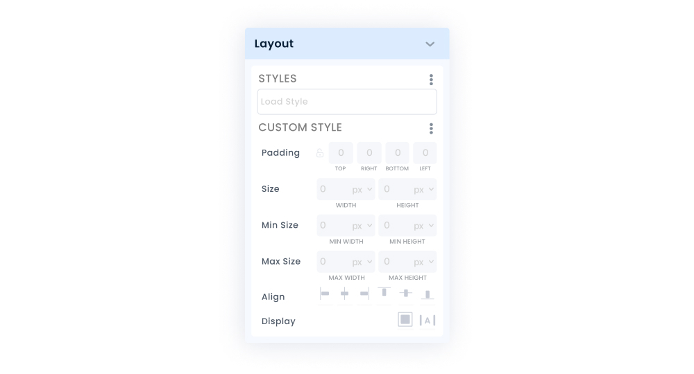
By saving the Layout style you created in the Custom Style section, you can use the style you saved via Load Style on different screens or different elements on the same screen. You can edit, duplicate and delete the Layout styles you have created at any time.
Padding
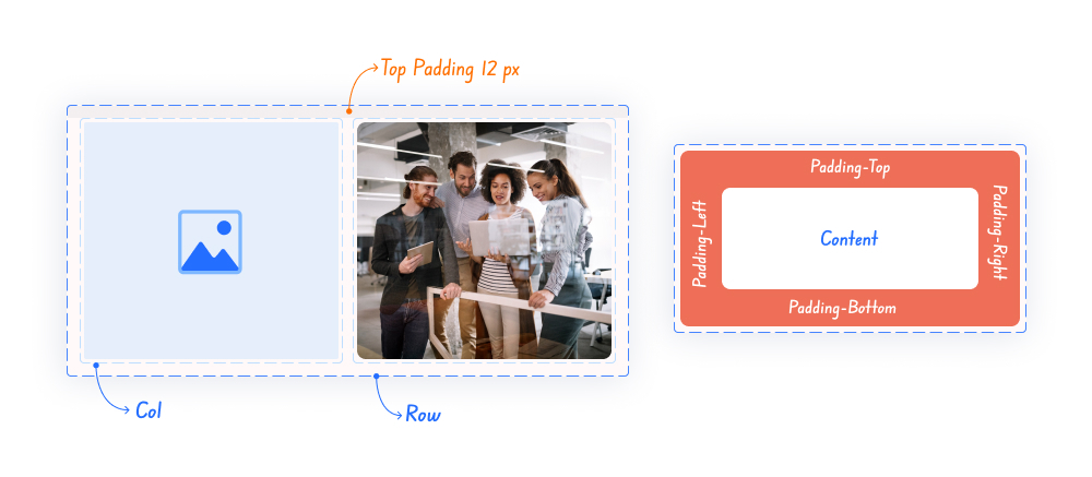
Padding structure
You can add internal spaces to your element. Thanks to the top, bottom, right and left options in this area, you can strengthen your design by entering the values you specify in the direction you need for the element you are using.
In UI (User Interface) design, Margin is used to define the space or distance around an element (for example, a button, label). Kuika does not have Margin. However, you can easily do the spacing between elements or objects without using Margin with the Padding structure.
Size
You can use the width and height fields to adjust the dimensions of elements you add to the Workspace.
You can set the values you will use according to the pixel (px) and % options. The dimensions you enter with the px unit will be applied exactly. For example, a width of 200px will look the same on all devices. However, the 20% value resizes itself based on the screen width (browser). You can use 100% for elements that you want to appear exactly according to the browser width or height.
Max Size
These are the fields where you can enter the maximum width/height value that the element can take in the Workspace. When you enter a max 480 width value for an Image element (taking into account padding values), it will be at most 480px wide according to the device or browser width, and the width will narrow at lower widths.
Min Size
Min size is a property that specifies the smallest width or height an element can have. This property refers to the smallest size the element can be reduced to. Like max width or max height, min size is often used to control the size of an element and maintain a certain layout.
Align
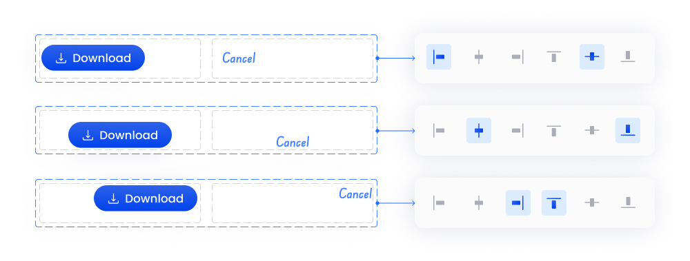
Align Settings
You can set the alignment of the element's own content (the label of the button element) or the elements under it as a child element in container elements. It can be vertically up, down or centered or horizontally centered, right or left aligned.
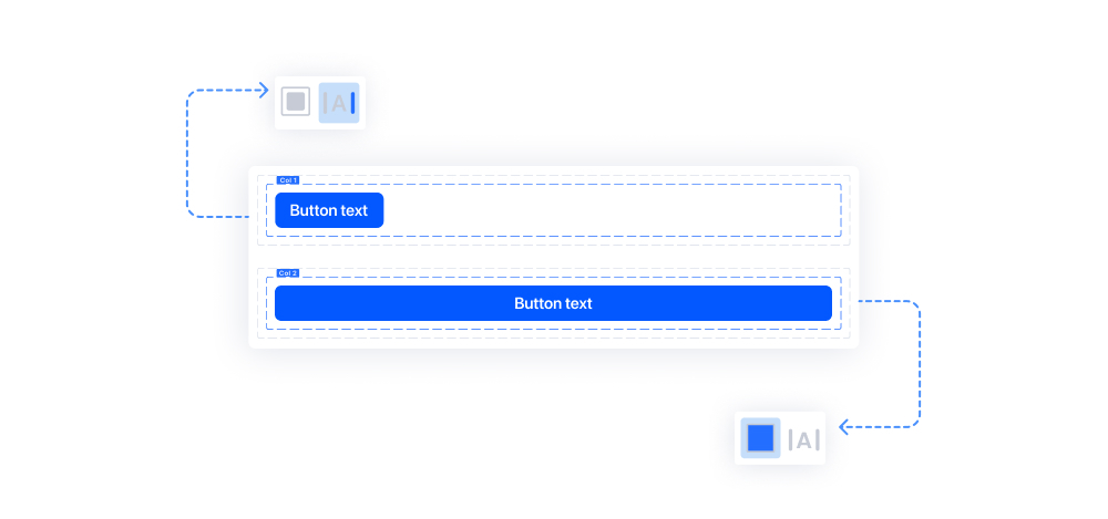
Display
Elements you add in the same column (unless there is a predefined setting) are added side by side. You can use the block option if you want an element to remain alone in the row in the container it is in.
In Inline, it is possible to set the elements side by side. You cannot add some elements side by side.
Making Layout Settings in Elements:
With Layout in elements, you can make visual adjustments such as environmental padding and sizing.
Follow these steps to adjust the padding and sizing settings in elements:
The properties in Layout vary according to the elements. While some elements can use all the properties in Layout, some elements use limited properties.