
Widgets allow you to create custom and reusable UI elements for Kuika Designer. This guide covers everything you need to know to create, develop, and publish your own widget packages.
Before you begin, ensure you have the following installed:
The fastest way to create your first widget pack is to use the create-kuika-widget CLI tool:
npx create-kuika-widgetThis interactive wizard will guide you through the following steps:
Quick Start Example
npx create-kuika-widget
# Widget Pack Name => My Custom Buttons
# Company => Acme
# Framework => React
# Stylesheet => Tailwind
# Package Manager => Yarn
# Git Initialization => No
# Go to the project folder
cd my-custom-buttons
# Start the development server
yarn devAfter the project is created, your project will have the following structure:
my-dashboard-widgets/
├── src/
│ ├── Components/ # Your widget components
│ │ ├── MyWidget/
│ │ │ ├── MyWidget.tsx # Component implementation
│ │ │ └── MyWidget.css # Component styles
│ │ └── ...
│ ├── App.tsx # Local playground (not exported)
│ └── index.tsx # Entry point (not exported)
├── kuika.manifest.ts # Widget pack configuration (REQUIRED)
├── package.json # Dependencies and scripts
├── tsconfig.json # TypeScript configuration
└── dist/ # Build output (generated)
Important Notes
kuika.manifest.ts is the heart of your widget pack. It defines which components are exported and how they appear in Kuika Designer.
Basic Structure
import { defineWidgetComponent, defineWidgetManifest } from “@kuika/sdk/react”;
import { MyWidget } from “./src/Components/MyWidget/MyWidget”;
import { AnotherWidget } from “./src/Components/AnotherWidget/AnotherWidget”;
export default defineWidgetManifest({
projectId: "com.mycompany. my-dashboard-widgets“,
name: ”My Dashboard Widgets“,
version: ”1.0.0“,
components: [
defineWidgetComponent(MyWidget, { title: ”My Widget“ }),
defineWidgetComponent(AnotherWidget, { title: ”Another Widget" })
]
});
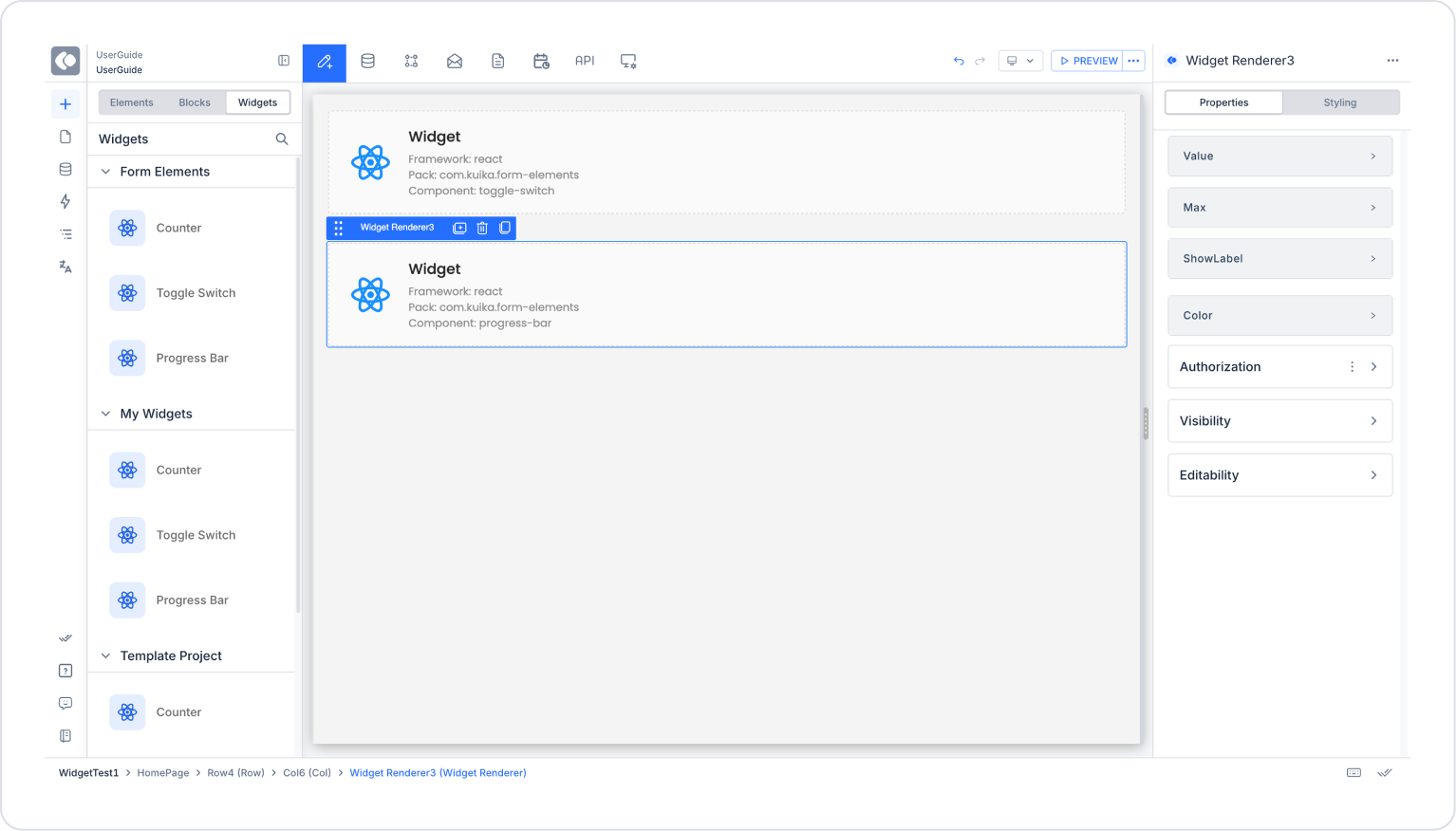
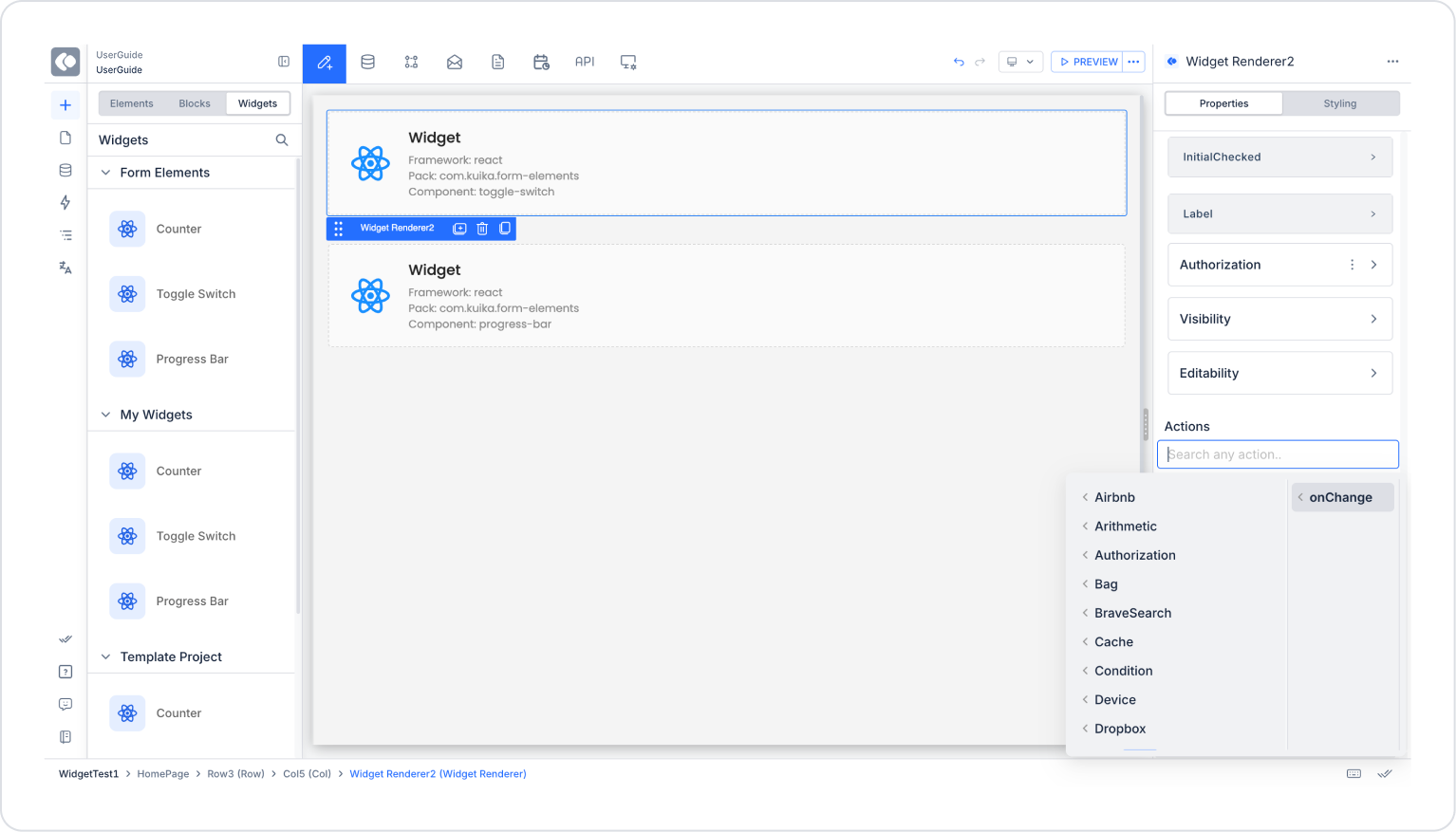
Configuration Options
Component Registration
Each component is registered using defineWidgetComponent():
defineWidgetComponent(ComponentReference, {
title: “Display Title” // This appears in the Designer's component palette
})
React Components
Create standard React functional components with TypeScript props:
// src/Components/Counter/Counter.tsx
import { useState } from “react”;
import “./Counter.css”;
// TypeScript type definition - REQUIRED for Kuika to detect props
type CounterProps = {
initialValue?: number; // Optional prop with default value
step?: number; // Optional prop with default value
label?: string; // Visible label
};
export const Counter = ({
initialValue = 0,
step = 1,
label = “Count”
}: CounterProps) => {
const [count, setCount] = useState(initialValue);
return (
<div className="counter">
<span className="counter__label">{label}</span>
<button onClick={() => setCount(count - step)}>-</button>
<span>{count}</span>
<button onClick={() => setCount(count + step)}>+</button>
</div>
);
};
Vue Components
<!-- src/Components/Counter/Counter.vue -->
<script setup lang="ts">
import { ref } from ‘vue’;
// TypeScript type definition - REQUIRED for Kuika to detect props
const props = withDefaults(defineProps<{
initialValue?: number;
step?: number;
label?: string;
}>(), {
initialValue: 0,
step: 1,
label: “Count”
});
const count = ref(props.initialValue);
</script>
<template>
<div class="counter">
<span class="counter__label">{{ label }}</span>
<button @click=“count -= props.step”>-</button>
<span>{{ count }}</span>
<button @click=“count += props.step”>+</button>
</div>
</template>
TypeScript Requirements
Kuika uses your TypeScript type definitions for the following:
Supported Prop Types
Kuika automatically detects the following prop types from your TypeScript definitions:
Prop Best Practices
AngularJS widgets work differently from other frameworks. Since AngularJS does not use TypeScript for component definitions, you must explicitly define the props in the manifest file.
AngularJS Manifest Structure
import { defineWidgetComponent, defineWidgetManifest } from “@kuika/sdk/angularjs”;
export default defineWidgetManifest({
projectId: “com.mycompany.angularjs-widgets”,
name: “My AngularJS Widgets”,
version: “1.0.0”,
components: [
defineWidgetComponent(“counter”, {
title: “Counter”,
props: {
initialValue: { type: “number” },
step: { type: ‘number’ },
label: { type: “string” }
}
}),
defineWidgetComponent(“statusBadge”, {
title: “Status Badge”,
props: {
status: {
type: “string”,
required: true,
unionValues: [“active”, ‘inactive’, “pending”]
},
showIcon: { type: “boolean” }
}
})
]
});
Key Differences for AngularJS
AngularJS Prop Schema
Function Properties in AngularJS
defineWidgetComponent(“myWidget”, {
title: “My Widget”,
props: {
onSubmit: {
type: “function”,
parameters: [
{ name: “data”, type: “object” },
{ name: ‘isValid’, type: “boolean” }
]
}
}
})
Available Commands
Development Server
The development server provides:
yarn devTesting Your Components
Use the App.tsx (or equivalent) file as a local playground:
// src/App.tsx
import { Counter } from “./Components/Counter/Counter”;
function App() {
return (
<div>
<h1>Widget Playground</h1>
<Counter initialValue={10} step={5} label="Items" />
</div>
);
}
export default App;
This playground file is NOT INCLUDED in the published widget pack.
Always test your build locally before publishing:
yarn buildThis creates optimized outputs along with asset-manifest.json in the dist/ folder.
Publishing on Kuika
yarn run publishThe publish command will:
On-Premises Deployments: If you are using an on-premises Kuika installation, use the --api-url flag to specify your API endpoint:
yarn run kuika publish --api-url https://your-kuika-instance.com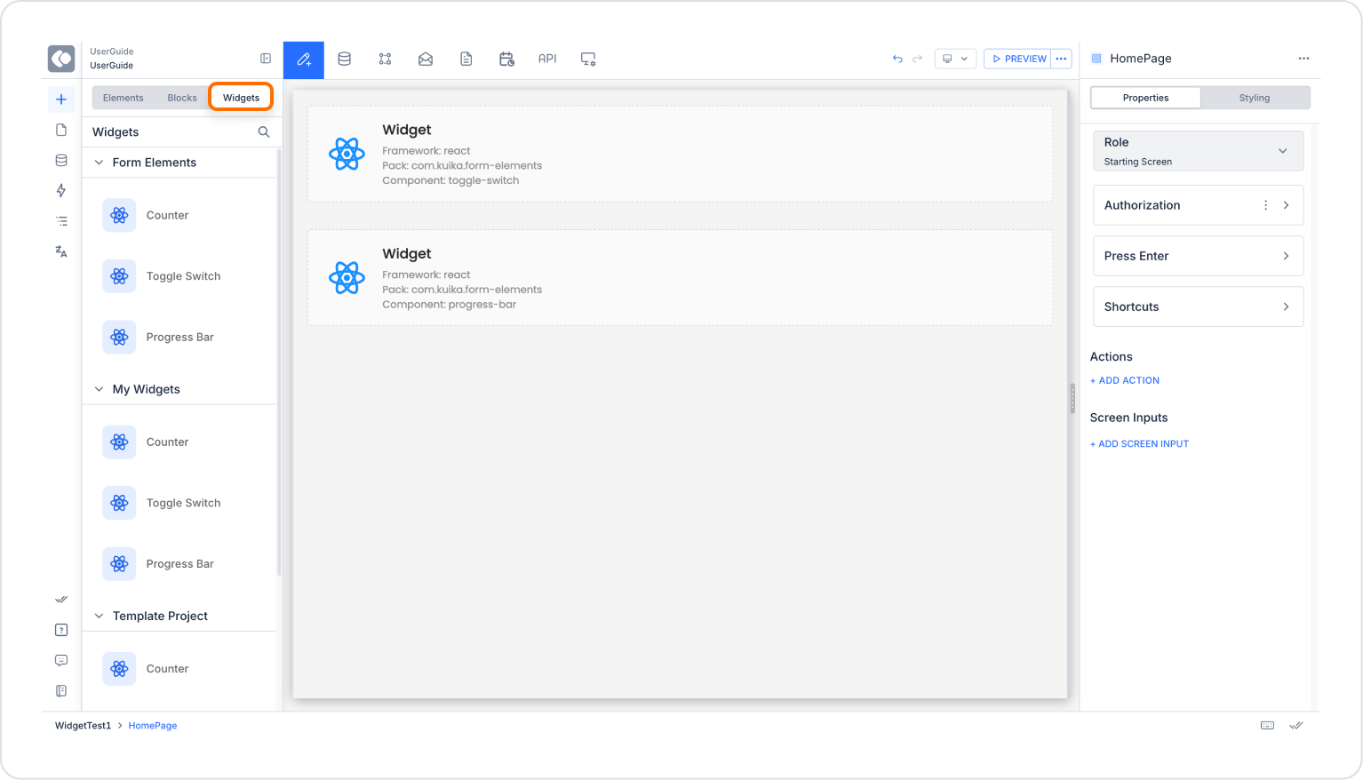

