The URL element is a special input element that allows users to enter a valid web address (URL) within the application. Unlike standard text fields, it helps prevent invalid link entries by checking that the entered value complies with the URL format.
The URL element ensures that links entered by the user are validated and can display URLs in a valid format as clickable links.
The URL element is supported in both web and mobile applications.
1.1. Common Use Cases
Website or profile link entry
Reference and source links
External redirect URLs
Documentation or content links
URL fields in forms and settings screens
2. Key Features
URL format validation: The system checks whether the entered value is in a valid web address format.
Warning mechanism for incorrect entries: The user is notified of invalid URL formats.
Clickable link support: Valid URLs can be displayed as links and visited directly.
Dynamic value binding support: Values can be dynamically managed with state, variables, or action outputs.
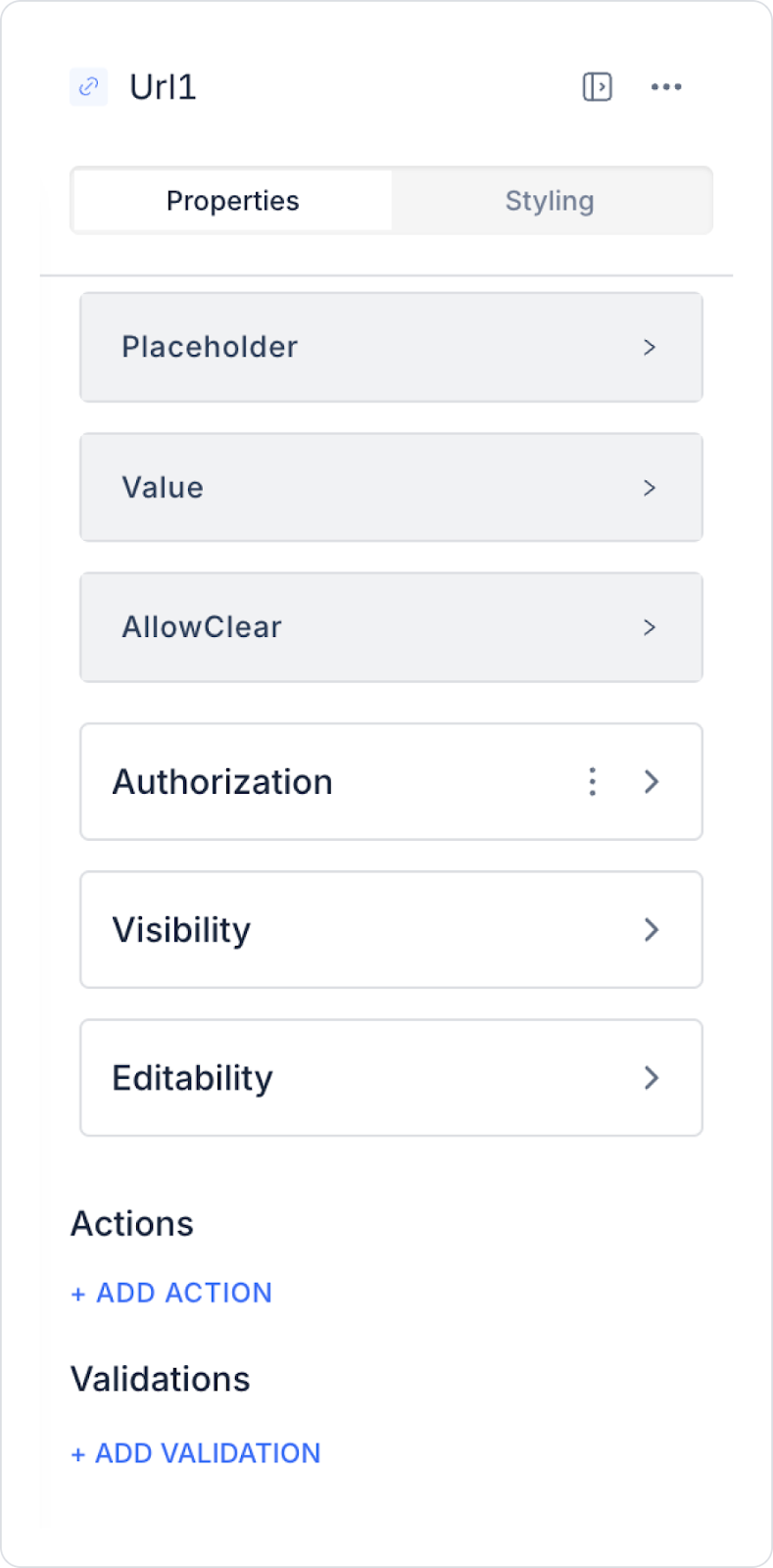
2.1. URL Element Properties
You can configure the following settings from the Properties panel:
Value: You can add a static value to the URL element or dynamically retrieve the content of another element or action result using the Symbol Picker. Checks whether the entered URL is in a valid format.
Placeholder: The placeholder text that appears when the user has not entered a URL. Guides the user by showing an example URL format (e.g., “https://www.ornek.com”).
Allow Clear: Allows users to delete the entered URL with a single click using the Delete (X) icon on the right side.
2.2. Actions That Can Be Added to Elements
The URL element supports the following triggers (events) based on user interactions. These triggers ensure that actions are executed in a controlled manner based on the URL input.
onChange: Triggers every time the user changes the value in the URL field.
Usage scenarios:
Performing instant validation based on the URL format
Enabling buttons when a valid URL is entered
Preparing dynamic field display or redirection
onPressEnter: Triggered when the user presses the Enter key in the URL field.
Usage scenarios:
Initiating the form submit process
Redirecting to the entered URL
Trigger link validation or registration action
3. How to Use the Url Element?
In this section, we will cover the end-to-end use of the Url element through example scenarios.
Scenario: Adding a LinkedIn Profile Link
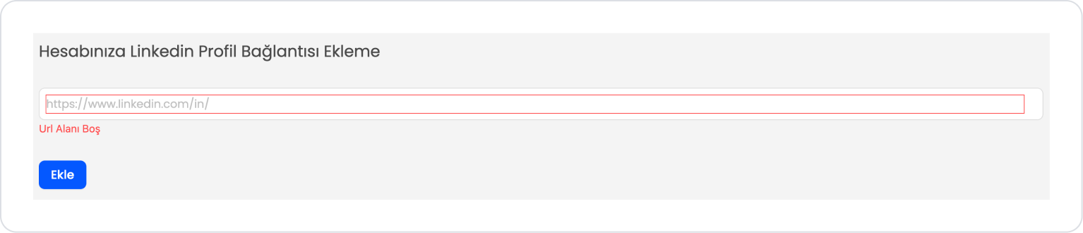
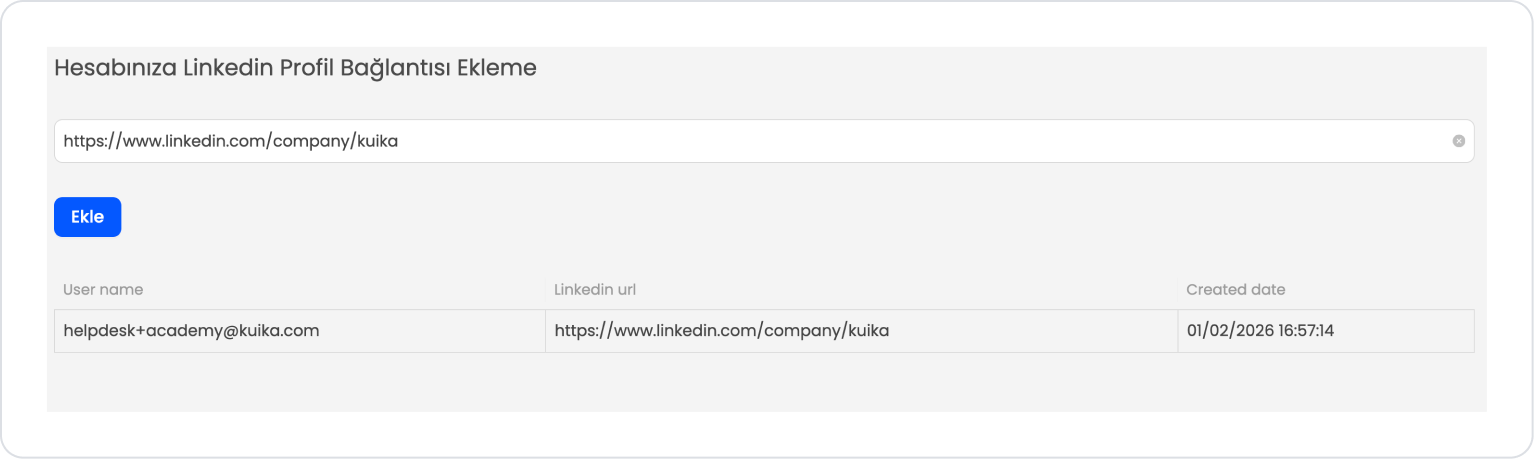
In an application, it is important to enter the LinkedIn profile link correctly and validly so that users can quickly access their professional profiles. In this scenario, the URL Input element is used to allow the user to add their LinkedIn profile address.
In the scenario:
The user enters their profile URL in the LinkedIn Profile Link field (e.g., https://www.linkedin.com/in/...).
If the entered value does not match a valid URL format, the input field is visually highlighted and a warning message is displayed informing the user that they must enter a valid LinkedIn link.
When the user enters a valid LinkedIn profile link, the validation warning is automatically removed.
When the Add button is clicked, the process is completed only if a valid URL has been entered, and the profile link is added to the user account.
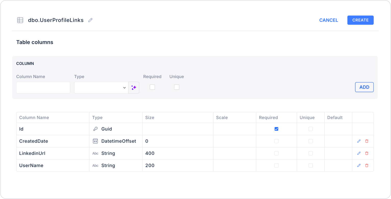
Step 1 - Creating the Data Source
Creating a table in the DataSources module:
Go to the Datasources module.
Then go to the Tables tab.
Create a new table named “UserProfileLinks”.
The table structure to be set up is as follows:
Important Field names:
UserName: Holds the name or username of the user whose LinkedIn profile is added.
LinkedinUrl: Contains the user's LinkedIn profile link.
CreatedDate: Holds the date the LinkedIn profile link was added to the system.
Step 2 - Defining the Required Action
To display and add data in the interface:
You need to define two actions.
Add a new action from the Actions > New SQL Action tab in the Datasources module.
Action Listing Sample Data (GetUserProfileLinks):
SELECT * FROM UserProfileLinks;
When applying, delete the UserProfileLinks part, rewrite UserProfileLinks, and press Enter. This will add the correct schema name before the table name.
Step 3 - Adding and Configuring Elements
Drag and drop the Elements > Display > Label element onto the page.
Edit the text to Label > Properties > Value > “Add a LinkedIn Profile Link to Your Account”.
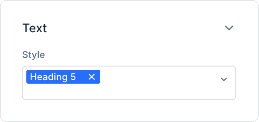
Set the font to Label > Styling > Text > Style > Heading 5.
Drag and drop the Elements > Text Input > Url element onto the page.
Add the text Url > Properties > Placeholder > “https://www.linkedin.com/in/” as the placeholder text.
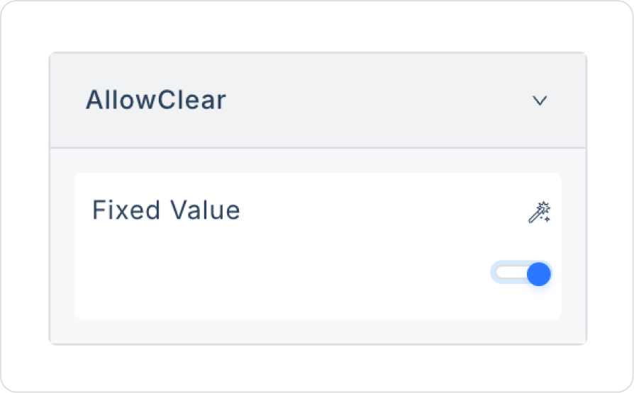
Set Url > Properties > AllowClear > Open to clear the content.
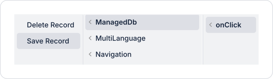
Drag and drop the Elements > Navigation > Button element onto the page.
Edit the Button text to Button > Properties > Label > “Add”.
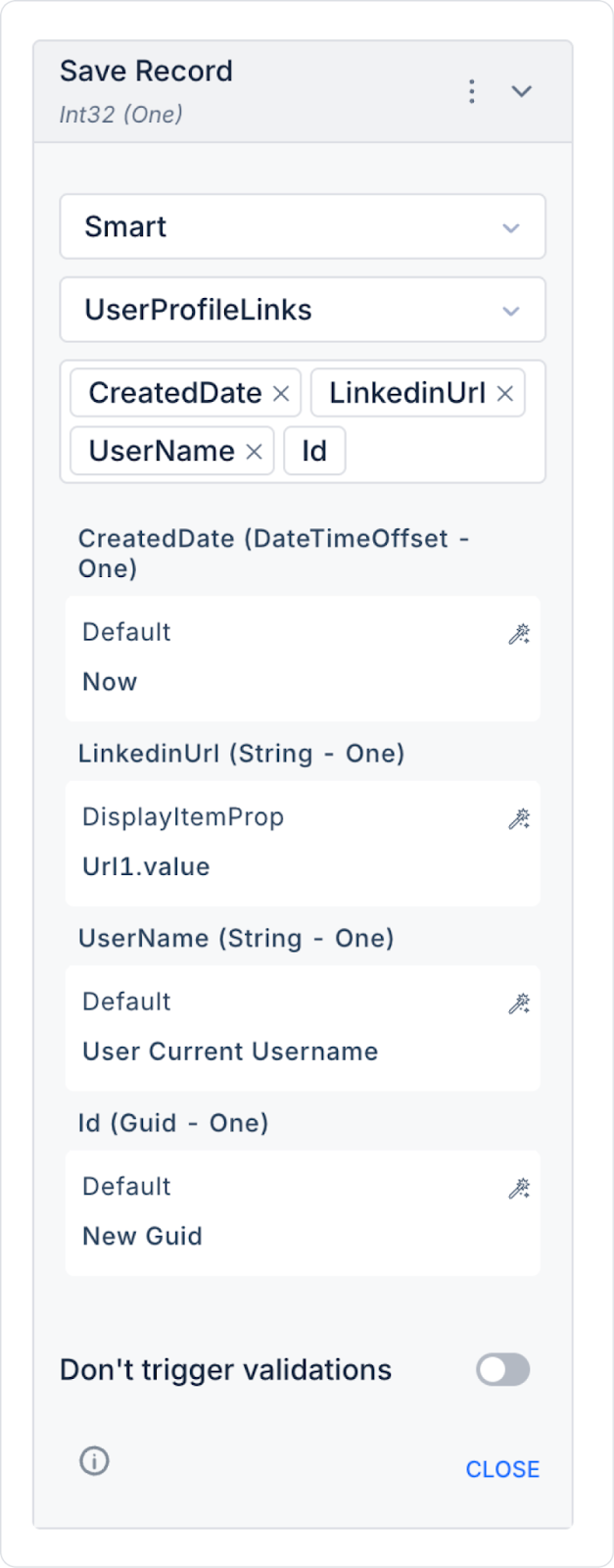
Add the save record action to the Button element: Button > Add Action > onClick > ManagedDb > Save Record.
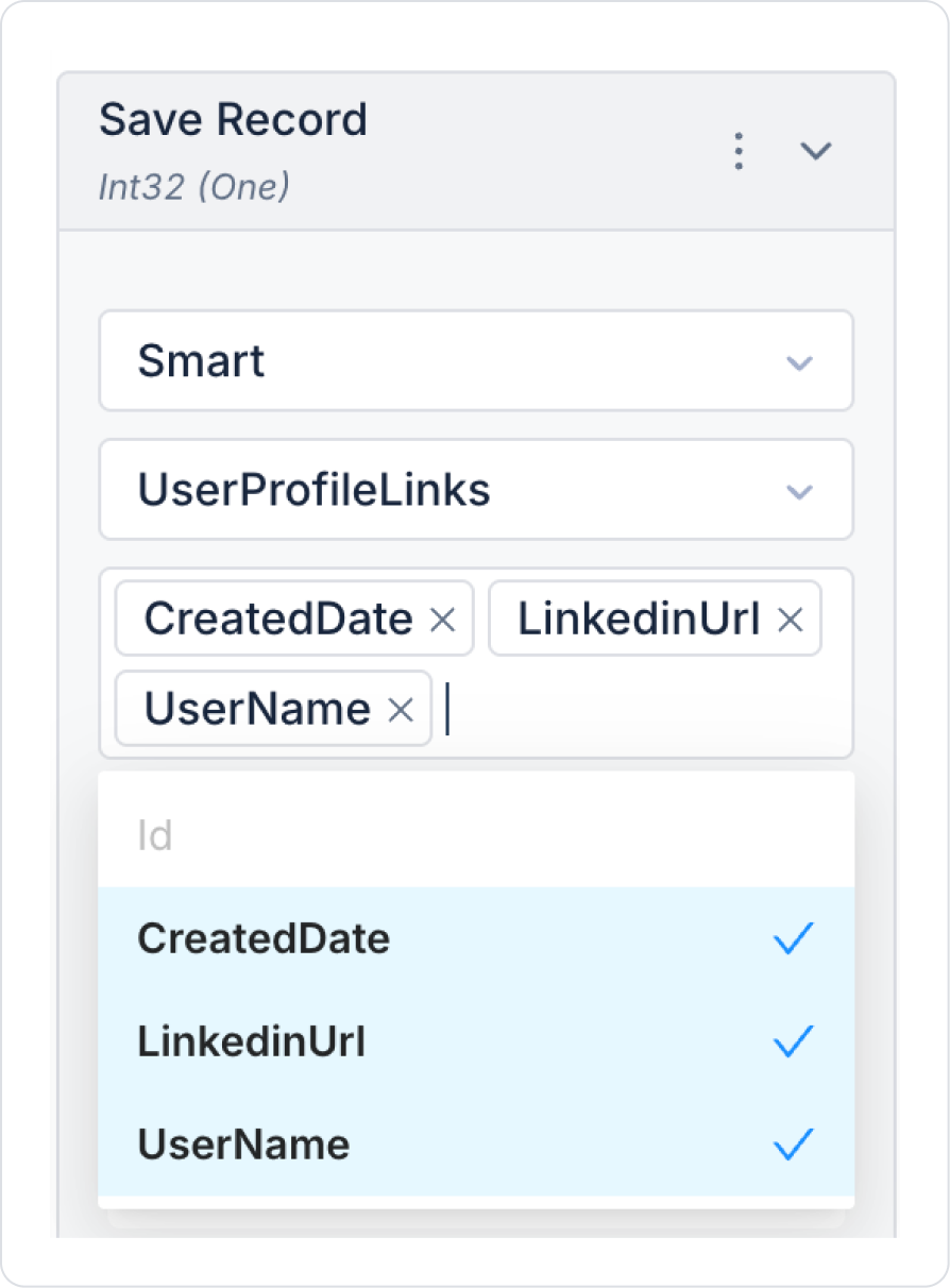
In the Save Record action, select the UserProfileLinks table. In the column names field that opens, select all column names.
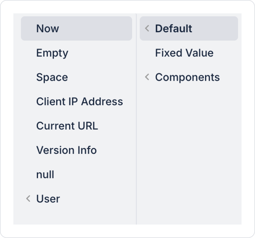
Set the CreatedDate field to Default > Now.
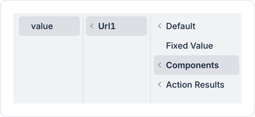
Define the LinkedinUrl field as Components > Url1 > value.
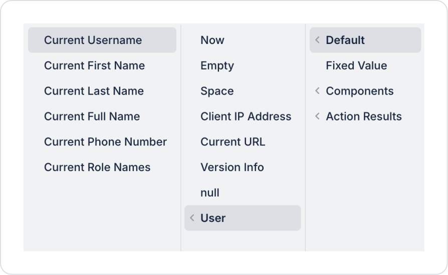
Define the UserName field as Default > User > Current Username.
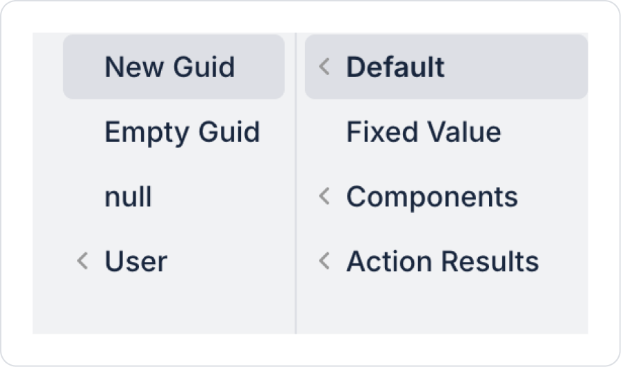
Define the Id field as Default > New Guid.
As a result of these definitions, all fields of the Save Record action should be as follows.
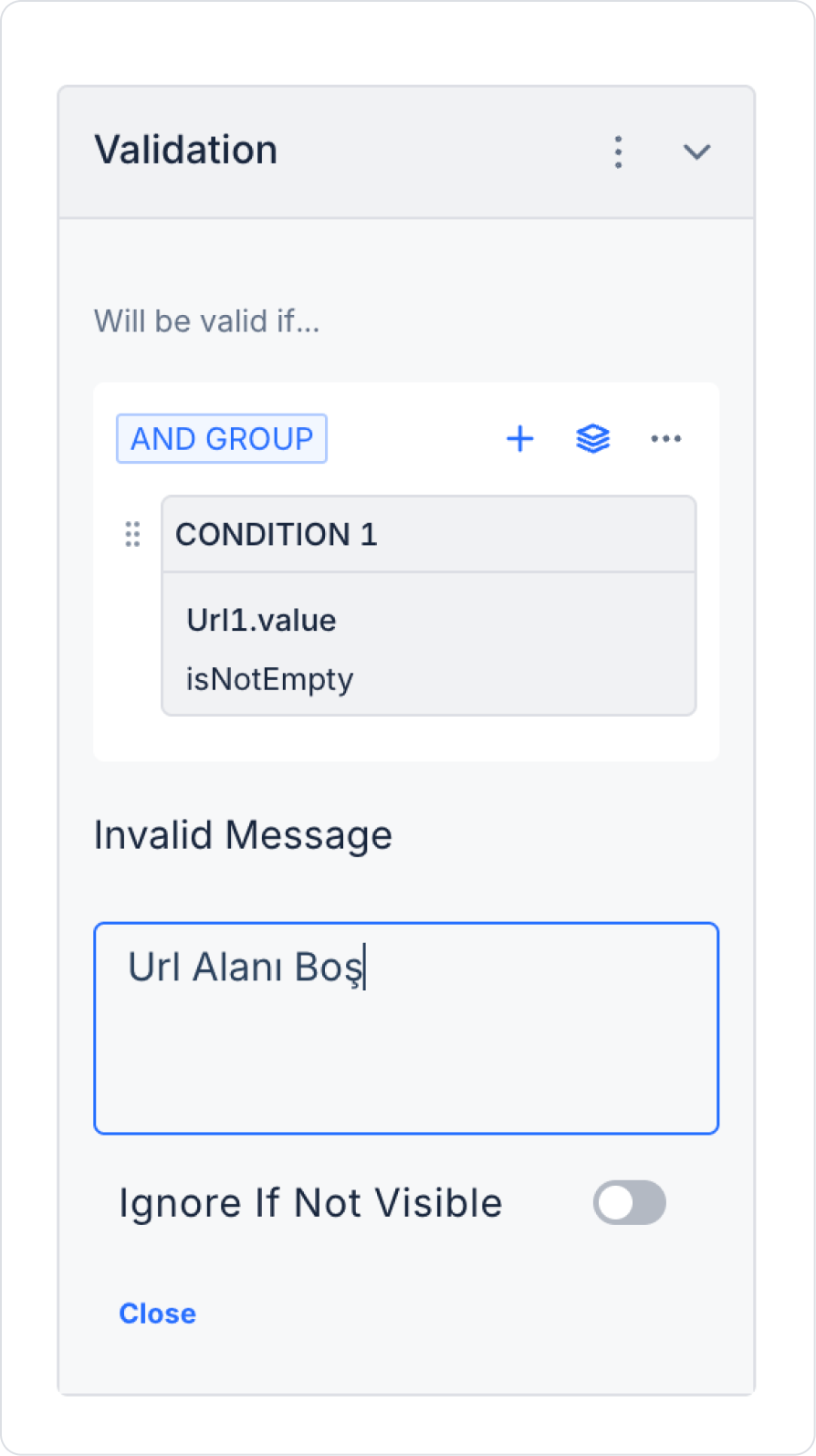
Add Url > Add Validation to ensure the Url field is not left blank. Make the following definition in the text field that opens.
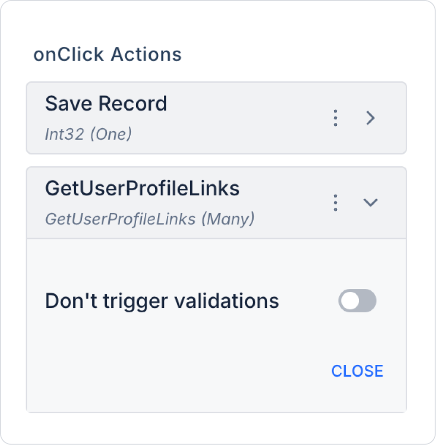
To view previously saved and newly saved records after clicking the button, add the Button > Add Action > onClick > Custom > Managed DB > GetUserProfileLinks action.
Since redirection occurs after the operations are completed on the record page, the Set Value Of action does not clear the Url content after saving the record.
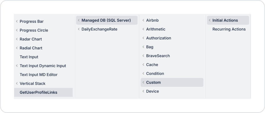
To view past posts when the page opens, add the Add Action > Initial Action > Custom > Managed DB > GetUserProfileLinks action to the page.
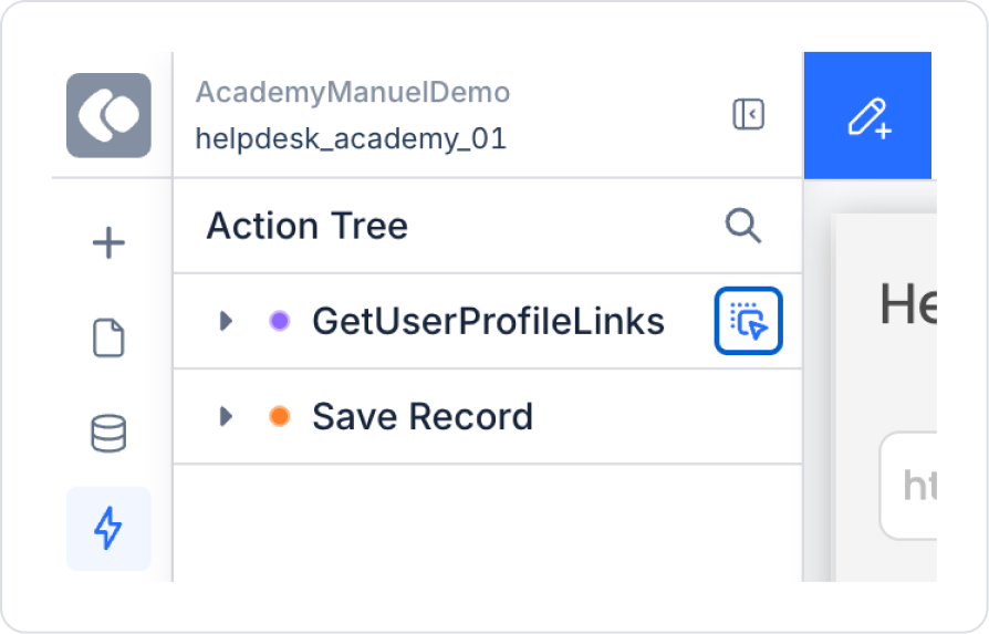
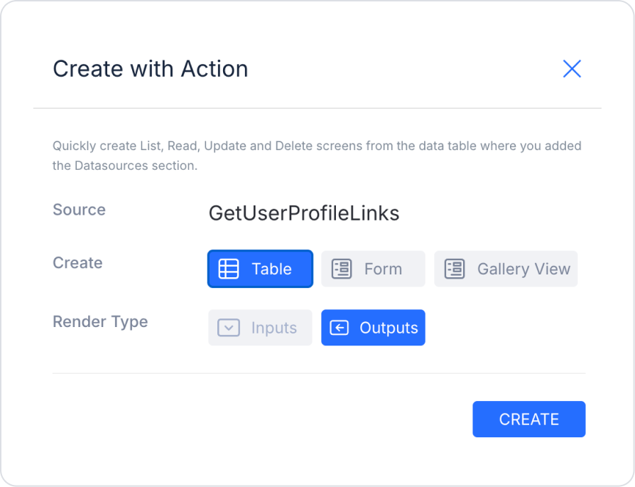
From the Action Tree area on the left side panel, press and hold the blue icon next to the GetUserProfileLinks action and drag it to the page.
Select the relevant fields in the window that opens and create them.
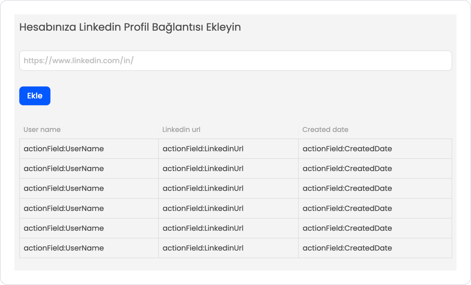
The page should look like this in its final state.
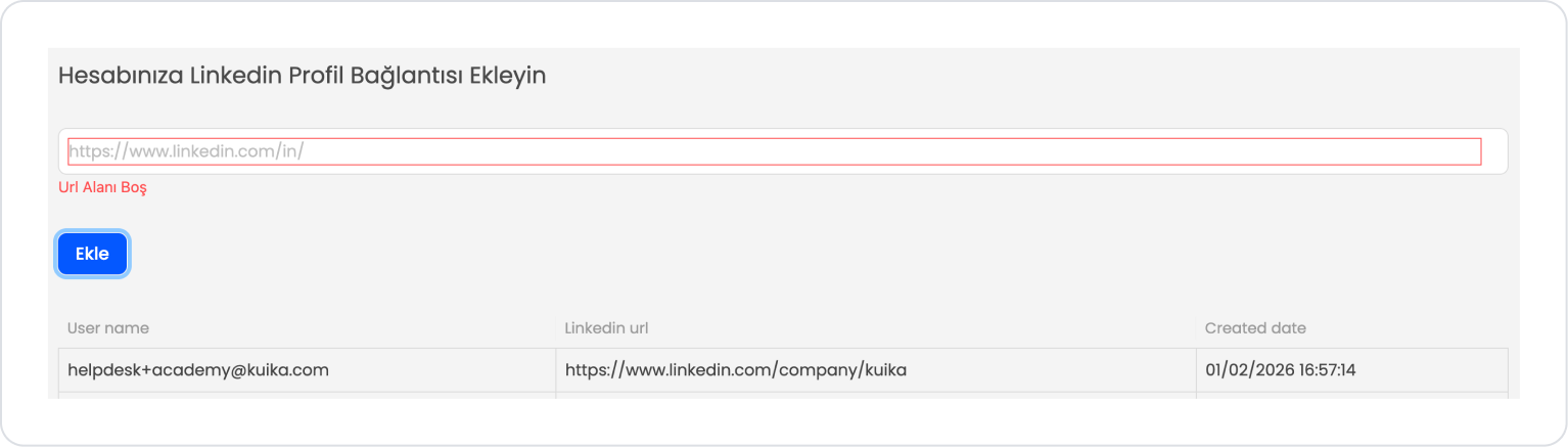
Preview:
When the application is tested, a URL entry field is displayed to add a LinkedIn profile link to the user account. If the user clicks the Add button without entering their LinkedIn profile address in this field, the field is highlighted with a red border and the warning message “Url Field is Empty” is displayed.
When a valid LinkedIn link is entered, the warning is automatically removed. When the Add button is clicked, the entered link is saved to the system and displayed in the list field below, along with the User name, LinkedIn url, and Created date information.
This structure allows users to easily track and store the LinkedIn profile links they have added.
4. Common Properties
Some fields on the URL element are used in common across all UI elements. Therefore, detailed descriptions of the following properties can be found in the relevant general guide pages:


