Kuika's Text editing features allow you to fully customize the text in your web projects. Through the Styling panel, you can easily configure settings such as font, size, color, letter spacing and create text styles suitable for your project. You can also use the text styles you create in different elements and edit or delete them as needed.
Text Properties
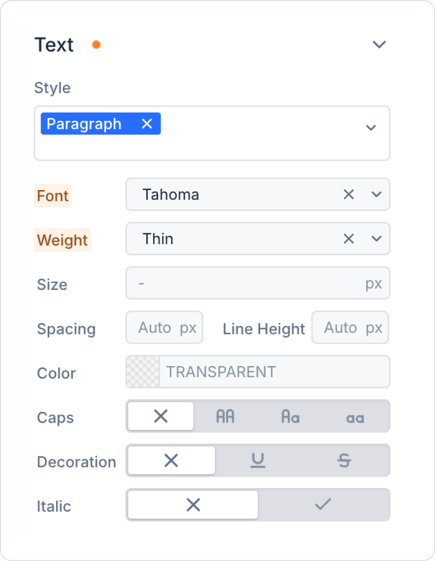
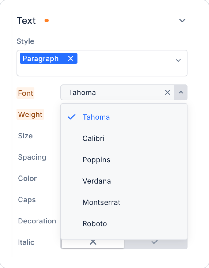
Font Family:
You can choose one of the default fonts available on the platform.
Style:
You can choose the thickness settings of the selected font (e.g. thin, light, regular, medium, bold).
Size and Color:
Size:
Pixels (px): Fixed unit.
Points (pt): Common unit of measurement for printed text.
Rems (root ems): The page is scaled to the base font size.
EMS: Proportional to the main element.
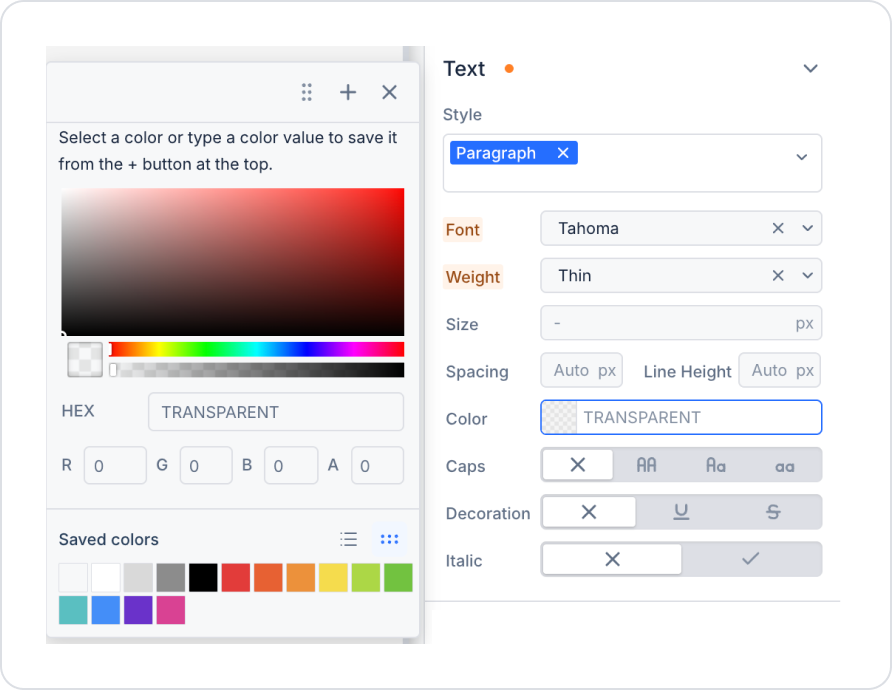
Color:
You can specify the color of the text usingColor Picker, RGB values or Hex code.
Text Style Options:
All Caps: All letters are uppercase.
All Lowercase: All letters will be lowercase.
Underline Text: Underlines the text.
Spacing:
Letter Spacing: Sets the space between letters.
Line Height: Determines the line height (usually 1.5 times the font size is recommended).
Making Text Settings in Elements
Log in to the Kuika platform and open your project from the Apps screen.
In the UI Design module, select and add an element from the Elements panel on the left side.
Select the element you want to adjust.
Open the Styling panel on the right side.
Click on the Text section.
You can create a new text style by clicking the ellipsis icon in the Styles field and selecting Add New Style.
Custom Style
Font Family: Specify the font family.
Style: Choose from thin, light, regular, medium or bold.
Size: Use one of the units such as pixels (px), points (pt) or em (em).
Color: Choose the color you want with the color picker tool.
Text settings may differ depending on the type of element selected. Some elements support all features, while others only allow certain features.


