Kuika's Tab element allows applications to present different content in an organized manner using a tab structure . Users can quickly access different data groups on the same screen by switching between tabs. This approach creates a simple and user-friendly interface experience.
The Tab element is supported in both web and mobile applications. Additionally, thanks to Nested Tab support, tabs within tabs can be used in Web and Android applications.Areas of Use
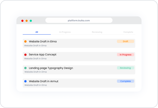
Content Management → Displaying different data groups on the same pageProject Tracking → Categorizing task statuses (All, In Progress, Reviewing, Complete)Forms & Settings → Dividing different settings areas into tabsNavigation → Switching between pages within a page using tabs without switching to different screensAnalytics & Reporting → Presenting different graphs or data tables on a single screenUse Case – Task Status View In a project management application, the Tab element allows tasks to be categorized according to their status.
All → List of all tasksIn Progress → Tasks in progressReviewing → Tasks in the review phaseComplete → Completed tasksWhen the user switches between tabs, they only see tasks belonging to that status. Each tab displays task cards with colored status badges.
UI Design Module Operations
Go to the UI Design module. Select the Tab element from the Elements > Interactive category on the left side. Drag and drop it into the workspace. Define the content for each tab (e.g., task list, table, or card view). Edit the tab titles: TabItem1 → All TabItem2 → In Progress TabItem3 → Reviewing TabItem4 → Complete Using Properties in the Scenario Context
Tab Description: Area for adding new tabs, deleting existing tabs, or changing their order. Usage: You can create new tabs with the +Add Tab Item option. Type Description: Determines the display type of tab titles (e.g., line or box style). Tab Position Description: Determines the position of the tabs. Options: Top → At the top (default) Bottom → At the bottom Left → On the left side Right → On the right side Selected Tab Color Description: Defines the line and text color of the active tab. Example: #4B7CF3 (blue tone). TabItem – Label Description: Text to be displayed in the tab header. Usage: Text can be edited by selecting the tab in the Properties panel. Dynamic Usage – Linking Tabs with Datasource The tab element can be used dynamically with Datasource filters .
For example, to link task statuses to different tabs:
Go to the Datasources module. Then click the + icon next to the Tables heading and name the table “Tab”. Create the following table. Then click SQL Actions and name the action “TabActions”. You can also create it with C#. Enter the following SQL command. SELECT * FROM Tasks WHERE Status = @{Tab.SelectedLabel} Tab element → Link the Tab.SelectedLabel variable from the Symbol Picker.When each tab is selected, only tasks belonging to that status are displayed. When the Scenario is Complete
The user navigates between tabs to view tasks by status. The active tab is highlighted, and the line below it changes color. Only the relevant data group is displayed on each tab. With Nested Tab support, sub-tabs can also be used on detail pages. Limitations
Using too many tabs can clutter the interface. The Nested Tab feature is not supported in iOS applications. Tips & Best Practices
Common mistake: Using long tab titles → Causes overflow on narrow screens.Tab colors should be selected to match the overall theme of the application. Dividing content by category provides the user with a clear flow of information. The Nested Tab structure provides a neat appearance on complex settings or management screens. 


