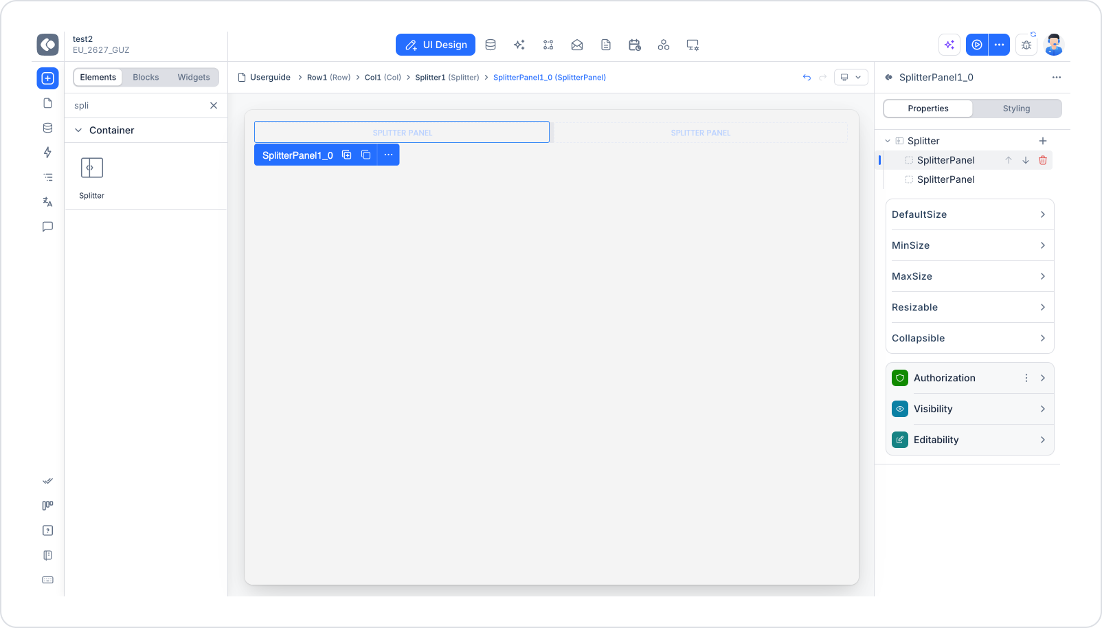
The Splitter element is a container element that divides the screen into two panes, either side by side or one above the other. A draggable handle (gutter) sits between the panes, allowing users to adjust the width or height of each pane themselves while using the application.
Each pane of the Splitter is defined as a SplitterPanel. When a Splitter is added to the screen, it automatically comes with two SplitterPanels. Any UI element, such as a Tree, Table, form fields or a map, can be placed inside each SplitterPanel.
Before Splitter, such layouts could only be built with fixed-width Col elements, which did not allow users to change pane widths. Splitter makes it possible to build flexible interfaces where users can shrink and expand their own screen areas as needed.
The Splitter element is currently supported only in web projects. It is not displayed in Android and iOS projects.
1.1. Common Use Cases
Splitter is ideal for screens where a selection is made on one side and the details of the selected record are shown on the other:
Product tree and part details. The product tree on the left, the details of the selected part on the right.
List and preview. A list of records on the left, a preview of the selected record on the right.
Category/folder tree and content. A category or folder structure on the left, the related content on the right.
Form and live preview. Form fields on the left, a live preview of the form's output on the right.
Map and list. A map and a list of locations displayed side by side.
If the widths of the two panes will always remain fixed, Row and Col elements are sufficient. Splitter should be preferred on screens where users need to be able to change pane sizes.
2. Key Features
Works as a container. Splitter can hold any type of UI element through its SplitterPanels.
Horizontal and vertical split. Panes can be positioned side by side (horizontal) or one above the other (vertical).
User resizing. Panel sizes can be changed at runtime by dragging the handle between the panes.
Per-panel size limits. An initial size as well as minimum and maximum limits can be defined for each panel.
Collapsible panels. A panel can be fully collapsed by double-clicking the handle and restored by double-clicking it again.
Keyboard support. When the handle is focused via the keyboard, the panel size can be changed in 10-pixel steps with the arrow keys, and the panel can be collapsed with Enter or Space.
2.1. Element Settings (Properties)
Splitter settings are configured at two levels: settings of the Splitter element itself and settings of each SplitterPanel.
Splitter Settings
When you select the Splitter element, you can configure the following settings from the Properties panel on the right.
Orientation Determines the direction in which the panes are arranged.
Horizontal: Panels are placed side by side. Suitable for tree–detail and list–preview layouts.
Vertical: Panels are placed one above the other. Suitable for layouts such as content on top and details or preview below.
GutterSize Determines the thickness of the handle between the panes. A thin handle provides a clean look, while a thicker handle is easier to notice and drag.
GutterColor Determines the color of the handle. By choosing a color that matches the application's theme, the separation between panes can be made either prominent or subtle.
The Splitter's Properties area also lists the panels it contains. From this list you can click a panel to open its settings and change the order of the panels using the up/down arrow icons.
SplitterPanel Settings
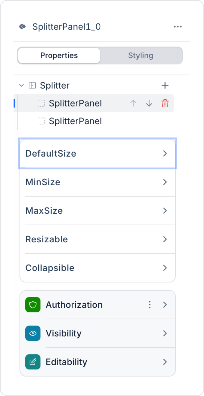
When a SplitterPanel is selected from the panel list in the Splitter's Properties area or via the BreadCrumb, the following settings are displayed:
DefaultSize Determines the size of the panel when the screen first opens. The value can be entered in pixels (px) or percent (%). For example: left panel 30%, right panel 70%.
MinSize Determines the smallest size to which the user can shrink the panel. Prevents the content from becoming too narrow to read.
MaxSize Determines the largest size to which the user can expand the panel. Prevents one panel from pushing the other entirely off the screen.
Resizable Determines whether the panel can be resized. When disabled, the handle on that panel's edge cannot be dragged and the panel remains at its DefaultSize value.
Collapsible Determines whether the panel can be collapsed. When enabled, the user can fully close the panel by double-clicking the handle and reopen it by double-clicking again. When using the keyboard, the same action is performed with Enter or Space.
3. How to Use the Splitter Element
In this section, we will walk through the end-to-end usage of the Splitter element with an example scenario.
Scenario: Building a Product Tree and Part Details Screen
In a production management application, it is important to see which assembly groups, raw materials and operations a product consists of in a tree structure, and to examine the details of the selected part on the same screen.
In this scenario, the screen is split into two panes with a Splitter. The left panel displays the product tree using the Tree element; each node is listed with its own icon and color based on its type, together with quantity and unit information. The right panel displays the details of the part selected in the tree. The user can widen the tree area by dragging the handle, or collapse the tree panel to focus on the details area.
Step 1 - Creating the Data Source
Creating the table in the DataSources module:
Go to the Datasources module.
Then go to the Tables tab.
Create a new table named "ProductPart".
The table consists of the Id, ParentId, Name, PartType, PartCode, Quantity, Unit, Icon, Color and Description columns.
Important Field names:
Id: The unique identifier of the part.
ParentId: The Id of the parent node the part belongs to in the tree. Left empty for the top-level node (the product itself). The Tree element builds the hierarchy using this field.
Name: The part name displayed as the node text in the tree.
PartType: Specifies the type of the part. E.g.: Product, Assembly, Raw Material, Operation.
PartCode: The stock or material code of the part.
Quantity: The quantity required for the parent node.
Unit: The unit of the quantity. E.g.: pcs, kg, min.
Icon: The icon displayed on the node. Stored as a Material icon name or an image URL.
Color: Determines the icon and text color of the node. Stored in HEX format.
Description: Descriptive information about the part. Displayed in the details panel.
Step 2 - Defining the Required Actions
You need to define three actions to display and insert data in the interface. Add a new action from the Actions > New SQL Action tab in the Datasources module.
Action That Inserts Sample Data (InsertProductPartData): To test the application with sample data, add the following SQL action and click the TEST button.
When applying this, delete the ProductPart part, type ProductPart again and press Enter. This way, the correct schema name will be added in front of the table name.
Action That Provides the Tree Data (GetProductTree):
SELECT
    Id,
    ParentId,
    Name,
    PartType,
    Quantity,
    Unit,
    Icon,
    Color
FROM ProductPart;
Action That Provides the Selected Part's Details (GetPartDetail): Define a parameter named PartId for this action.
SELECT Name,
PartType,
PartCode,
Quantity,
Unit,
Description
FROM ProductPart
WHERE Id =@PartId;
When applying this, delete the ProductPart part, type ProductPart again and press Enter. This way, the correct schema name will be added in front of the table name.
Step 3 - Adding the Initial Action
Open the UI Design module.
Add the Initial Actions > Custom > Managed Db > GetProductTree action to the page using the ADD ACTION button.
Step 4 - Adding Elements
Open the UI Design module.
Drag and drop the Elements > Container > Row element from the left side panel onto the page.
Drag and drop the Elements > Container > Splitter element into the Row. The Splitter comes with two SplitterPanels inside it.
Drag and drop the Tree element into the first SplitterPanel.
Drag and drop the Elements > Container > VerticalStack element into the second SplitterPanel.
Click the VerticalStack element and click Elements > Display > Label in the left side panel five times to create five Labels stacked vertically.
Step 5 - Configuring Element Settings
You can reach any element using the BreadCrumb at the bottom of the page.
Splitter settings:
Click the Splitter1 element via the BreadCrumb.
Select horizontal in the Splitter > Properties > Orientation field.
Set 6 px in the Splitter > Properties > GutterSize field.
Select the #E0E0E0 color in the Splitter > Properties > GutterColor field.
Left panel (product tree) settings:
Click the first SplitterPanel in the panel list in the Splitter's Properties area, or click the SplitterPanel1_0 element via the BreadCrumb.
Set 30% in the DefaultSize field.
Set 250 px in the MinSize field.
Set 60% in the MaxSize field.
Enable the Resizable field.
Enable the Collapsible field. This allows the user to close the tree by double-clicking the handle and focus on the details area.
Right panel (part details) settings:
Click the second SplitterPanel (SplitterPanel1_1).
Set 70% in the DefaultSize field.
Set 40% in the MinSize field.
Enable the Resizable field.
Leave the Collapsible field disabled. This ensures the details area is never fully closed.
Tree settings:
Click the Tree element and select the GetProductTree action in the Tree > Properties > Datasource field.
Map the Id field for the node identifier, ParentId for the parent node and Name for the node text.
Map Icon in the Icon Field. Each node is displayed with an icon matching its type.
Map Color in the Color Field. Raw materials are distinguished in red, operations in green and assembly groups in brown.
Add the Quantity and Unit fields to Columns. Quantity and unit information is displayed aligned to the right of the node text.
Adjust the column width from the Column Width field. If you do not want the column header strip to be displayed, turn off the Show Column Header field.
Fields added via Columns are not a table; they are cells aligned next to the node text. Sorting and filtering are not available for these fields.
Selection and detail binding:
While the Tree element is selected, use the ADD ACTION button to add the action triggered when a node is selected, and select the GetPartDetail action.
Pass the selected node's Id value to the PartId parameter.
In the Labels in the right panel, map the fields returned by the GetPartDetail action in the Label > Properties > Value > Field to display field in the following order: Name, PartType, PartCode, Quantity and Description.
Preview
When the application is tested, the screen is displayed split into two panes by the Splitter element. The left panel lists the product tree; each node is shown with its own icon, a color based on its type, and quantity–unit information aligned to its right. When a part is clicked in the tree, its name, type, code, quantity and description are displayed in the right panel.
The user can widen or narrow the tree area within the defined limits by dragging the handle between the panes. Double-clicking the handle fully collapses the tree panel so the details area fills the entire screen; double-clicking it again reopens the tree panel.
4. Common Properties
Some fields on the Splitter and SplitterPanel elements are shared across all UI elements. Detailed descriptions of the following properties can therefore be found on the relevant general guide pages:
Authorization Settings
Visibility
Editability
Style Panel
5. Best Practices
Use Splitter only when it is truly needed. If pane widths will remain fixed, Row and Col elements are a simpler solution.
Define a MinSize for each panel. Panels without a minimum size can be shrunk until the Tree or form fields inside them become unreadable.
Make the selection panel collapsible and keep the details panel fixed. Enabling Collapsible on selection areas such as trees, lists or categories lets users focus on the details when needed.
Choose px or % based on screen size. Use px for MinSize on panels whose content must not drop below a certain width, and % for DefaultSize on panels where you want to preserve the overall ratio.
Make the handle noticeable with GutterSize and GutterColor. Ensure the handle has enough contrast with the background so users understand that the panes can be resized.
6. Limitations
Splitter is supported only in web projects; it cannot be used in Android and iOS projects.
Splitter works with two panes only. Other UI elements must be added inside the SplitterPanels, not directly into the Splitter.
The handle on the edge of a panel with Resizable disabled cannot be dragged; in this case the panel is displayed only at its DefaultSize value.
The DefaultSize, MinSize and MaxSize values of the panels must be consistent with each other. If the panels' combined minimum sizes exceed the available screen area, the layout may not behave as expected.