User Manual

Select Box Usage Scenario

Select Box Usage Scenario

Kuika's Select Box element allows users to choose from specific options via a dropdown menu. Preferred in forms, registration screens, or dynamic filtering processes, the Select Box enables users to easily make selections from long data lists.

Supported in both web and mobile applications.

Areas of Use

  • Registration and application forms (e.g., city, department, category selection)
  • Payment or reservation processes (e.g., card, date, room type selection)
  • Filtering screens (e.g., product category, price range, brand selection)
  • Dynamic data selection in reporting and analysis screens
  • Dependent dropdown menus in multi-step form structures

Usage Scenario – Festival Ticket Information Selection

In an event reservation application, users select the card, guest type, and date using the Select Box element when purchasing a “Music Fest 2024” ticket.

In the scenario:

  • The user opens the event page.
  • They select their registered card from the “Select Registered Card” field (e.g., MasterCard).
  • Then, they specify the ticket type from the “Select Guest Type” field (e.g., Standard, VIP, Premium).
  • Finally, they select the date they want to attend the event from the “Select Date” field.
  • Once the selections are complete, they click the “Buy a Ticket” button to complete the transaction.

In this scenario, each Select Box connects to a different data source to provide dynamic content.

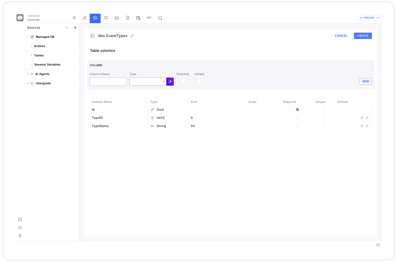
Connecting Data Sources

  • Go to the Datasources module.
  • Click the “+” icon next to the Tables heading.
  • Name the table GuestTypes.
  • Create the following table.
  • Create a new action from the SQL Actions tab and name it SelectGuestType.
  • Enter the SQL command:
SELECT 1 AS TypeId, ‘Standard’ AS TypeNameUNION ALLSELECT 2, ‘VIP’UNION ALLSELECT 3, ‘Premium’
  • Return to the UI Design module and select the Select Box element.
  • Make the Options → SelectGuestType connection.
  • Set Key = TypeId and Text = TypeName.

UI Design Module Operations

  1. Open the UI Design module.
  2. From the left panel, select the Elements > Select Input > Select Box element.
  3. Drag and drop the element onto the screen.
  4. Configure the following settings in the Properties panel:
  • Label: Select Guest Type
  • Placeholder: Standard, VIP, etc.
  • Options: SelectGuestType
  • Allow Clear: Active
  • Searchable: Active
  • Contains Null Item: Inactive
  • Sort By: A-Z
  • Dropdown Scroll Item Limit: 5

Using Properties in a Scenario Context

  • Value: Holds the selected value (e.g., “2” → VIP).
  • Options: Specifies the data source to link to the list.
  • Fixed Options List: Creates a list with manual (fixed) values.
  • Placeholder: The description text displayed before the user makes a selection.
  • Allow Clear: Allows the selected value to be deleted with a single click.
  • Searchable: Enables searching in the dropdown list.
  • Contains Null Item: Leaves the first row of the list blank.
  • Sort By: Sorts items alphabetically.
  • Dropdown Scroll Item Limit: Sets the maximum number of items to display; remaining items are visible by scrolling.

When the Scenario is Complete

  • The user clicks on the “Select Guest Type” box.
  • The list opens and the options from the system are displayed.
  • The user selects the VIP option.
  • The field is updated as VIP and the process continues.
  • If necessary, the user can clear their selection by clicking the (X) icon.

Restrictions

  • When using Dynamic data, the Options link must be set correctly.
  • For performance in very long lists, “Dropdown Scroll Item Limit” should be used.
  • If Contains Null Item is not enabled, the first row will not be left blank.
  • Select Box is not suitable for multiple selections (Multi Select should be used for this).

Tips and Best Practices

  • The placeholder text should guide the user (e.g., “Select your ticket type”).
  • Dynamic filtering can be used to hide unnecessary options.
  • The user experience can be improved by enabling ‘Searchable’.
  • Create a consistent visual style using colors that match the theme.
  • If selection is mandatory, disable the “Allow Clear” feature.
No items found.

Other Related Content

No items found.

Glossary

No items found.

Alt Başlıklar