User Manual

Radio Group Usage Scenario

Radio Group Usage Scenario

Kuika's Radio Group element allows users to select only one option from a group. With its intuitive and simple design, this element speeds up the decision-making process for users and ensures the correct selection is made. It is commonly used in forms, surveys, and settings screens.

Supported only in web applications.

Areas of Use

  • Job type selection in recruitment forms (Full-Time, Part-Time, Contract)
  • Delivery method selection (Standard, Express, Same-Day)
  • Payment preference (Credit Card, Bank Transfer, PayPal)
  • User preferences (Dark Mode / Light Mode)
  • Survey and test questions (single-answer options)
  • Setting default behavior in application settings

Use Case – Employment Type Selection

In an HR (Human Resources) application, the employee information form asks the user to select their employment type. The Radio Group element is used in this field to offer three different options:

  • Full-Time
  • Contract
  • Part-Time

In the scenario:

  • The user sees the question “What is your employment type?” on the form.
  • When they select the “Full-Time” option, the other options are automatically disabled.
  • The selected button is highlighted in purple (example #6C63FF).
  • When the form is submitted, the selected value is stored in the system as a single record.

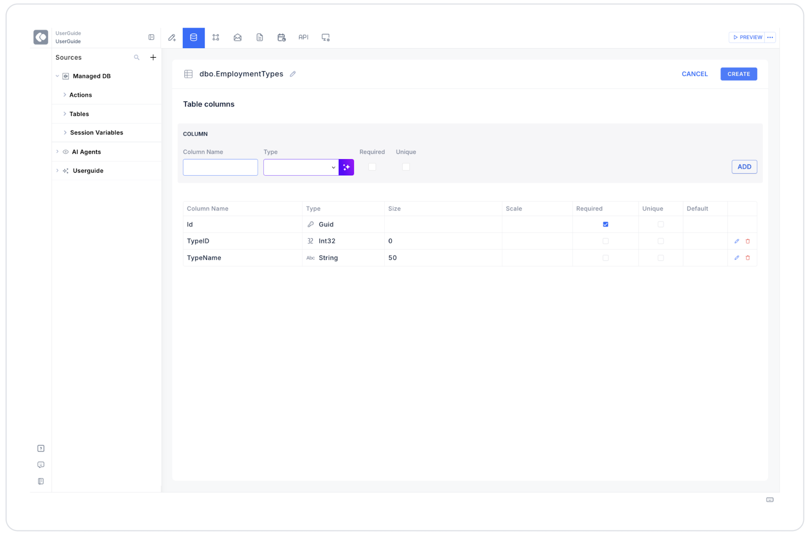
Connecting the Data Source

  • Go to the Datasources module.
  • Click the “+” icon next to the Tables heading and name the table EmploymentTypes.
  • Add the following table.
  • Then, create a new action from the Actions > SQL Actions tab and name it EmploymentList.
  • Enter the following SQL command:
SELECT 1 AS TypeId, ‘Full-TimeAS TypeNameUNION ALLSELECT 2, ‘Contract’UNION ALLSELECT 3, ‘Part-Time
  • Connect the EmploymentList action to the Radio Group element.
  • Set Options → EmploymentList, Key = TypeId, Text = TypeName.

UI Design Module Operations

  1. Go to the UI Design module.
  2. From the left panel, select the Elements > Select Input > Radio Group element.
  3. Drag and drop the element onto the form field.
  4. Configure the following settings in the Properties panel:
  • Label: What is your employment type?
  • Options: EmploymentList
  • Value: TypeId
  • Direction: Horizontal
  • Space: 16 px
  • Selected Radio Color: #6C63FF
  • Unselected Radio Color: #D9D9D9
  • Multi Selectable: Off

Using Properties in the Scenario Context

  • Value: Holds the value of the selected option (e.g., “1” → Full-Time).
  • Options: Defines the list of data to be displayed in the Radio Group.
  • Direction: Determines the horizontal or vertical alignment of the Radio Buttons.
  • Space: Sets the space between options.
  • Selected Radio Color: Determines the color highlight of the selected option.
  • Unselected Radio Color: Sets the color of unselected buttons.
  • Multi Selectable: If enabled, allows multiple options to be selected at the same time (default: disabled).

When the Scenario is Complete

  • The user answers the question “What is your employment type?”.
  • Only one option is active.
  • The selected option receives a colored highlight.
  • When the form is submitted, only the selected value (e.g., “Full-Time”) is saved to the database.

Limitations

  • Only one selection can be made at a time.
  • Multiple selections are not supported unless Multi Selectable is enabled.
  • Vertical layout can take up too much space in long lists.

Tips and Best Practices

  • Use short, clear option texts (e.g., “Full Time” instead of “Full-Time”).
  • Ensure sufficient contrast between selected and unselected colors.
  • Prefer horizontal layout on wide screens and vertical layout on narrow spaces.
  • Use Radio Group instead of Checkbox in survey or form structures, as it is more suitable when only one selection is valid.
No items found.

Other Related Content

No items found.

Glossary

No items found.

Alt Başlıklar