The Progress Bar element allows you to visually show users the progress of processes. It is used for loading statuses, task completion rates, survey progress, or multi-step workflows.
Supported in web and mobile applications.
Usage Areas
Displaying file upload progress,
Tracking task or project completion percentage,
Creating a survey or exam progress bar,
Visualizing user onboarding steps, etc.
Task Completion Scenario
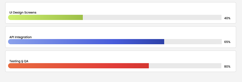
In a project management application, the percentage of tasks completed by the user is displayed with a Progress Bar. The user can easily track the progress of the process by seeing the fill rate and percentage on the bar.
1) Static Usage Scenario
Example Scenario – Fixed Percentage
On a file upload screen, the Progress Bar always displays a fixed percentage.
Datasource: Not required
Percent: 65
Colors: Green
Hide Percentage: false
The user always sees a bar that is 65% full.
UI Design Operations
Add the Progress Bar element.
In the Properties panel, enter 65 as the Percent value.
Customize the colors with First Gradient Color and Second Gradient Color.
Using the Properties
Percent → 65 → 65% full bar
Gradient Colors → Start: #00BFFF, End: #28a745
Hide Percentage → If enabled, only the bar is visible
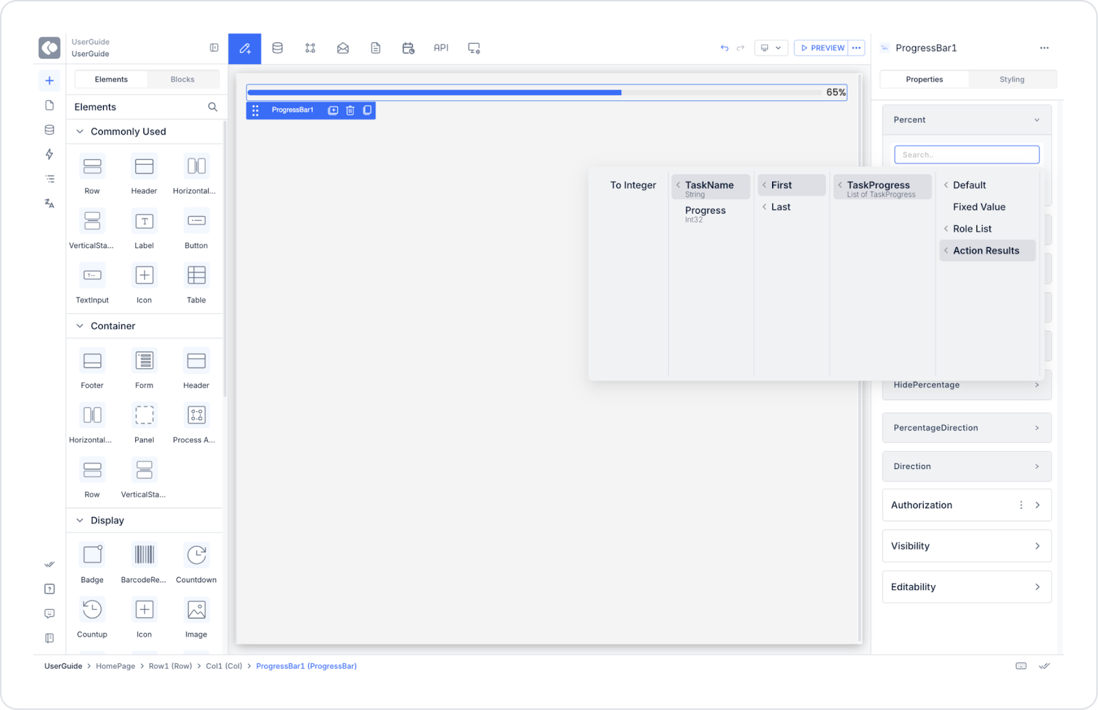
2) Dynamic Usage Scenario
Example Scenario – Task Completion Tracking
In a project management application, the task completion rate of users is displayed with a Progress Bar.
Datasource: TaskProgress table
Percent: Automatically retrieved from the Progress column
Connecting the Data Source
Go to the Datasources module.
Click the Tables > + icon and name the table “TaskProgress”.
Create the following table.
Click SQL Actions and name the action TaskProgress.


