Kuika's Multi Select element allows users to select multiple options from a list at the same time. Selected items are displayed in tag format, and users can easily delete or update these tags. It is used in situations where multiple items need to be selected, such as filtering, category selection, and tagging.
Supported in web and mobile applications. Areas of Use
Product filtering menus (e.g., color, category, brand selection) Selecting multiple areas of interest or preferences in forms Multiple selection in reporting or data analysis Selecting multiple categories in event or ticket systems Assigning multiple tasks to a user in task management applications Selecting multiple courses or skills in education platforms Use Case – Festival Ticket Category Selection In a festival ticket sales application , users use the Multi Select element to select the areas they want to attend.
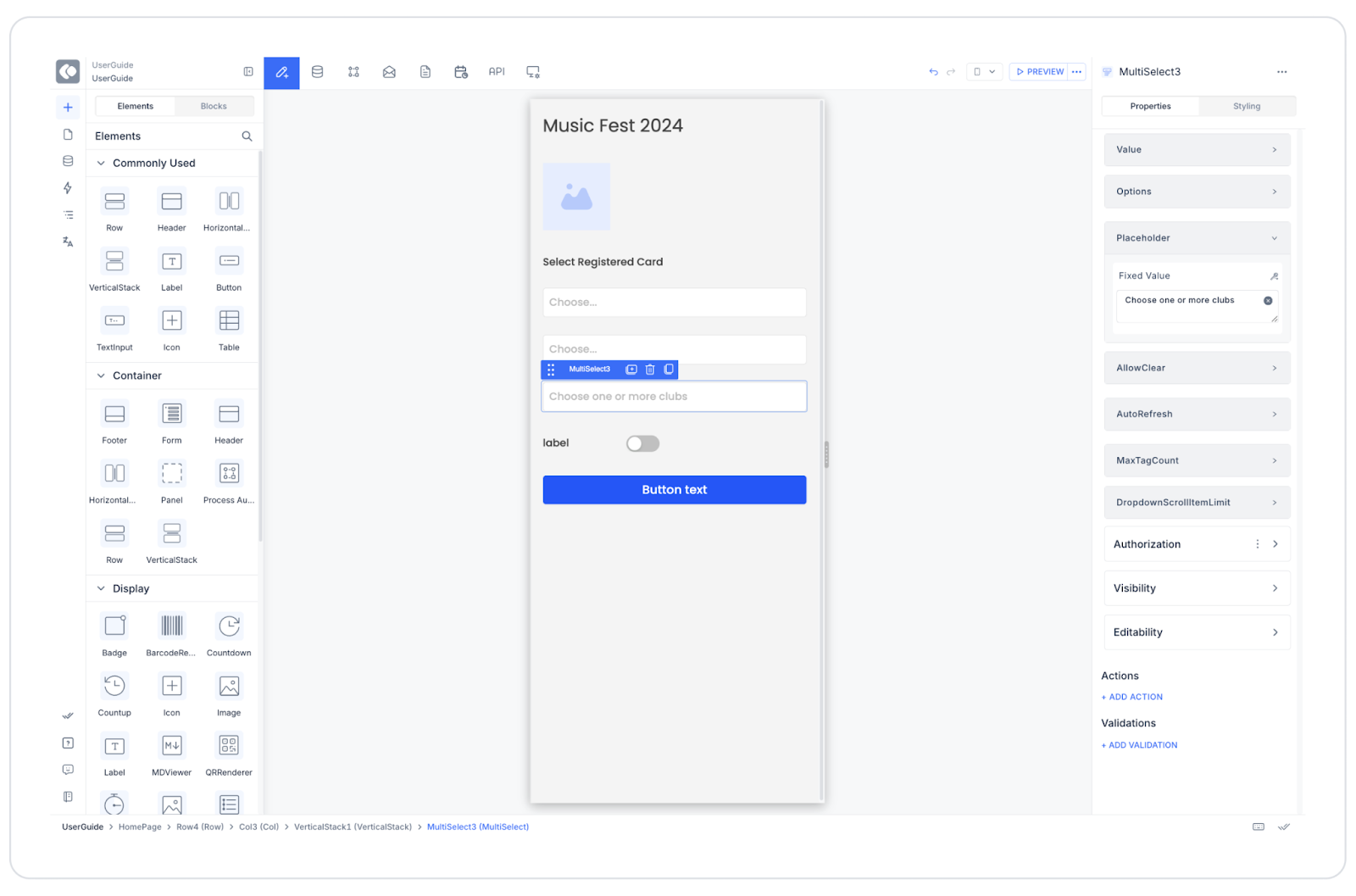
The user opens the “Music Fest 2024” screen. They select their registered card from the “Select Registered Card” field. They make an individual or group selection from the “Select Guest Type” field. The Multi Select element is located in the “Select Club” field. Users can select multiple clubs, such as “Beach Club,” “VIP Zone,” and “After Party.” The selected clubs appear in the field in tag format. If desired, the user can remove their selection by clicking the (x) icon. Once all selections are complete, they complete the process by clicking the “Buy a Ticket” button. Connecting the Data Source
Go to the Datasources module. Click the “+” icon next to the Tables heading to create the following table named “Clubs”. Then, create an action named “ClubList” from the Actions > SQL Actions tab. Enter the following query as the SQL command: SELECT 1 AS ClubId, ‘Beach Club’ AS ClubNameUNION ALLSELECT 2 , ‘VIP Zone’ UNION ALLSELECT 3 , ‘After Party’ Connect the “ClubList” action to the Multi Select element. Options → ClubList , configure Key = ClubId , Text = ClubName .UI Design Module Operations
Go to the UI Design module. From the left panel, drag and drop the Elements > Select Input > Multi Select element. In the Properties panel , make the following settings: Placeholder: Choose one or more clubsOptions: ClubListAllow Clear: ActiveAuto Refresh: ActiveMax Tag Count: 3Using Properties in the Scenario Context
Value: Holds the selected items as a list (e.g., [1,2]).Options: Specifies the data source to display in the list.Placeholder: Descriptive text visible before the user makes a selection.Allow Clear: Allows selections to be cleared with a single click.Auto Refresh: Ensures results are instantly refreshed when selections change.Max Tag Count: Specifies the maximum number of tags to display. Any more will appear as “+3 more”.When the Scenario is Complete
When the user clicks on the “Select Club” field, the list opens. The user selects multiple options. The selected items appear as tags. The user can remove tags if necessary. The user saves their selections by clicking the “Buy a Ticket” button. Limitations
The screen may become cluttered when too many selections are made. In this case, use Max Tag Count . If Auto Refresh is off, selection changes will not be visible immediately. If dynamic data is used, the Options field must be linked to an SQL Action. Tips and Best Practices
Make the placeholder text descriptive for user guidance (e.g., “Select clubs you'd like to join”). Match tag colors to the theme. Enable filtering or search functionality if there are many options. Add a “Select All” option to enhance the user experience. Set a maximum number of selections to limit choices when necessary. 


