The Horizontal Grid element allows you to display content in a horizontal layout within your application. Users can easily discover products, campaigns, or cards by swiping left or right. It is particularly ideal for product catalogs, campaign banners, and horizontal display of content cards.
Use Cases
Product lists (e.g., shoes, clothing),
Campaign banners,
News cards,
Service/feature promotion areas, etc.
The Horizontal Grid element is supported in web and mobile applications.
Men's Shoes Scenario
In a men's shoe shopping app, the user sees the following on the home page:
First, the “Black Friday Discount” campaign banner,
Immediately below it, Air Jordan 1 ($90) and other shoe products are displayed in a horizontal scrollable grid.
The user can switch between products by swiping left or right with their finger or using the arrow buttons.
Connecting the Data Source
Go to the Datasources module.
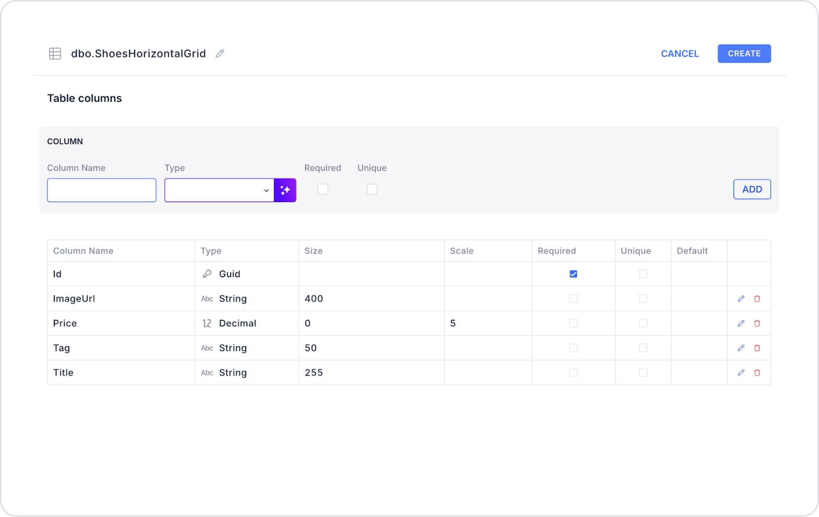
Click the + icon next to the Tables heading and name the table ShoesHorizontalGrid.
Create the following table.
Then click SQL Actions and name the action ShoesHorizontalGrid. You can also create it with C#.
Enter the following SQL command.
SELECT ‘https://cdn.example.com/airjordan1.png’ AS ImageUrl,‘Air Jordan 1’ AS Title,90.00AS Price,‘Black Friday Discount’ AS TagUNION ALLSELECT ‘https://cdn.example.com/nike-collection.png’,‘New Nike Collection Summer 2019’,120.00,‘New’UNION ALLSELECT ‘https://cdn.example.com/adidas-boost.png’,‘Adidas Ultra Boost’,150.00,‘Hot’;
UI Design Module operations
Click the Add Action button on the right side of the application screen.
Then select Custom > ShoesHorizontalGrid.
Using Properties in the Scenario Context
No Data Found Message → “No products found to display.”
Datasource → ShoesHorizontalGrid.
Fade → Applies an effect during slide transitions.
Hover Font Color → Changes the text color when hovering over the product card.
Hover Bg Color → Changes the background color when hovering over the product card.
Slide To Scroll → Number of products to scroll through per swipe (e.g., 1).
Slide To Show → Number of products to display at the same time (e.g., 2).
Swipe → Scrolling with finger movement on mobile.
Vertical → If left open, products are arranged vertically (not used in this scenario).
Pause On Dots Hover → Autoplay pauses when hovering over the dots.
Autoplay → Products scroll automatically (recommended for campaigns).
Autoplay Speed → Transition time, e.g., 3000 ms.
Show No Data Found Image → Displays a fallback image if no data is found.
Arrow Color → Determines the color of the right/left arrows.
When the Scenario Step is Complete
The user sees the Air Jordan 1 ($90) campaign card and other shoes in a horizontal swipeable grid.
Slides automatically scroll every 3 seconds; the user can manually scroll using the arrows or finger gestures.
Campaign tags (“Black Friday Discount,” “New,” “Hot”) appear as small badges above the products.
One product card is displayed on mobile, two on tablet, and three on desktop at the same time.
Limitations
Scrolling performance may decrease when too many products are loaded.
Loading time may increase if images are not optimized.
If autoplay speed is set too low, users may miss products.
Tips and Best Practices
Set the Slide To Show value according to the device type (mobile → 1, tablet → 2, desktop → 3).
Enable autoplay only for campaign cards.
Enable both the arrow buttons and the swipe feature for user experience.
Select hover colors that contrast with the product cards.
Optimize performance by keeping images at 400x400px and under 200 KB.


