The Gallery View element allows you to display images or content in an organized manner within your application. Users can easily discover your content and navigate between multiple images. It is particularly effective for image galleries, portfolios, and displaying multiple pieces of content.
Use Cases
Product photo galleries,
Designer/Photographer portfolios,
Blog image collections,
Real estate listings or catalogs, etc.
The Gallery View element is supported in web and mobile applications.
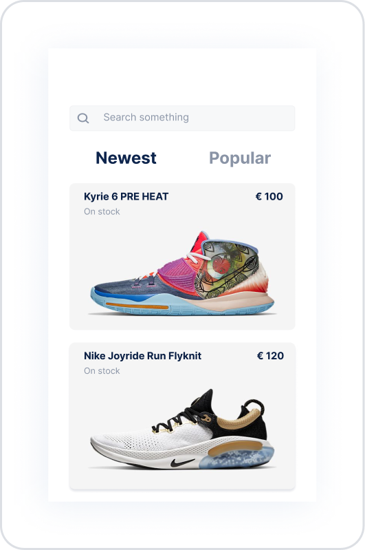
Product List Scenario
In a sports shoe store application, product images, names, prices, and stock statuses are displayed to the user under the “Newest” and “Popular” tabs using the Gallery View element. Users can easily discover products and switch between different categories.
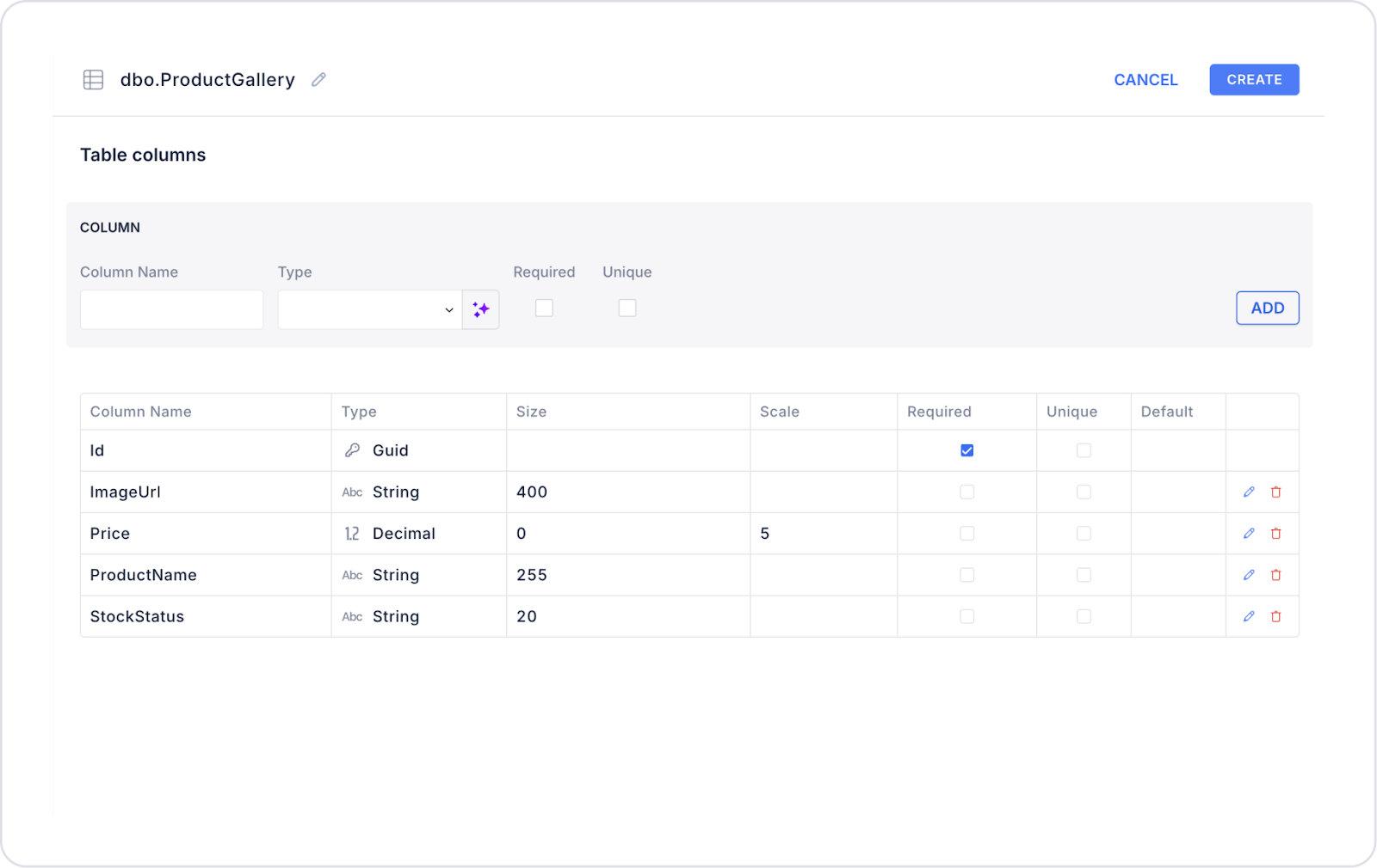
Connecting the Data Source
Go to the Datasources module.
Click the + icon next to the Tables heading and name the table ProductGallery.
Create the following table.
Then click SQL Actions and name the action “ProductGallery”. You can also create it with C#.
Enter the following SQL command.
SELECT ‘https://cdn.example.com/kyrie6.png’ AS ImageUrl,‘Kyrie 6 PRE HEAT’ AS ProductName,100.00AS Price,‘On stock’ AS StockStatusUNION ALLSELECT ‘https://cdn.example.com/nike-joyride.png’,‘Nike Joyride Run Flyknit’,120.00,‘On stock’;
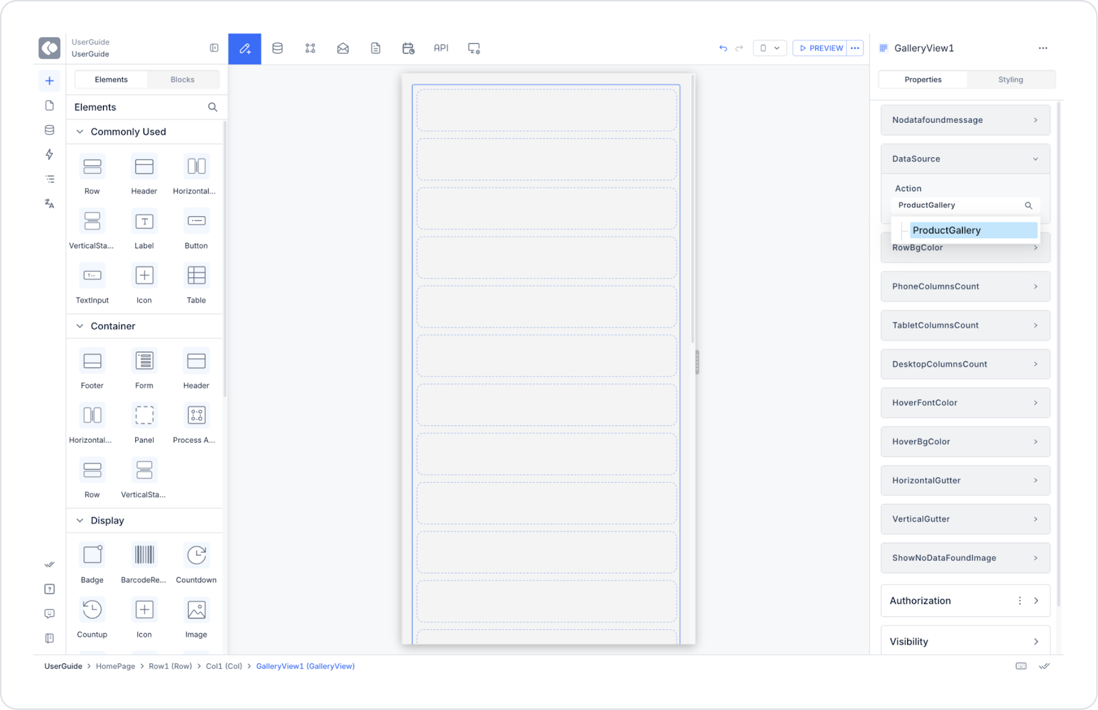
UI Design Module operations
Click the Add Action button on the right side of the application screen.
Then select Custom > ProductGallery.
Using Properties in the Scenario Context
Datasource → Connects to ProductGallery.
GalleryView Element → The listing logic is managed here.
No Data Found Message: “No products found to display.”
Show No Data Found Image: (image to be added)
Row Bg Color: Controls the row hover color.
Phone Columns Count: 1
Tablet Columns Count: 2
Desktop Columns Count: 3
Hover Font Color / Hover Bg Color: Hover effects.
Horizontal Gutter / Vertical Gutter: Spacing between cards.
Image Element (added to GalleryView)
Works as a backup image, meaning that when no data is found, both the message and this image are displayed together.
Example: An illustrative image such as “no-products.png”.
When the Scenario Step is Complete
The user sees the Kyrie 6 PRE HEAT (€100) and Nike Joyride Run Flyknit (€120) products.
Products are listed with images, names, prices, and stock information.
One column is visible on mobile, two columns on tablet, and three columns on desktop.
Hover effects enrich the user experience.
The “Newest” and “Popular” tabs can be linked to different data sources to make the product list dynamic.
Limitations
Performance may slow down when too many products are loaded.
High-resolution images increase loading times.
Long product names may break the design on mobile devices.
Tips and Best Practices
Use product images in optimized sizes (e.g., 400x400px).
Prefer decimal (2 digits) in the price field.
Add an icon/color to display the StockStatus field like a label (e.g., “In stock” → green).
For user experience, keep a single column in the mobile view.
If there are many products, use pagination or “infinite scroll”.

