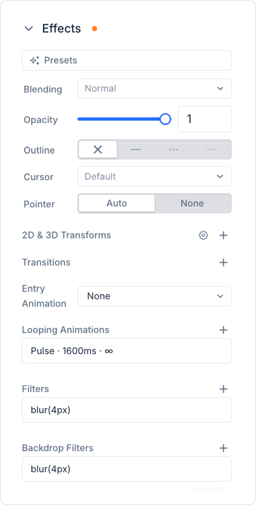
Kuika’s Effects feature allows you to add visual effects, transformations, and animations to elements in your web projects. By easily configuring settings such as opacity, outline, transform, filter, transition, and animation through the Styling panel, you can create interfaces that add movement and depth to your project. Additionally, you can quickly achieve results by using ready-made effect templates (Presets) without having to design effects from scratch.
Effects Features
1. Presets:
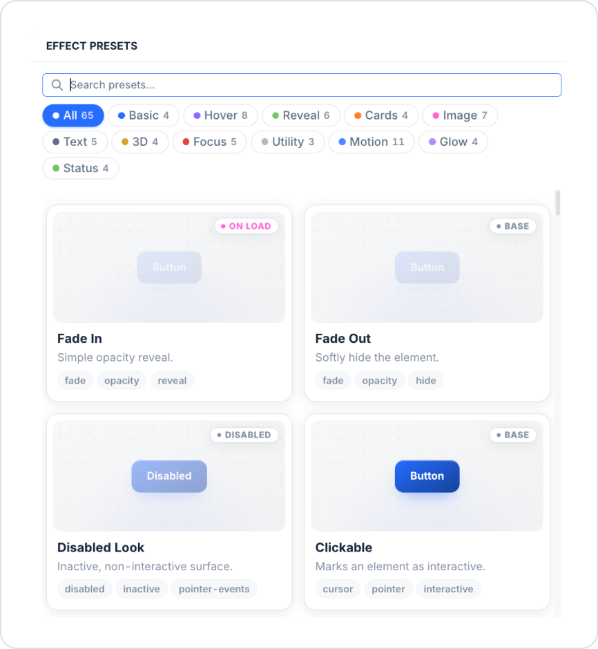
You can search for ready-made effect presets—such as Fade In, Fade Out, Disabled Look, and Clickable—or filter them by category (Basic, Hover, Reveal, Cards, Image, Text, 3D, Focus, Utility, Motion, Glow, Status) and apply them with a single click.
2. Blending Mode:
Determines how the element blends with the layer below it (Normal, Multiply, Screen, Difference, etc.).
3. Opacity:
You can adjust the element’s opacity using a slider or by entering a numerical value (between 0 and 1).
4. Outline:
You can set the color, thickness, and style (solid, dashed, dotted).
5. Cursor:
You can select the cursor type (pointer, grab, not-allowed, etc.) that will appear when the mouse hovers over the element.
6. Pointer (Click Behavior):
Auto: The element is responsive to clicks and hover interactions.
None: The element does not detect clicks or hover events; it passes them through to the underlying layer.
7. 2D & 3D Transforms:
You can apply 2D and 3D transforms such as rotate, scale, translate, and skew.
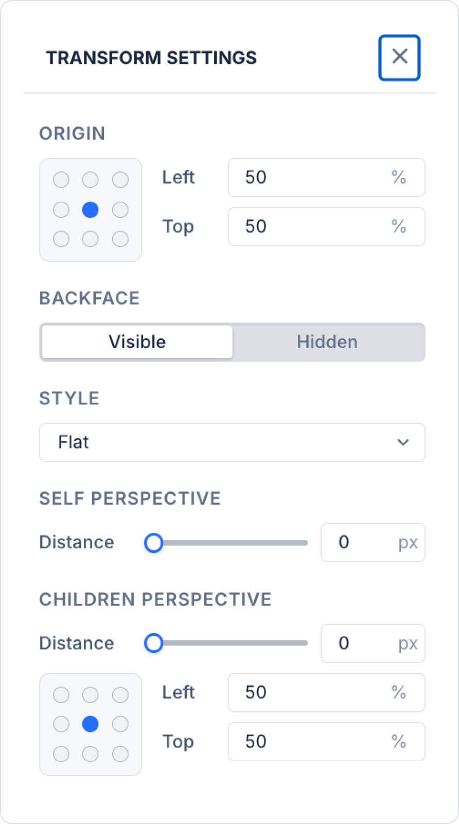
You can configure the following detailed settings in the Transform Settings window, which opens when you click the gear (⚙) icon:
Origin: Sets the starting point of the transformation using a 3x3 grid or Left/Top percentage values.
Backface: Sets whether the element’s backface is visible or hidden during 3D rotations.
Style: Sets the 3D transformation style to Flat or Preserve-3D.
Self Perspective: Sets the element’s own perspective depth (px).
Children Perspective: Sets the perspective depth and center point (Left/Top) for child elements.
8. Transitions:
Ensures that properties transition smoothly during state changes (hover, pressed, focus, etc.); duration, delay, and transition curve (ease, cubic-bezier) can be defined.
9. Entry Animation:
You can specify an entry animation (Fade In, Slide Up, Reveal, etc.) that will play once when the element is loaded onto the screen (mount).
10. Looping Animations:
You can add animations that repeat continuously or stop after a specific number of repetitions (Pulse, Float, Shake, etc.), and you can apply more than one at the same time.
11. Filters:
You can apply visual filters such as blur, brightness, contrast, saturate, grayscale, invert, sepia, and hue-rotate, and use multiple filters together.
12. Backdrop Filters:
By applying effects like blur and saturate to the area behind the element, you can achieve a frosted glass (glassmorphism) look.
Configuring Effects for Elements
Log in to the Kuika platform and open your project from the Apps screen.
In the UI Design module, select and add an element from the Elements panel on the left.
Select the element you want to configure.
Open the Styling panel on the right.
Click the Effects section.
You can configure the desired effect directly or select and apply a ready-made template from the Presets area.
To define effects specifically for a particular State (Hover, Pressed, Focused, Disabled), select the relevant state from the State selector and configure the settings for that state.
Entry and Looping animations do not play in the Designer view; the preview is only visible in the published (generated) web application. Effects are currently web-specific; most effects are not applied in the mobile output.