Kuika's Divider element is used to visually separate content areas in your application and create hierarchy in the page layout. It creates a structured layout between lists, forms, table groups, or cards. The Divider can be used as a line only or with a heading label.
Supported only in web applications.
Use Cases
Separating groups in user lists, project tables, or report screens
Visually separating form steps or information fields
Separating headers or categories in dashboard cards
Improving readability in long content
Drawing boundaries between different data sets or user roles
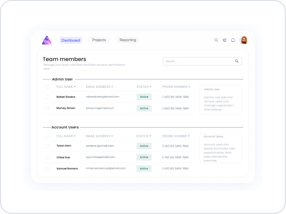
Use Case – Team Members Management Page
In an Admin Panel application, users can view team members as “Admin Users” and “Account Users”. The Divider element is used to clearly separate these two user groups.
In the scenario:
A table titled “Team Members” is created.
People in the “Admin User” group are listed in the upper section, while those in the “Account Users” group are listed in the lower section.
A Divider is added between them to provide a visual distinction between the groups.
The Divider is displayed with a header label (“Admin User”, “Account Users”) if necessary.
The page layout becomes clearer and more professional.
Using Features in the Scenario Context
Label: The title displayed in the middle of the Divider.
Example: “Admin Users” or “Account Users”
Can be written as a static value or made dynamic with the Symbol Picker.
Dashed: Determines the Divider line style.
Default: Solid line
Alternative: Dashed line (for a lighter visual emphasis)
UI Design Module Operations
Go to the UI Design module.
Select the Elements > Special > Divider element from the left panel.
Drag and drop the Divider between two content blocks (e.g., two user tables).
Configure the following settings in the Properties panel:
Label: “Account Users”
Dashed: False (solid line)
When the Scenario is Complete
A clear line appears between the “Admin User” and “Account Users” groups.
The divider line neatly separates the content blocks.
Users can easily distinguish between different roles or data sets.
The page gains a more organized and professional interface.
Limitations
The Divider element does not support data binding or interaction (action); it is for visual purposes only.
Excessive use of Divider can increase page density.
In mobile view, the Divider width automatically scales according to the screen size.
Tips and Best Practices
Choose a Divider color that contrasts well with the page.
Keep text short in Dividers that contain labels.
Add a short description below the Divider to emphasize transitions between sections in forms.
Use the Divider with white space between cards in dashboards to achieve visual balance.
In dark themes, adjust the Divider color to #2D2D2D or similar tones.


