
The Directory element is a UI element used to present the folder and document structure within an application in a hierarchical tree view. Especially in Document Management System (DMS) scenarios, it allows users to navigate comfortably between folders and documents using a VS Code-like explorer structure.
Thanks to this element, even if folder and document records from the backend are in a flat data structure, they can be displayed on the screen as a tree structure. Users can open folders, navigate through subfolders, select documents, and track their current location via the breadcrumb trail. This makes multi-layered content structures more organized, readable, and manageable.
The Directory element is commonly used in the following scenarios:
The Directory element offers the following key features for managing folder and document structures:
When you select the Directory element, you can control its data structure and visual appearance via the Properties panel on the right.
The basic properties available for this element are as follows:
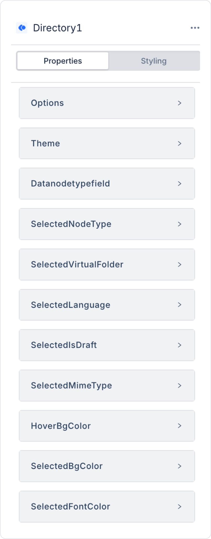
Options: This section contains the action and field mapping settings used to retrieve data from the backend. The data source and field definitions required for the Directory element to create the folder/document structure are configured in this section. Subfields:
Theme: Specifies the visual theme of the Directory element. Supported values: light, dark. The theme selection is important for readability and visual harmony, especially on screens containing large amounts of data.
DataNodeTypeField: Defines the field that specifies the node’s type. By default, `nodeType` is used. This field allows for the differentiation of various node types, such as folder, document, or virtual folder, if applicable.
SelectedNodeType: This field holds the type of the node currently selected by the user (folder, document, virtualFolder, etc.). As the selection within the Directory element changes, this value is automatically updated, and elements bound to this field from the outside can change their behavior based on the type of the selected item (for example, enabling an action button only when “document” is selected).
SelectedVirtualFolder: This field holds the virtual folder the user is currently in or has selected. In virtual folder structures created independently of the physical folder hierarchy, this field is used to track which virtual folder is active or selected.
SelectedLanguage: This field holds the language information of the selected node (specifically, a document). In multilingual document management scenarios, it is used to indicate which language version of the selected document is being viewed or selected.
SelectedIsDraft: A boolean field indicating whether the selected node is in draft status. In document management systems, it is used to distinguish whether the record selected by the user has been published or is still in draft form.
SelectedMimeType: A field that stores the MIME type (file type) information of the selected node. For example, it can take values such as “application/pdf” or “image/png.” It is used to determine preview, download, or action options based on the type of the selected document.
HoverBgColor: Specifies the background color applied to a row when the user hovers the mouse cursor over it. This allows the user to visually distinguish which row they are currently on.
SelectedBgColor: Specifies the background color applied to the selected node row. It is used to visually distinguish the selected item from other items in the list.
SelectedFontColor: Specifies the text color of the selected node. When used in conjunction with SelectedBgColor, it ensures that the background-text color contrast of the selected row is sufficient and readable.
The Directory element has a structure capable of executing actions based on user interactions. When the element is selected, the ADD ACTION button appears, and actions can be defined via specific events.
The event actions available in the Directory element are as follows:
OnNodeSelect: Triggered when the user selects any node in the Directory structure.
This event is used to manage more general selection scenarios. For example, it can be used to display detailed information about the selected node, open related content in a different panel, or filter data based on the selection.
OnDocumentSelect: Triggers when the user selects a document. It is typically used for document-focused operations. For example, the selected document’s detail screen can be opened, a preview can be displayed, a download can be initiated, or additional information about the document can be presented to the user.
OnFolderSelect: Triggers when the user selects a folder. The contents of the selected folder can be listed, subfolders can be displayed, or only documents associated with the relevant folder can be displayed on the screen. It is particularly useful in folder-based navigation scenarios.
The Directory element generates various output values based on the selected node and user interactions. These values can be read using the value() function and transferred to other elements via SetValueOf.
Available Binding Values
Virtual Folders operate in smart mode. This mode automatically generates different views based on the document’s language and version structure.
Document Management on the DMS Main Screen
The Directory element can be used to display the folder and document tree in the left panel of the DMS main screen. In this scenario, the user makes a selection from the tree on the left, and operations are performed on the selected content in the right panel.
Page Initialization Flow
User Interaction
When the user clicks a folder in the tree, the onFolderSelect event is triggered.
When the user clicks a document, the onDocumentSelect event is triggered.
The Document element automatically uploads the new version.
Example Action Binding
Page Init:
1. GetDocumentTree → dsDocumentTree
2. Directory.options = dsDocumentTree
Directory.onDocumentSelect:
1. SetValueOf(Document.versionId, Directory.selectedVersionId)
Directory.onFolderSelect:
1. SetValueOf(DocumentUploader.folderId, Directory.selectedFolderId)

