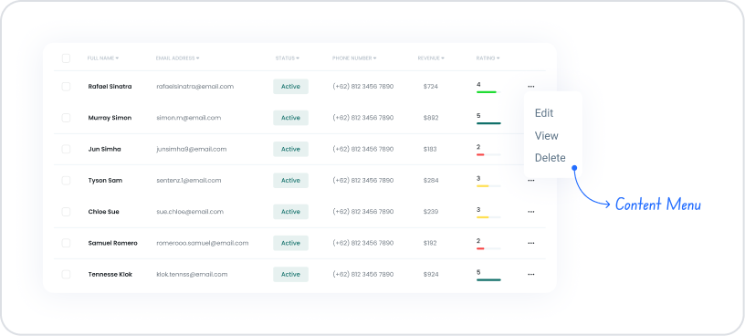
The Content Menu element is a navigation element that allows users to quickly access specific content or actions within the application. It is typically used for in-page navigation, triggering actions, or consolidating frequently used actions in a single area. The Content Menu simplifies the user experience, making navigation within the application more intuitive.
The Content Menu element is only supported in web applications.
1.1. Common Use Cases
Providing quick access to sections within a page
Grouping frequently used actions under a single menu
Redirecting to related sub-content on detail screens
Heading-based navigation on report or documentation pages
Presenting content categorized in settings or management screens
Directing users to the right content on long pages
2. Key Features
Organizing menu items in a list
Customizing menu titles and content
Ability to work with dynamic or static content
Structure compliant with visibility and authorization rules
Support for in-page navigation and action triggering
2.1. Content Menu Element Features
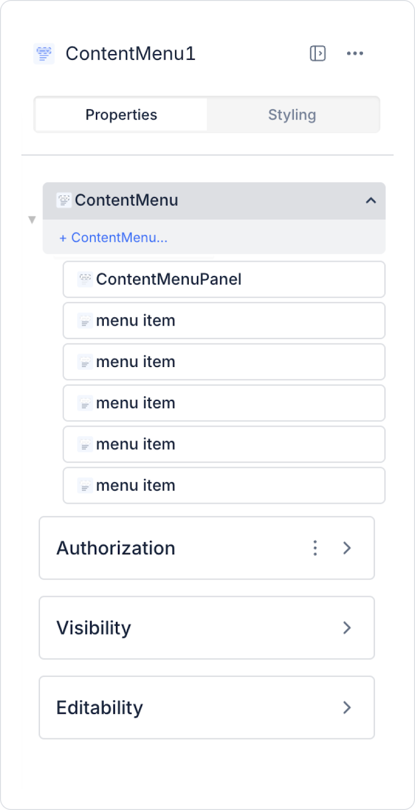
The settings for the Content Menu element are configured via the Properties panel on the right. The basic features of this element are described below:
Label: Determines the text displayed to the user on the Content Menu.
Static text can be entered.
Dynamic values (action result, variable, table field, etc.) can be linked using the Symbol Picker.
Menu Opening Type: Determines which user interaction opens the menu content. Available options:
Click: The content opens when the user clicks on the menu. Offers more controlled and mobile-friendly usage.
Hover: The content opens automatically when the user hovers over the menu. Suitable for quick access in desktop applications.
2.2. Actions That Can Be Added to the Content Menu Element
Since the Content Menu element is a passive UI element focused on navigation and content display, it does not support adding actions directly. Therefore, the ADD ACTION button is not visible when the element is selected, and no custom trigger can be defined for the Content Menu.
The following points explain the action structure of the Content Menu:
There is no OnClick, OnChange, or similar event on the Content Menu element.
The menu opening behavior (Click / Hover) is only a visual and interactive setting, not an action trigger.
The Content Menu presents options to the user; actions are performed through other elements within the menu (Button, Menu Item, Link, etc.).
Redirection, data processing, or action calls can be made through the Button or similar elements added to the items in the menu.
The Content Menu itself only plays a container and organizer role; it does not initiate any actions.
3. How to Use the Content Menu Element?
In this section, we will cover the end-to-end use of the Content Menu element through example scenarios.
Scenario: Creating a Profile Information Menu
The Content Menu structure is used in an application to allow users to access their account operations quickly and in an organized manner. In this scenario, a profile menu is created that presents the user's profile information and account operations under a single drop-down menu.
In the scenario:
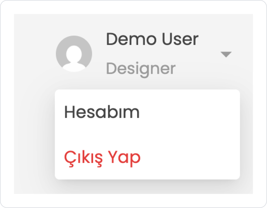
The user's profile icon, name, and role (e.g., Designer) are displayed together at the top of the application.
When the user clicks on the profile area, the Content Menu associated with the relevant component opens.
The Content Menu that opens lists menu options related to account operations, such as My Account and Log Out.
The user is directed to the profile or account settings page by selecting the My Account option.
When the Log Out option is selected, the user is securely logged out.
Step 1 - Defining the Required Action
To display data in the interface:
You need to define a sample action.
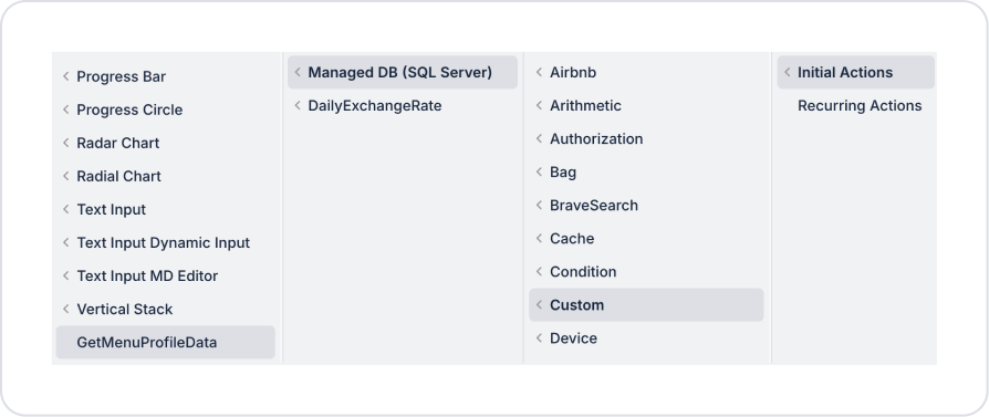
Add a new action from the Actions > New SQL Action tab in the Datasources module.
Action Providing Sample Data (GetMenuProfileData):
SELECT ‘Demo User’ AS Name, ‘Designer’ AS Role, ‘https://www.gravatar.com/avatar/?d=mp&s=200’ AS ImageUrl
Step 2 - Adding the Initial Action
Initially on the home page:
Add the Add Action > Initial Action > Custom > Managed DB > GetMenuProfileData action to the Element to display sample data.
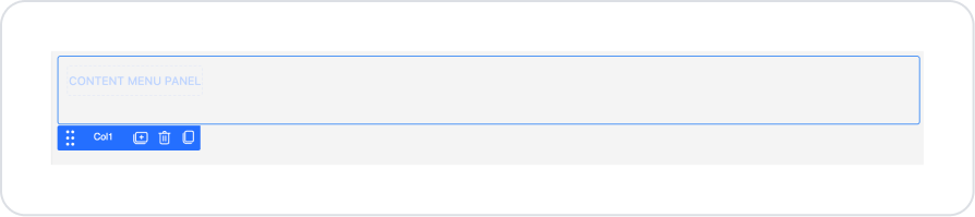
Step 3 - Add Content Menu Element and Style Editing
On the home page:
Open the UI Design module.
From the left side panel, drag and drop the Elements > Navigation > ContentMenu element onto the page.
Click on the empty space next to the Content Menu element.
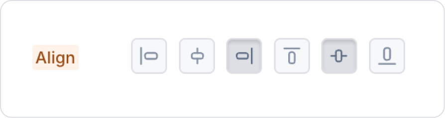
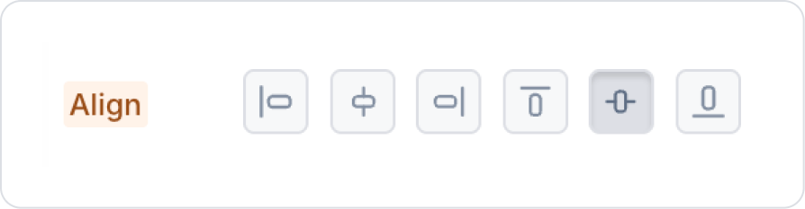
Set it to Col > Styling > Align Right and Center.
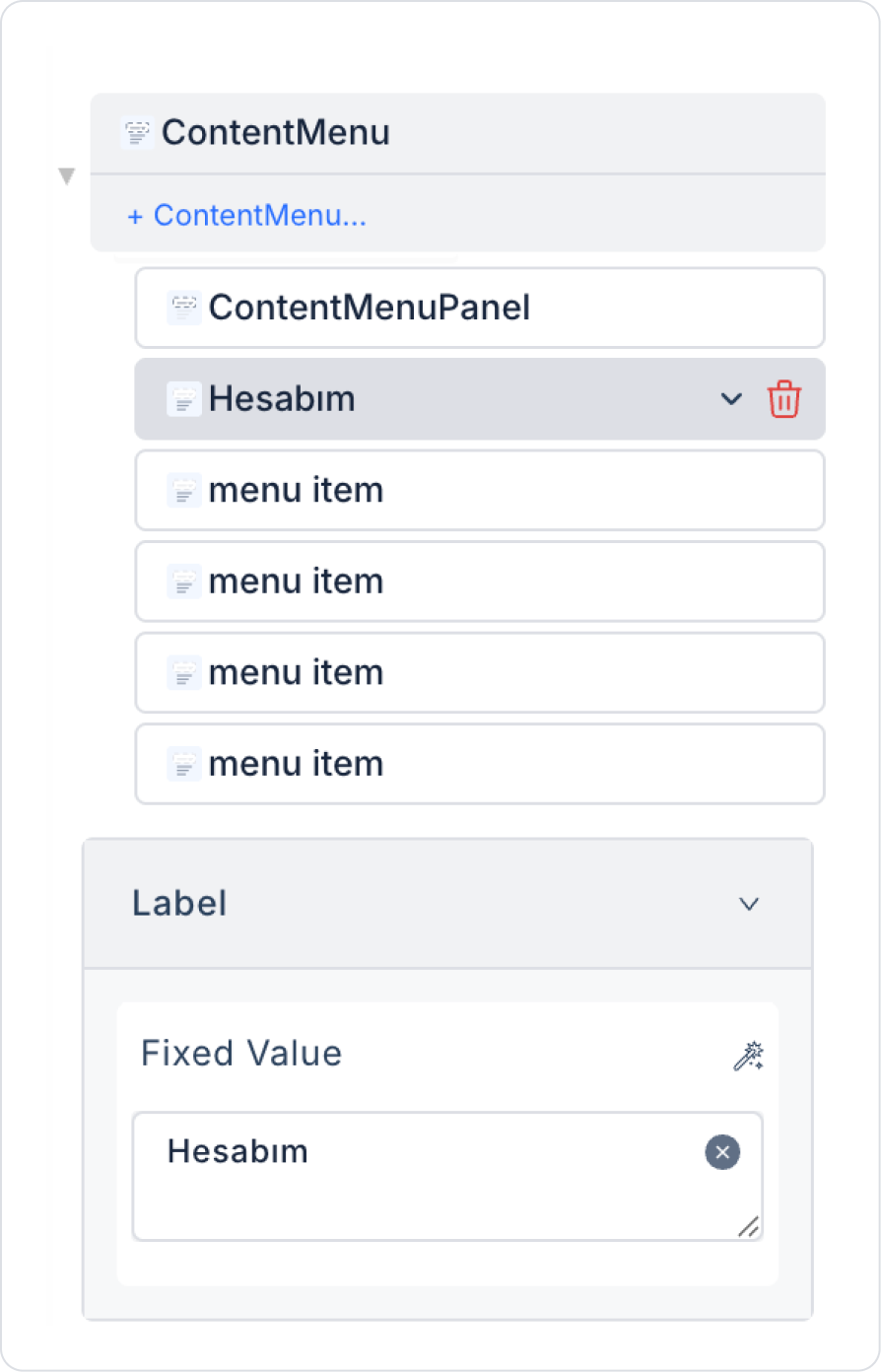
For the first option name, update it to ContentMenu > Properties > Menu Item > Label > “My Account”.
Click on the second Menu item option and update it to Label > “Log Out”.
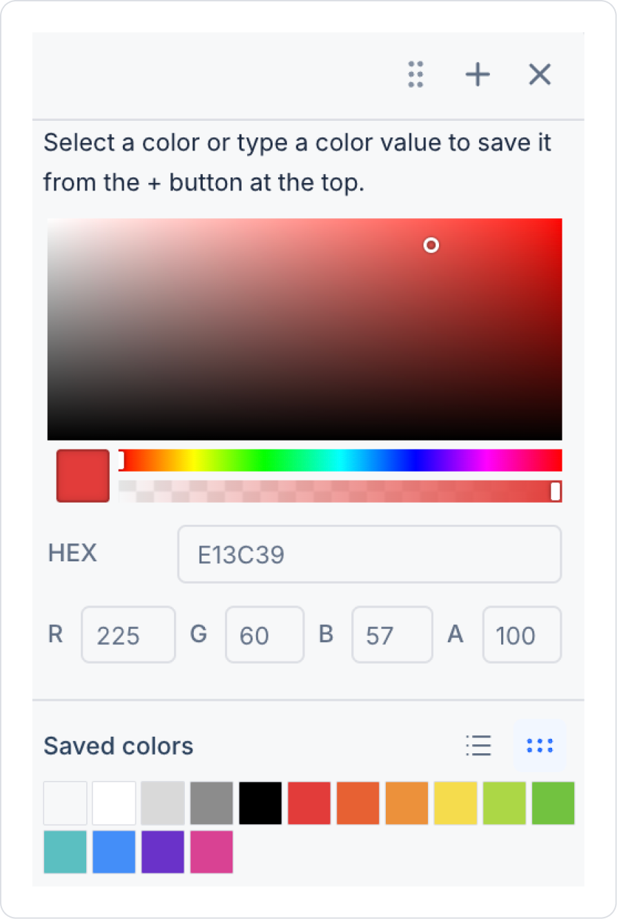
With Log Out selected, set it to ContentMenuItem > Styling > Text > Red.
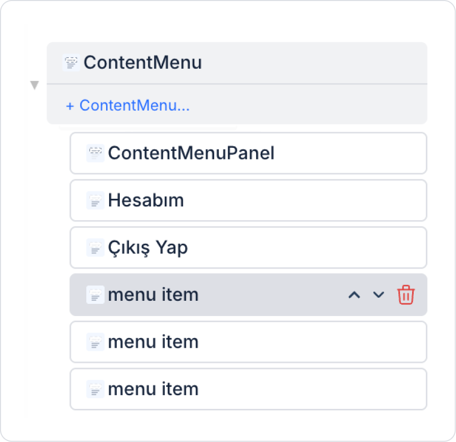
Delete the first two remaining Menu items by clicking the delete icon on their left side.
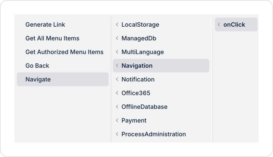
Click on the My Account Menu item and add the ContentMenuItem > Add Action > onClick > Navigation > Navigate action.
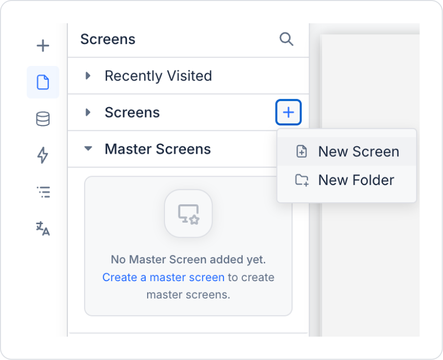
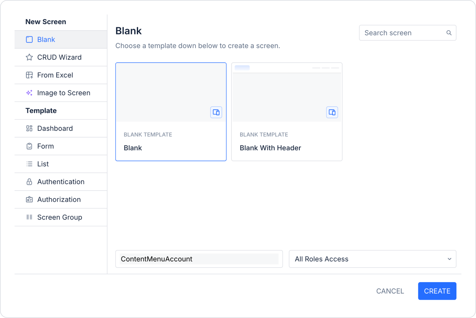
Create the page to navigate to in the left side panel under Screens > New Screen, naming it “ContentMenuAccount”.
Set the parameters in the Navigate action to To Screen > ContentMenuAccount and Open As > Current Page.
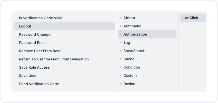
Click on the Logout Menu Item and add the ContentMenuItem > Add Action > onClick > Authorization > Logout system action.
Step 4 - Adding and Configuring Elements to the Content Menu
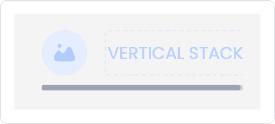
Drag and drop the Elements > Container > Horizontal Stack element into the Content Menu.
To center the contents of the Horizontal element, set HorizontalStack > Styling > Layout > Align > Center Vertically.
Drag and drop the Elements > Display > Image element into the Horizontal Stack.
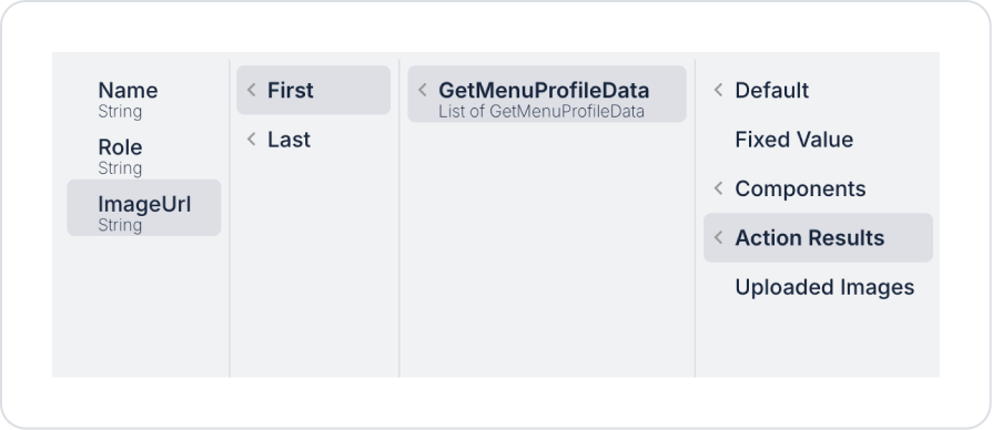
In the Image element, define Image > Properties > Value > Action Result > GetMenuProfileData > First > ImageUrl.
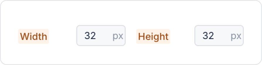
Set the Image element size to Image > Styling > Layout > Width and Height > 32 px.
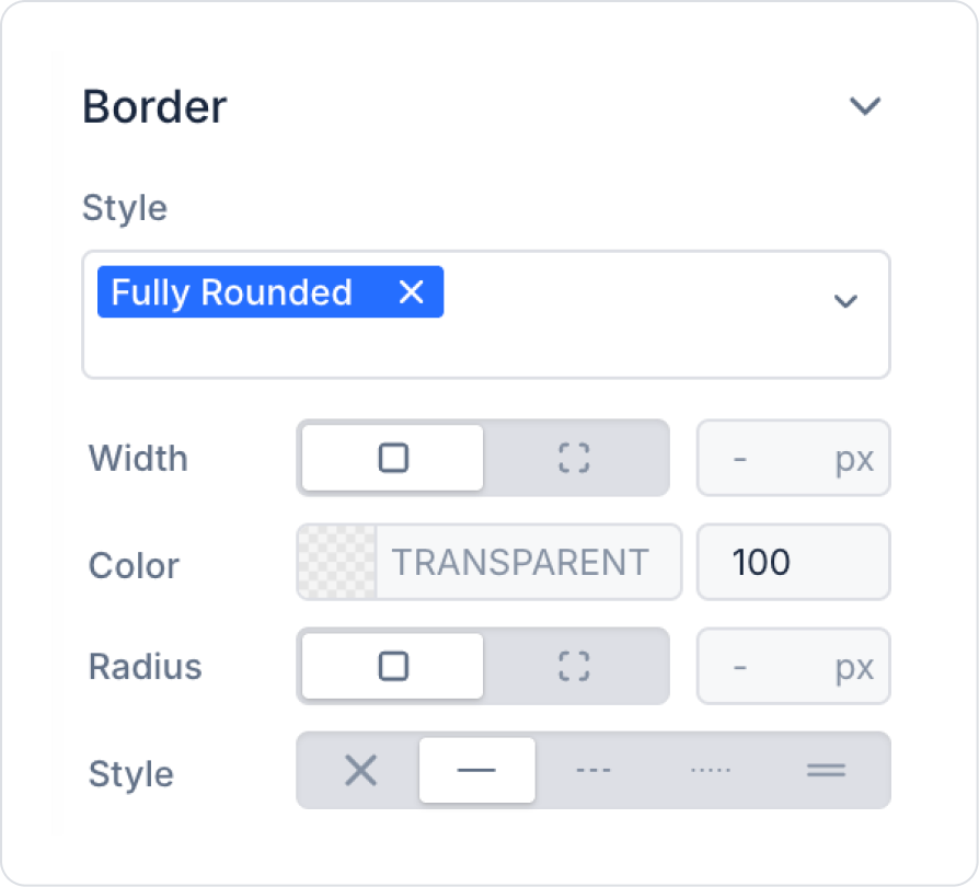
Set the borders to Image > Styling > Border > Style > Fully Rounded.
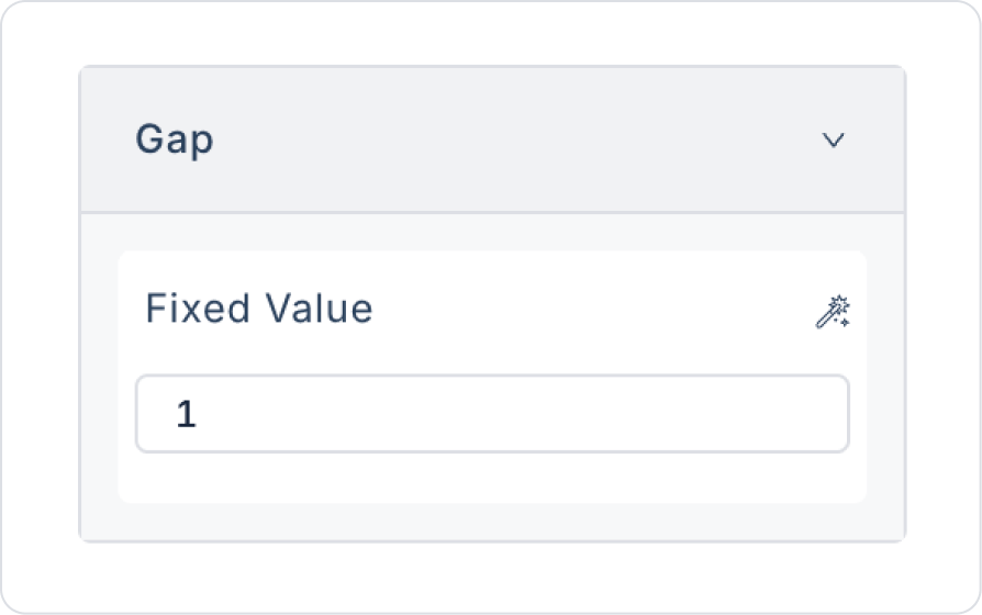
Drag and drop the Elements > Container > Vertical Stack element into the Horizontal Stack next to the Image element.
Set the gap in the Vertical Stack to VerticalStack > Properties > Gap > 1.
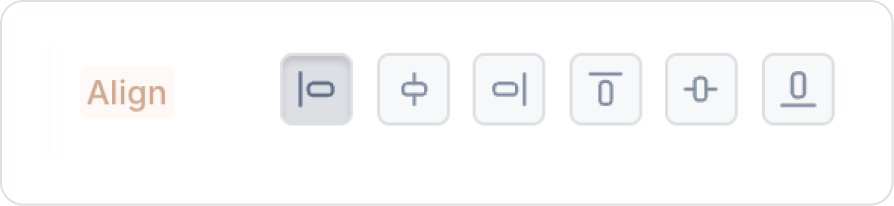
Set the elements in the Vertical Stack to VerticalStack > Styling > Layout > Align > Align Left.
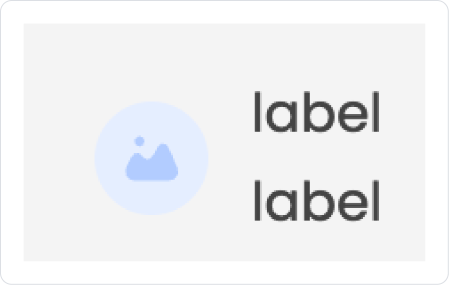
Drag and drop two Elements > Display > Label elements into the Vertical Stack.
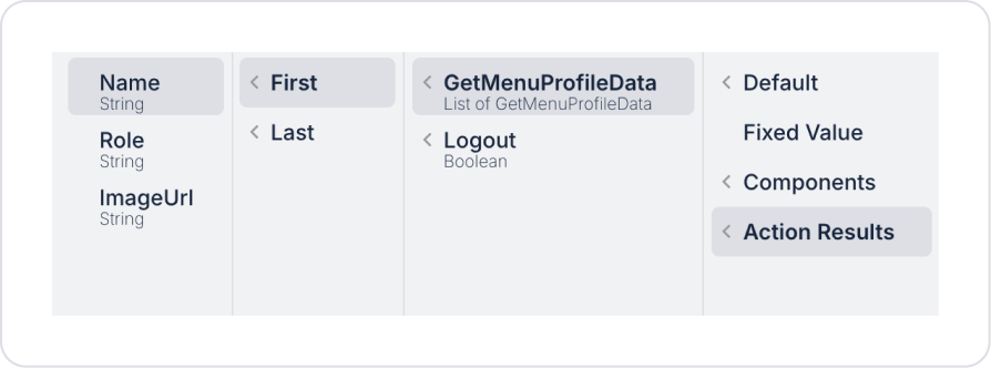
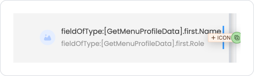
For the user name, define the first Label > Properties > Value > Action Result > First > Name.
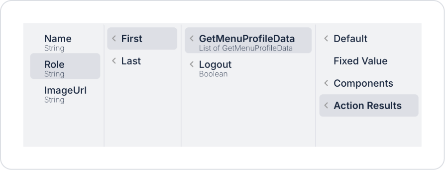
For the department information, define the Label > Properties > Value > Action Result > First > Role.
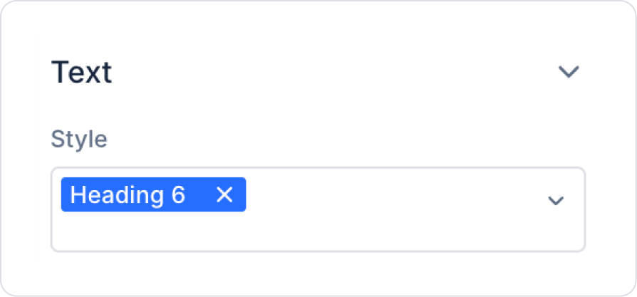
Set the department information style to Label > Styling > Text > Style > Heading 6.
Next to the Label elements, drag and drop an Elements > Display > Icon element into the Horizontal Stack.
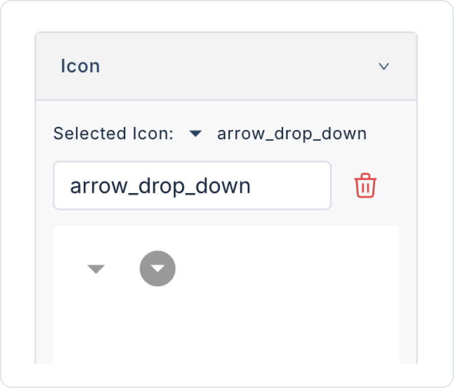
Set the icon symbol to Icon > Properties > Icon > arrow_drop_down.
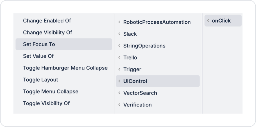
Optionally, you can add the Icon > Add Action > UIControl > Set Focus To action to the Icon so that clicking on it redirects back to the Content Menu.
Define Select Component > ContentMenu1 for the Set Focus To action.
Preview
When the user hovers over the Content Menu area, the menu automatically appears without requiring any additional action. User-specific actions such as My Account and Log Out are listed in the menu in an organized and accessible manner.
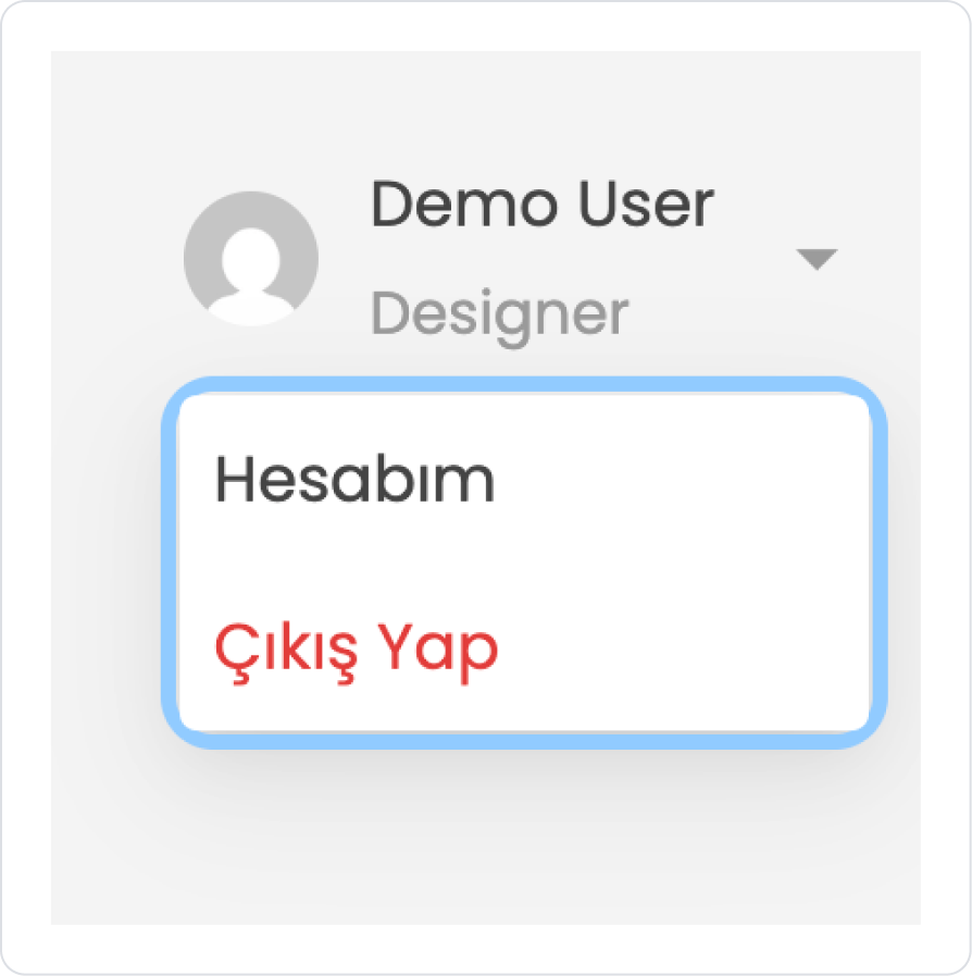
When the application is tested, clicking on the arrow icon in the user profile area opens the Content Menu. When the menu opens, the active area is displayed with a blue frame in focus, clearly highlighting the area the user is interacting with.
This structure allows the user to quickly access profile actions; focus and hover feedback provide an interactive and user-friendly experience.
4. Common Properties
Some areas on the Content Menu element are used commonly across all UI elements. Therefore, detailed explanations of the following properties are provided in the relevant general guide pages:


