

In Kuika’s UI Design module, the Comments Panel is used to facilitate the exchange of feedback within the team on screen designs. With this panel, you can leave notes about the design as a whole or specific elements, tag your teammates, and track feedback until it is resolved.
You can access the Comments panel by clicking the speech bubble icon located on the vertical toolbar on the left side of the UI Design screen. If there are any open (unresolved) comments in the panel, a counter (badge) will appear over this icon.
At the top of the panel, there are four filter tabs:
Next to each tab, there is a number badge indicating how many comments are in that category.
Below the filters, a search box (Search comments...) allows you to search the comment content. The Newest dropdown menu on the right lets you change the sorting order of the comments.
If there are no comments yet or no results for the selected filter, the message “No comments in this filter” is displayed.
Each comment card contains the following information:
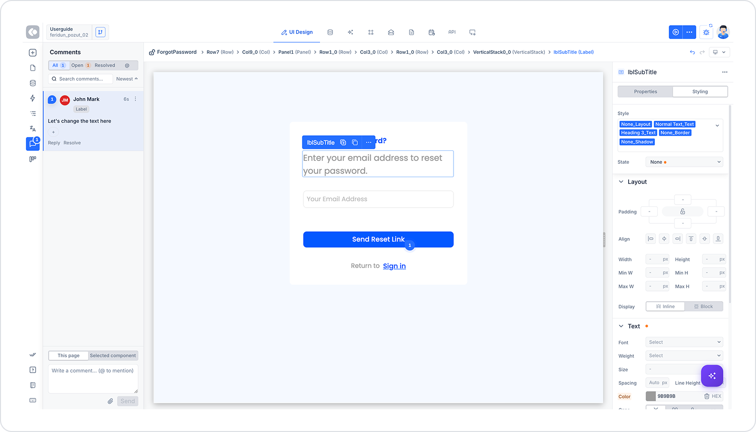
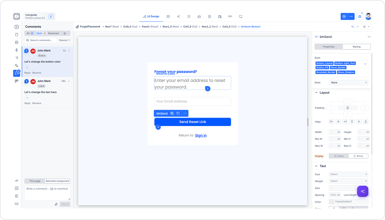
A comment left on an element is displayed on the canvas as a numbered badge above or next to the relevant element (e.g., “1” or “2” inside a blue circle). This allows you to visually track which comment belongs to which element in the design. The numbers on the comment cards listed in the left panel correspond exactly to the badges on the canvas.
When an element is selected, a breadcrumb trail appears at the top of the canvas, showing the element’s exact position in the page hierarchy. For example:
ForgotPassword > Row7 (Row) > Col9_0 (Col) > Panel1 (Panel) > Row1_0 (Row) > Col3_0 (Col) > Row1_0 (Row) > Col3_0 (Col) > VerticalStack0_0 (VerticalStack) > lblSubTitle (Label)
This bar clarifies exactly which nested element the comment belongs to.
At the bottom of the panel, there is a field for adding a new comment:
For example, when the comment “Let’s change the text here” is left on a Label element (lblSubTitle) on the “ForgotPassword” screen:
When a comment such as “Let's change the button color” is left on a Button element (btnSend) on the same page:
In this way, multiple comments associated with multiple elements on a single page can be tracked both as numbered items on the canvas and in chronological order (from newest to oldest) in the left panel. As the number of open comments increases, the counter in the Open tab at the top of the panel is updated accordingly.


