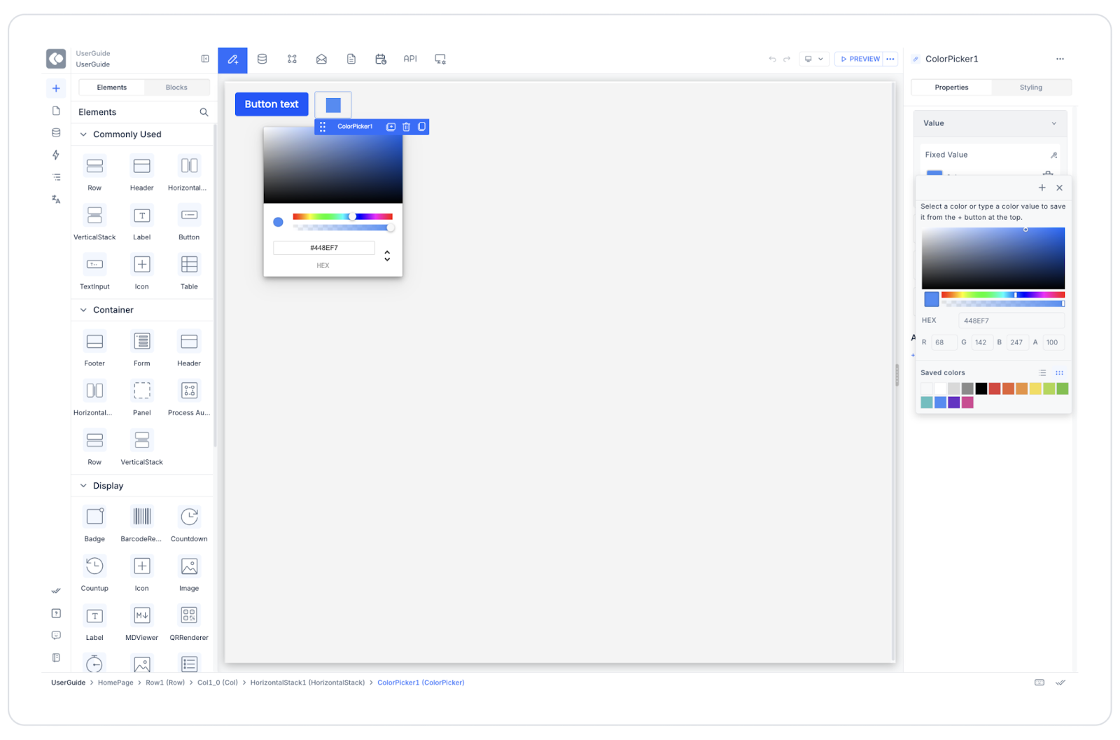
Kuika's Color Picker element allows users to select from a color palette. It enables users to either manually enter color codes or select from a visual color range. It is ideal for scenarios requiring color selection in design customizations, theme settings, or user preferences.
The Color Picker element is only supported in web applications. Areas of Use
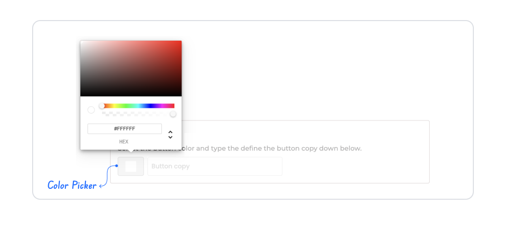
Interface customization (theme color, button color, etc.) Graphic or visual creation tools Color-based label or status selections Dynamic design previews Usage Scenario – Customizing Button Color In a design tool , the user wants to change the color of a button within the application. The Color Picker element is used for this purpose.
In the scenario:
The user comes to the “Button Color” field. They select a color from the Color Picker palette or manually enter a HEX code (e.g., #FF5733). The selected color is automatically applied to the button's background. The user can also edit the button's text in the same panel. UI Design Module Operations
Go to the UI Design module. Drag and drop the element from the Elements > Color Picker category. Value → Can be dynamically linked to a button's “Background Color” property.Using Properties in a Scenario Context
Color Palette Display: The user can make a selection from the color spectrum using the mouse.Manual Color Entry: The color code can be entered in HEX format (e.g., #FFFFFF).Hue and Opacity Selection: The brightness and transparency values of the color can be adjusted.Format Support: The color format can be changed to HEX, RGB, RGBA, or HSL.Value: The selected color value can be dynamically linked to the color of another element (e.g., a Button ).When the Scenario is Complete
The user selects a color from the Color Picker. The value is displayed in the HEX field (e.g., #007BFF). The button color is instantly updated, and the user can see a live preview. If desired, the user can reset the value and select another color. Limitations
The Color Picker is only supported in web applications. On mobile devices, color selection may redirect to the system interface. When no dynamic binding is applied, the selected color is only applied temporarily. Tips and Best Practices
Provide the user with a “preview area” for the color picker to instantly show the result of their selection. Support RGB or HSL formats in addition to HEX to provide a professional designer experience. Limiting the color palette according to the theme (e.g., brand colors) ensures consistency. Add automatic saving or a confirmation mechanism when the color value changes. 

