Kuika's Collapse element allows you to present content in a more compact and organized way. Users can show or hide content by clicking on the headings. It is ideal for long explanations, FAQs (Frequently Asked Questions), or information blocks that only need to be opened when necessary.
The Collapse element is only supported in web applications.
Use Cases
Frequently Asked Questions (FAQ) → Questions are closed; answers open when the user clicks.
Long Descriptions → Only the heading is shown to the user at first glance.
Step-by-Step Content → The user can expand each step separately.
Detailed Information → Start with a summary view and open details as needed.
Usage Scenario – Dashboard Navigation
In this scenario, we will create a sidebar menu on the left using the Collapse element. The user will be able to open and close the submenus by clicking on the “Management,” “Connection,” or “Customer” headings.
The following structure will be created:
A navy blue menu on the left side, with the “Dashboard” heading at the top and categories (Management, Connection, Customer) below.
A dashboard screen with cards and graphs in the middle area.
UI Design Steps
Go to the UI Design module.
Create a new page in your project: DashboardPage
Add a Row element to split the page in two.
Elements > Layout > Row
The left side will be the sidebar, and the right side will be the content area.
Set the Pading of the Column in the left column for the sidebar to 16px.
Add the sidebar heading (Dashboard).
Elements > Label
Text: “Dashboard”
Font Weight: Bold
Color: White
Margin Bottom: 12px
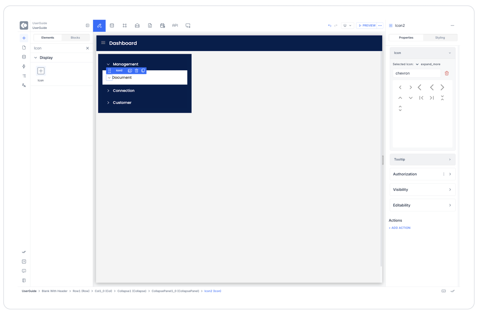
Add the Collapse element.
Elements > Interactive > Collapse
Create the “Management,” “Connection,” and “Customer” headings in the Collapse Panel Header field. Add the relevant submenus to each heading:
Management → You can create the following headings by adding a Label element to the Collapse Panel at the bottom:


