Kuika's Checkbox element allows users to make multiple selections by checking one or more options. It is ideal for increasing user interaction in scenarios such as forms, task lists, or filtering.
The Checkbox element can be used in both web and mobile applications.
Use Cases
Marking completed tasks in task lists
Forms requiring multiple selections (e.g., interests, categories)
Filtering systems (e.g., product categories)
Selecting options in surveys or preference lists
Use Case – Task List
In a task management (To Do List) application, users can list their daily tasks and mark completed tasks using Checkbox.
In the scenario:
The user's screen has an area titled “To Do List”.
Each task row contains a Checkbox, task title, and tags (e.g., ‘education’, “high priority”).
When the user completes the task, they check the Checkbox.
When the Checkbox is selected, the task is marked as completed and its color changes.
Connecting the Data Source
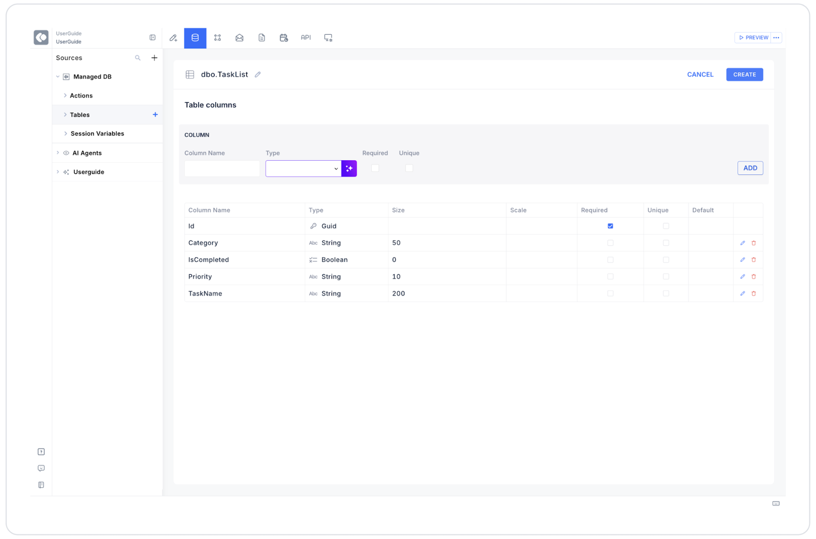
1. Datasources Module
Go to the Datasources module.
Then click the + icon next to the Tables heading and name the table “TaskList”.
Create the following table.
Then, create a new SQL Action from the Actions section and name it TaskListData:
SELECT 1 AS Id, ‘Speaking course for2 h’ AS TaskName, ‘education’ AS Category, ‘normal’ AS Priority, 1 AS IsCompletedUNION ALLSELECT 2, ‘Shopping’, ‘chores’, ‘high priority’, 0;
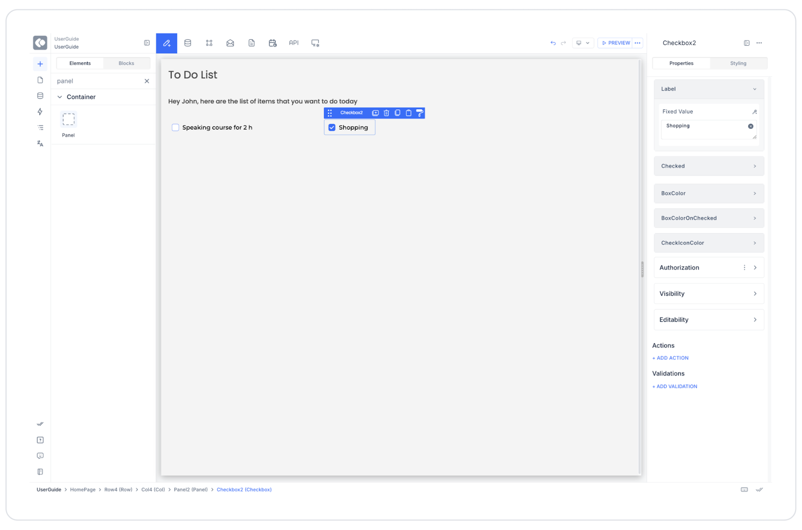
UI Design Module Operations
Go to the UI Design module.
Drag and drop the Checkbox element from the Elements > Select Input category.
Align the checkbox to the left of the task text.
Label → Speaking course for 2 h
Checked → True (for completed tasks)
Box Color → #E5E7EB
Box Color OnChecked → #10B981 (example green tone)
Check Icon Color → #FFFFFF
Using Properties in the Scenario Context
Label: Displays the task title. Example: “Speaking course for 2 h”
Checked: Indicates the completion status of the task.
Box Color: The color of the unchecked checkbox.
Box Color OnChecked: The background color changes when checked.
Check Icon Color: Defines the color of the check mark.
Text Color (on mobile): Sets the text color for iOS/Android.
When the Scenario is Complete
The user sees two tasks on the screen:
“Speaking course for 2 h” → Checkbox checked (completed)
“Shopping” → Checkbox unchecked (ongoing)
When the user completes the “Shopping” task, they check the checkbox.
The task now appears as completed and the style changes (e.g., gray text or green checkmark).
Restrictions
The checkbox value can only be stored as True / False (1 / 0).
Color changes are only made on the UI side; they are not automatically reflected in the database (manual action is required).
When using a large number of checkboxes, the data connection should be optimized for performance.
Tips and Best Practices
Use different color tones (green, gray) for checked checkboxes in task lists.
You can mark completed tasks as “strike-through” to visually show the user's progress.
Link the checkbox value to a Managed DB Action to save changes directly to the database.
Ensure ease of use by keeping the touch area large on mobile devices.


