The carousel element allows users to view images or content in a loop. Users can navigate between content by swiping or using arrow buttons. It is particularly used for product presentations, image galleries, and campaign announcements.
Areas of Use
Displaying product images,
Banners and campaign announcements,
Image galleries or portfolios,
Blog posts or content promotions, etc.
The Carousel element is supported in web and mobile applications.
Holiday Promotion Scenario
In a holiday booking application, the Carousel element is used to display campaign images to the user on the home page. The user can scroll through the slides manually or the content rotates sequentially thanks to the auto-scroll feature.
Connecting the Data Source
Go to the Datasources module.
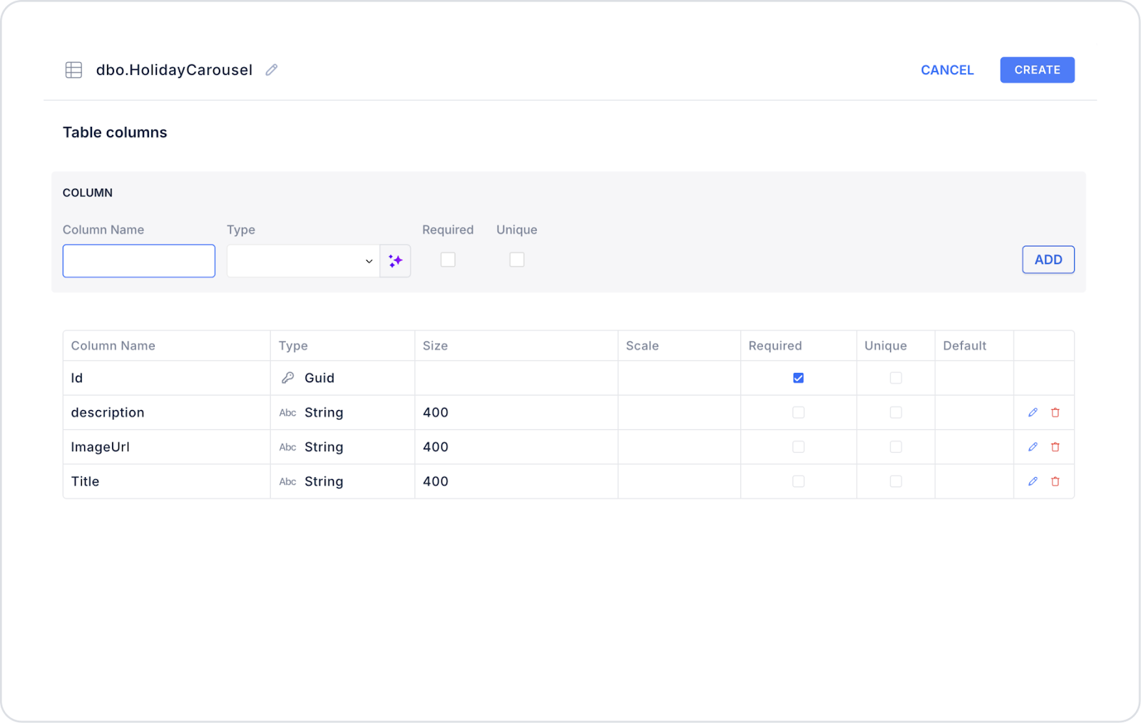
Click the + icon next to the Tables heading and name the table HolidayCarousel.
Create the following table.
Define an action named HolidayCarousel in the SQL Actions section.
Define the following SQL command.
SELECT ‘https://cdn.example.com/beach-resort.png’ AS ImageUrl,‘Maldives Tour’ AS Title,‘7 nights 8 days Maldives vacation, all inclusive!’ AS DescriptionUNION ALLSELECT ‘https://cdn.example.com/europe-tour.png’,‘European Cities’,‘Paris, Rome, Amsterdam tour package!’UNION ALLSELECT ‘https://cdn.example.com/cappadocia.png’,‘Cappadocia Getaway’,‘Includes hot air balloon tour and3 nights’ accommodation!';
UI Design Module operations
Click the Add Action button on the right side of the application screen.
Then select Custom > HolidayCarousel.
Using Features in a Scenario Context
No Data Found Message
Message to display if there is no data.
Example: “No content found to display.”
Data Source
Specifies the source of the data in the carousel.
Example: HolidayCarousel.
Fade
Sets the transition effect between slides.
Example: Enabled for a smooth transition.
Hover Font Color
The text color changes when the cursor is over the slide.
Example: Black (#000000).
Hover Background Color
The background changes when the cursor is over the slide.
Example: Gray (#f5f5f5).
Vertical
Enables slides to scroll vertically.
Example: Story view in mobile apps.
Pause On Dots Hover
Stops automatic scrolling when hovering over dots.
Autoplay
Enables automatic slide transition.
Example: Automatic rotation of campaign banners.
Autoplay Speed
Sets the automatic transition duration (ms).
Example: 3000 → Transition every 3 seconds.
Starting Index
Sets the slide to be displayed on first launch.
Example: 0 (first slide).
Dots
Hides/shows slide transition points.
Example: Small circles at the bottom.
Show No Data Found Image
Displays a backup image when no data is found.
When the Scenario Step is Complete
The user can see product campaign images on the home page.


