
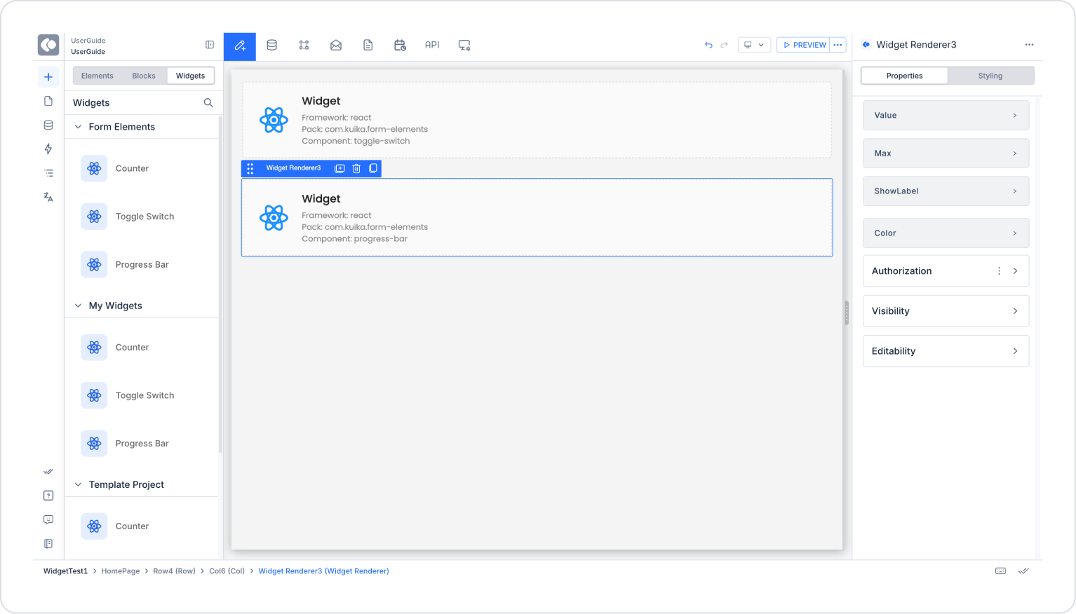
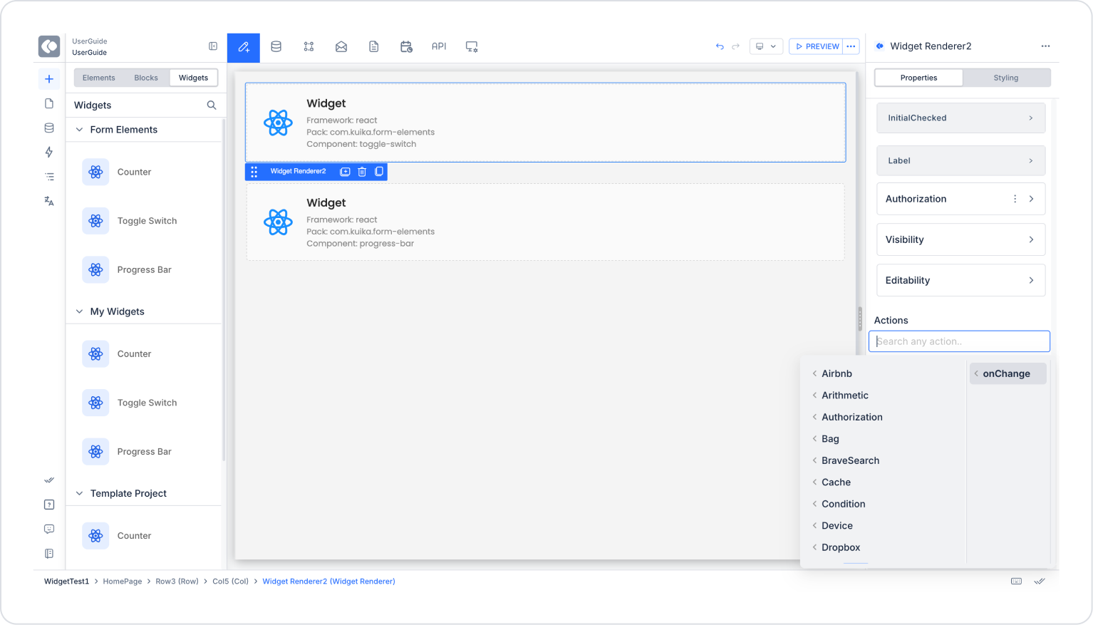
Widget’lar, Kuika Designer için özel ve yeniden kullanılabilir UI elementleri oluşturmanıza olanak tanır. Bu kılavuz, kendi widget paketlerinizi oluşturmak, geliştirmek ve yayınlamak için bilmeniz gereken her şeyi kapsar.
Başlamadan önce, aşağıdakilerin yüklü olduğundan emin olun:
İlk widget paketinizi oluşturmanın en hızlı yolu create-kuika-widget CLI aracını kullanmaktır:
npx create-kuika-widgetBu etkileşimli sihirbaz sizi şu adımlarda yönlendirecektir:
Hızlı Başlangıç Örneği
npx create-kuika-widget
# Widget Pack Name => My Custom Buttons
# Company => Acme
# Framework => React
# Stylesheet => Tailwind
# Package Manager => Yarn
# Git Initialization => No

# Proje klasörüne gidin
cd my-custom-buttons

# Geliştirme sunucusunu başlatın
yarn dev
Proje oluşturulduktan sonra projeniz şu yapıya sahip olacaktır:
my-dashboard-widgets/
├── src/
│   ├── Components/           # Widget bileşenleriniz
│   │   ├── MyWidget/
│   │   │   ├── MyWidget.tsx  # Bileşen implementasyonu
│   │   │   └── MyWidget.css  # Bileşen stilleri
│   │   └── ...
│   ├── App.tsx               # Yerel playground (export edilmez)
│   └── index.tsx             # Entry point (export edilmez)
├── kuika.manifest.ts         # Widget pack konfigürasyonu (GEREKLİ)
├── package.json              # Bağımlılıklar ve script’ler
├── tsconfig.json             # TypeScript konfigürasyonu
└── dist/                     # Build çıktısı (oluşturulur)
Önemli Notlar
kuika.manifest.ts dosyası widget pack’inizin kalbidir. Hangi bileşenlerin export edildiğini ve Kuika Designer’da nasıl göründüklerini tanımlar.
Temel Yapı
import { defineWidgetComponent, defineWidgetManifest } from "@kuika/sdk/react";
import { MyWidget } from "./src/Components/MyWidget/MyWidget";
import { AnotherWidget } from "./src/Components/AnotherWidget/AnotherWidget";

export default defineWidgetManifest({
  projectId: "com.mycompany.my-dashboard-widgets",
  name: "My Dashboard Widgets",
  version: "1.0.0",
  components: [
    defineWidgetComponent(MyWidget, { title: "My Widget" }),
    defineWidgetComponent(AnotherWidget, { title: "Another Widget" })
  ]
});
Yapılandırma Seçenekleri
Bileşen Kaydı
Her bileşen defineWidgetComponent() kullanılarak kaydedilir:
defineWidgetComponent(ComponentReference, {
  title: "Display Title"  // Bu, Designer’ın bileşen paletinde görünür
})
React Bileşenleri
TypeScript prop’larıyla standart React fonksiyonel bileşenleri oluşturun:
// src/Components/Counter/Counter.tsx
import { useState } from "react";
import "./Counter.css";

// TypeScript type definition - Kuika'nın prop'ları tespit etmesi için GEREKLİDİR
type CounterProps = {
  initialValue?: number;      // Varsayılanı olan opsiyonel prop
  step?: number;              // Varsayılanı olan opsiyonel prop
  label?: string;             // Görünen etiket
};

export const Counter = ({
  initialValue = 0,
  step = 1,
  label = "Count"
}: CounterProps) => {
  const [count, setCount] = useState(initialValue);

  return (
    <div className="counter">
      <span className="counter__label">{label}</span>
      <button onClick={() => setCount(count - step)}>-</button>
      <span>{count}</span>
      <button onClick={() => setCount(count + step)}>+</button>
    </div>
  );
};
Vue Components
<!-- src/Components/Counter/Counter.vue -->
<script setup lang="ts">
import { ref } from 'vue';

// TypeScript type definition - Kuika'nın prop'ları tespit etmesi için GEREKLİDİR
const props = withDefaults(defineProps<{
  initialValue?: number;
  step?: number;
  label?: string;
}>(), {
  initialValue: 0,
  step: 1,
  label: "Count"
});

const count = ref(props.initialValue);
</script>

<template>
  <div class="counter">
    <span class="counter__label">{{ label }}</span>
    <button @click="count -= props.step">-</button>
    <span>{{ count }}</span>
    <button @click="count += props.step">+</button>
  </div>
</template>
TypeScript Gereksinimleri
Kuika, TypeScript tip tanımlarınızı şunlar için kullanır:
Desteklenen Prop Türleri
Kuika, TypeScript tanımlarınızdan şu prop tiplerini otomatik olarak tespit eder:
Prop En İyi Pratikler
AngularJS widget’ları diğer framework’lerden farklı çalışır. AngularJS, bileşen tanımları için TypeScript kullanmadığından, prop’ları manifest dosyasında açıkça tanımlamanız gerekir.
AngularJS Manifest Yapısı
import { defineWidgetComponent, defineWidgetManifest } from "@kuika/sdk/angularjs";

export default defineWidgetManifest({
  projectId: "com.mycompany.angularjs-widgets",
  name: "My AngularJS Widgets",
  version: "1.0.0",
  components: [
    defineWidgetComponent("counter", {
      title: "Counter",
      props: {
        initialValue: { type: "number" },
        step: { type: "number" },
        label: { type: "string" }
      }
    }),
    defineWidgetComponent("statusBadge", {
      title: "Status Badge",
      props: {
        status: {
          type: "string",
          required: true,
          unionValues: ["active", "inactive", "pending"]
        },
        showIcon: { type: "boolean" }
      }
    })
  ]
});
AngularJS için Temel Farklılıklar
AngularJS Prop Şeması
AngularJS'de İşlev Özellikleri
defineWidgetComponent("myWidget", {
  title: "My Widget",
  props: {
    onSubmit: {
      type: "function",
      parameters: [
        { name: "data", type: "object" },
        { name: "isValid", type: "boolean" }
      ]
    }
  }
})
Kullanılabilir Komutlar
Development Server
Development server şunları sağlar:
yarn devBileşenlerinizi Test Etme
App.tsx (veya eşdeğeri) dosyasını yerel bir playground olarak kullanın:
// src/App.tsx
import { Counter } from "./Components/Counter/Counter";

function App() {
  return (
    <div>
      <h1>Widget Playground</h1>
      <Counter initialValue={10} step={5} label="Items" />
    </div>
  );
}

export default App;
Bu playground dosyası yayınlanan Widget Pack’e DAHİL EDİLMEZ.
Yayınlamadan önce build’inizi her zaman yerelde test edin:
yarn buildBu, dist/ klasöründe asset-manifest.json ile birlikte optimize edilmiş çıktılar oluşturur.
Kuika'da yayınlama
yarn run publishPublish komutu şunları yapacaktır:
On-Premises Deployments: On-premises bir Kuika kurulumu kullanıyorsanız, API endpoint’inizi belirtmek için --api-url bayrağını kullanın:
yarn run kuika publish --api-url https://your-kuika-instance.com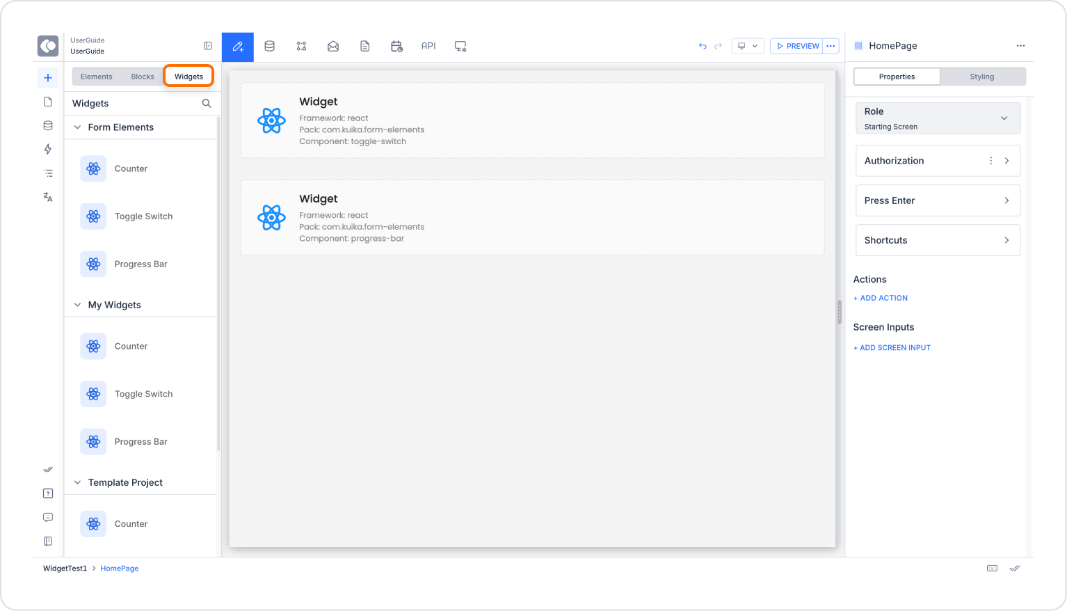

