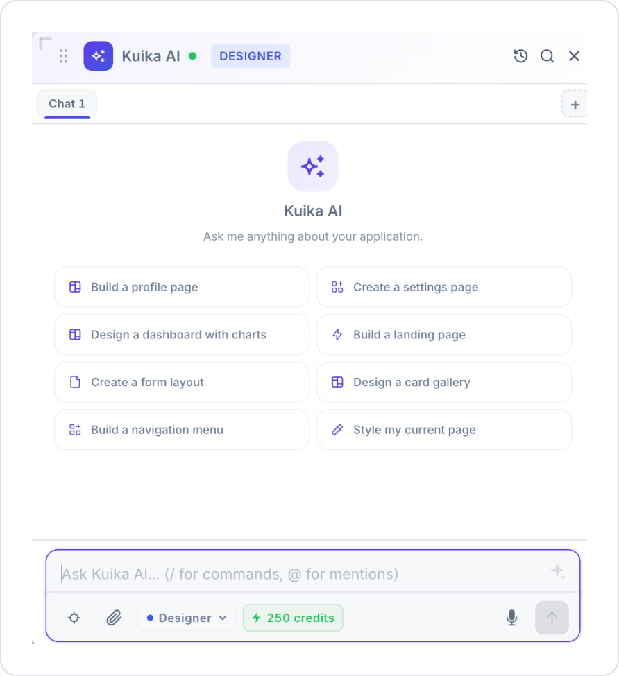
This screen is the chat panel used to interact with Kuika AI. Through this panel, users can:
Chat with the AI,
Initiate quick actions,
Upload files or images,
Use voice input,
Switch between Agent and Plan modes.
2. What Is It For?
This panel is used to issue AI-powered commands during application development or management processes. Users can:
Type commands directly,
Select predefined actions,
Initiate contextual operations via the UI.
3. Main Components
3.1 Header Area
Kuika AI Header: Displays the active AI session.
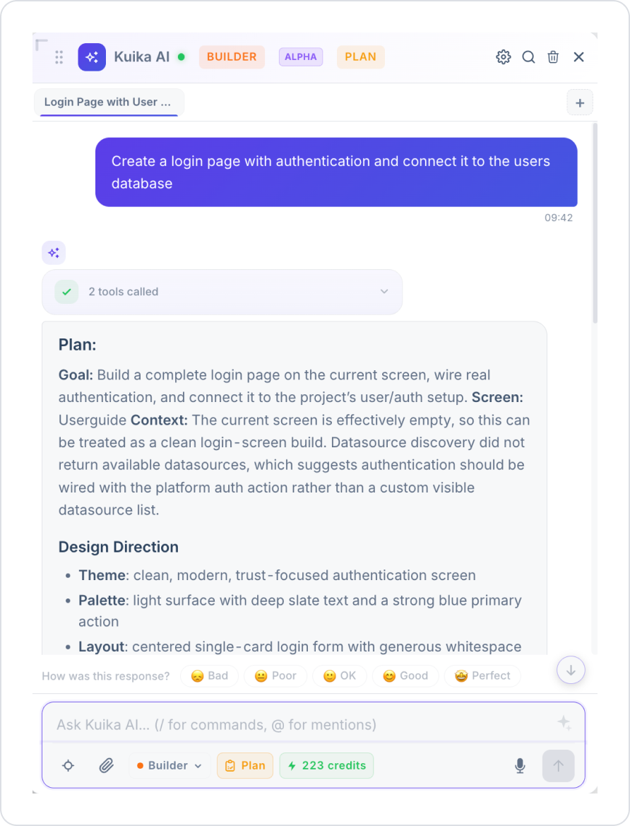
Active Mode Label (Designer / Builder / Ask): Displays the currently selected mode. For example, in the screenshot, the “BUILDER” label indicates the active mode.
ALPHA Label: Indicates that the Builder mode is still in the alpha (experimental) phase.
PLAN Label: A shortcut label that also displays the user’s current subscription plan in the header; clicking it redirects to plan details.
Status Indicator (green dot): The system is active and available.
Data & Logic: Actions, Data Sources, Database, APIs, Custom Code
Platform: Translation, Auth & Roles, Project, History
These tags visually represent the interface, backend/data, and platform-level (multilingual, authentication, project management, history) operations covered by the Builder mode. Each tag serves as a shortcut or context for commands related to that topic.
Translation: Represents operations related to in-app multilingual support and translation management.
Auth & Roles: Represents operations related to user authentication and role/permission management.
Project: Represents operations related to project-level settings and configurations.
History: Provides quick access to project or chat history (independent of the Revert panel; may be general project history).
3.6 Message Input Field
Placeholder: Ask Kuika AI... (/ for commands, @ for mentions)
This field is used to receive commands from the user. Typing “/” opens the command list, and typing “@” opens element or page mentions.
4. Bottom Toolbar (Input Actions)
4.1 Select Element (Target Selection)
Icon: target icon
Purpose: To provide context to the AI by selecting an element on the UI
Usage:
Click the button.
Select an element on the screen.
The AI performs an action based on the selected element.
4.2 Attachment (File Upload)
Icon: paperclip
When opened:
Image: Upload an image
File: Upload a file
Usage:
Click the paperclip icon.
Select the type (Image / File)
Upload the file.
The AI analyzes the uploaded content.
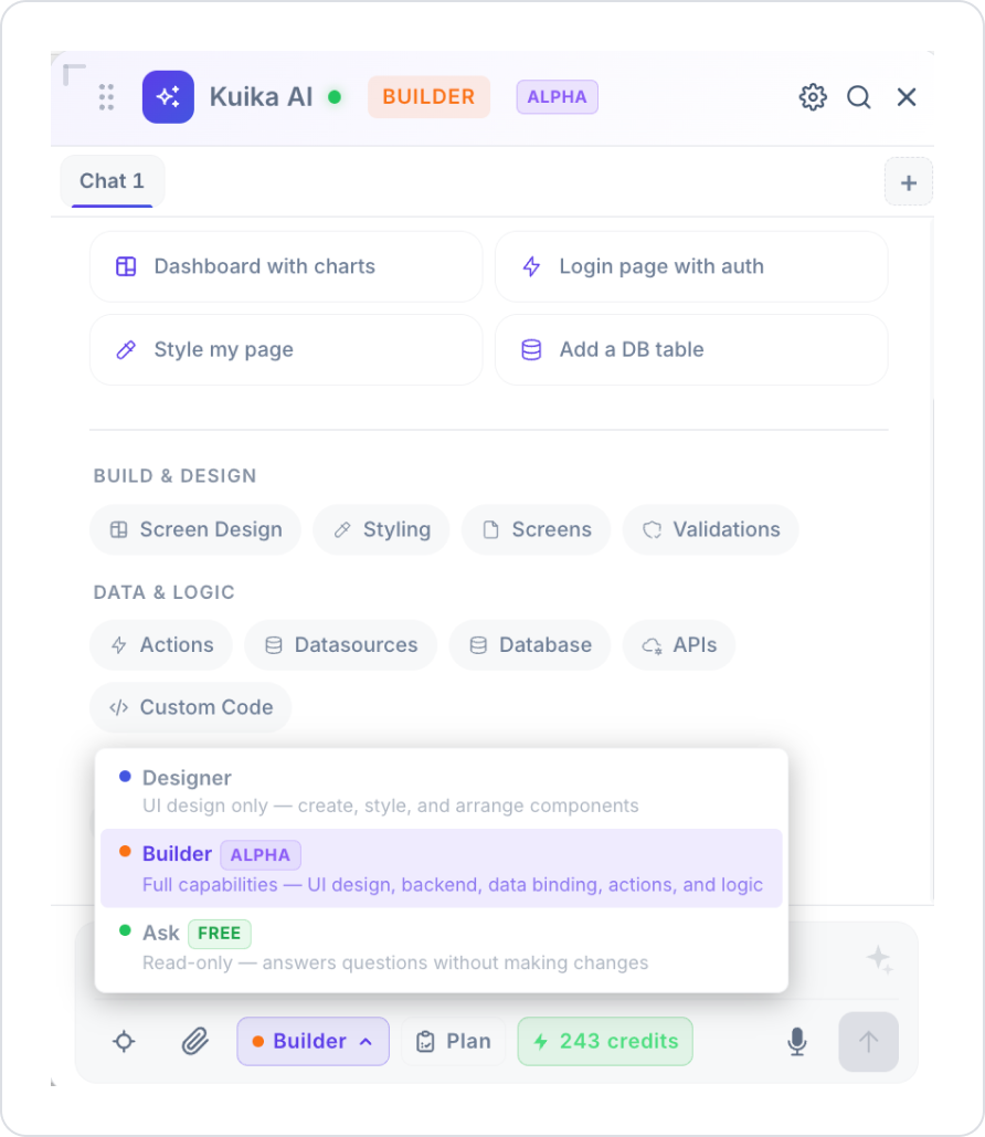
4.3 Mode Selector (Designer / Builder / Ask)
Select one of three modes from the dropdown menu:
Designer (blue dot)
UI design only — performs only interface creation, styling, and editing tasks.
Does not touch the backend or data layer.
Builder (orange dot, labeled ALPHA)
Full capabilities — covers all capabilities, including UI design, backend, data binding, actions, and logic.
In addition to page design, it can also handle tasks such as data sources, databases, API connections, and custom code.
Since it is currently in the alpha (experimental) phase, results should be tested before use.
Ask (green dot, labeled FREE)
Read-only mode; it only answers questions.
It does not make any changes to the system and is free.
Usage:
Click the mode selector (e.g., “Builder”).
Select Designer, Builder, or Ask mode from the dropdown menu.
Enter your command.
4.4 Plan Button
Icon: clipboard icon, displayed with the “Plan” label.
Purpose: Allows the user to view and manage their current subscription/usage plan.
This button appears both on the bottom toolbar and in the header (labeled “PLAN”); both lead to the same plan details screen.
Usage:
Click the “Plan” button.
Current plan information and any available upgrade options are displayed.
4.5 Credits Indicator
For example, the “243 credits” label displays the current credit balance.
Credit consumption may vary depending on the selected mode (Builder mode may consume more credits due to its broader scope; Ask mode is free).
4.6 Voice Input
Icon: microphone
Purpose: To issue commands without typing.
Usage:
Click the microphone icon.
Speak.
The system converts speech to text.
4.7 Send Button
It is the arrow icon in the lower-right corner.
Sends the command to the AI.
4.8 Revert / History Panel
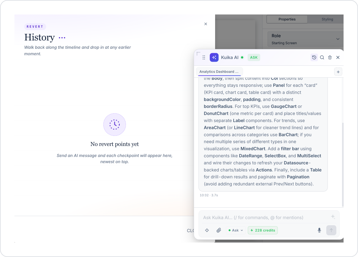
Clicking the history icon in the header opens the Revert — History panel.
Purpose: An automatic checkpoint is created after every message sent to the AI. You can revert to any previous point via this panel.
“No revert points yet” message: Appears when no AI messages have been sent yet.
Checkpoints are listed from newest to oldest, with the most recent one at the top.
5. Step-by-Step Usage (Mode-Based Scenarios)
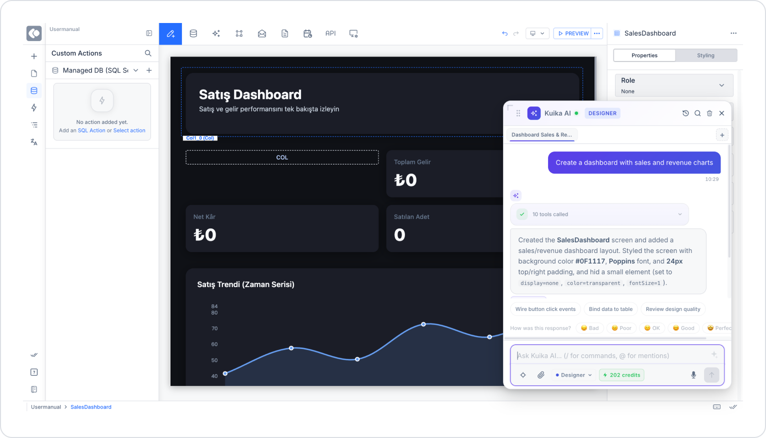
5.1 Designer Mode – Implementing UI Design
Purpose: To create, style, and arrange UI elements.
Steps
Open the mode selector from the bottom toolbar.
Select Designer.
Type the following command into the input field:
Create a dashboard with sales and revenue charts
Click the Send button.
Expected System Behavior
The AI directly performs the UI action.
The dashboard page is created.
Chart elements are added, and the layout is adjusted.
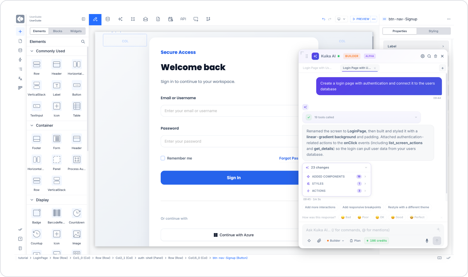
5.2 Builder Mode – End-to-End Application Development
Purpose: To create the backend, data binding, and business logic alongside the user interface.
Steps:
Select Builder from the mode selector.
Type the following command into the input field: Create a login page with authentication and connect it to the users database
Click the “Send” button.
Expected System Behavior:
The AI creates the UI elements.
It establishes the necessary data source/database connection.
It implements the action and logic layers (e.g., validation, login control).
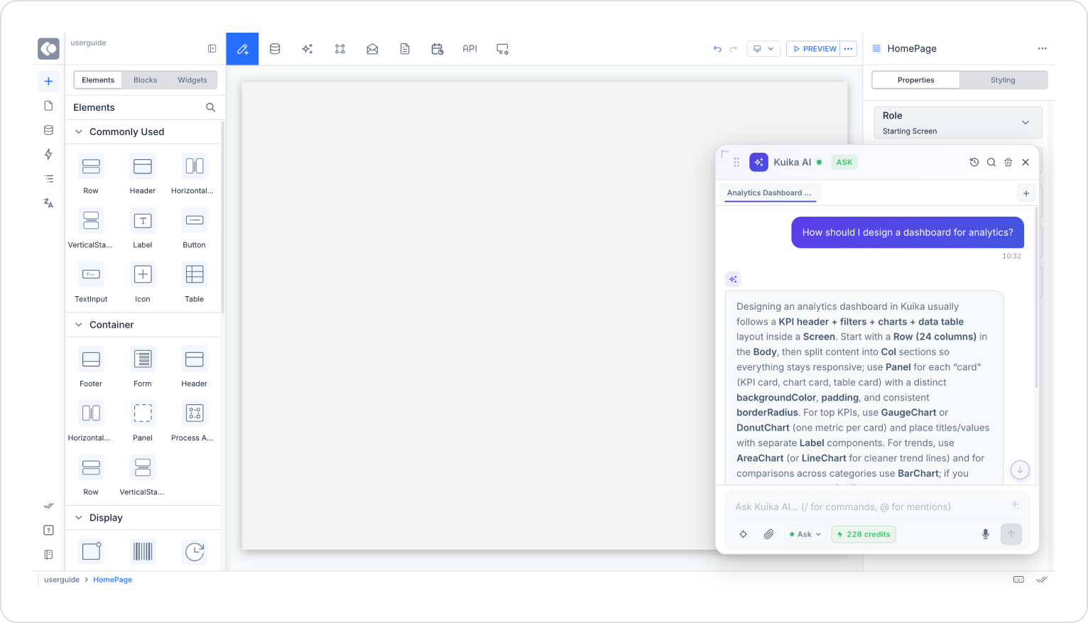
5.3 Ask Mode – Information Retrieval
Purpose: To retrieve information only; do not make changes to the system.
Steps
Select Ask from the Mode selector.
Command:
How should I design a dashboard for analytics?
Submit.
Expected System Behavior
The AI provides an explanation.
It offers best practice recommendations.
No action is taken.
5.4 Quick Access via Platform Tags
Purpose: To quickly access translation, authorization, project settings, or history.
Steps:
Select the relevant tag under the “Platform” category (e.g., Auth & Roles).
The system creates a prompt/context specific to the selected topic or opens the relevant panel.
If necessary, refine your command and submit it.
Expected System Behavior:
Depending on the selected category, the AI opens the relevant module (e.g., the role/permission management screen) or provides topic-specific recommendations.