
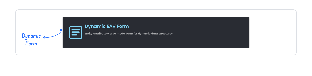
Kuika's Dynamic Form element allows you to create customisable forms that are shaped in real time based on user input and interactions. This feature enables characteristic data (Entity - Attribute - Value) to be dynamically represented within a form structure.

If you place the form inside an area, the system creates a layout with an appropriate structure (e.g. Column).

Dynamic Form enables characteristic values (Entity, Attribute, Value) to be represented in a dynamic form structure.

By following this guide, you can effectively use the Dynamic Form element on the Kuika platform and easily implement your dynamic form scenarios.
Authorization

To manage access control at the element level, you can use the Authorization section in the Properties panel.
Access Types
Anonymous
Allows all users to view the element without logging in.
Restricted
Restricts access to only verified users or specific roles.
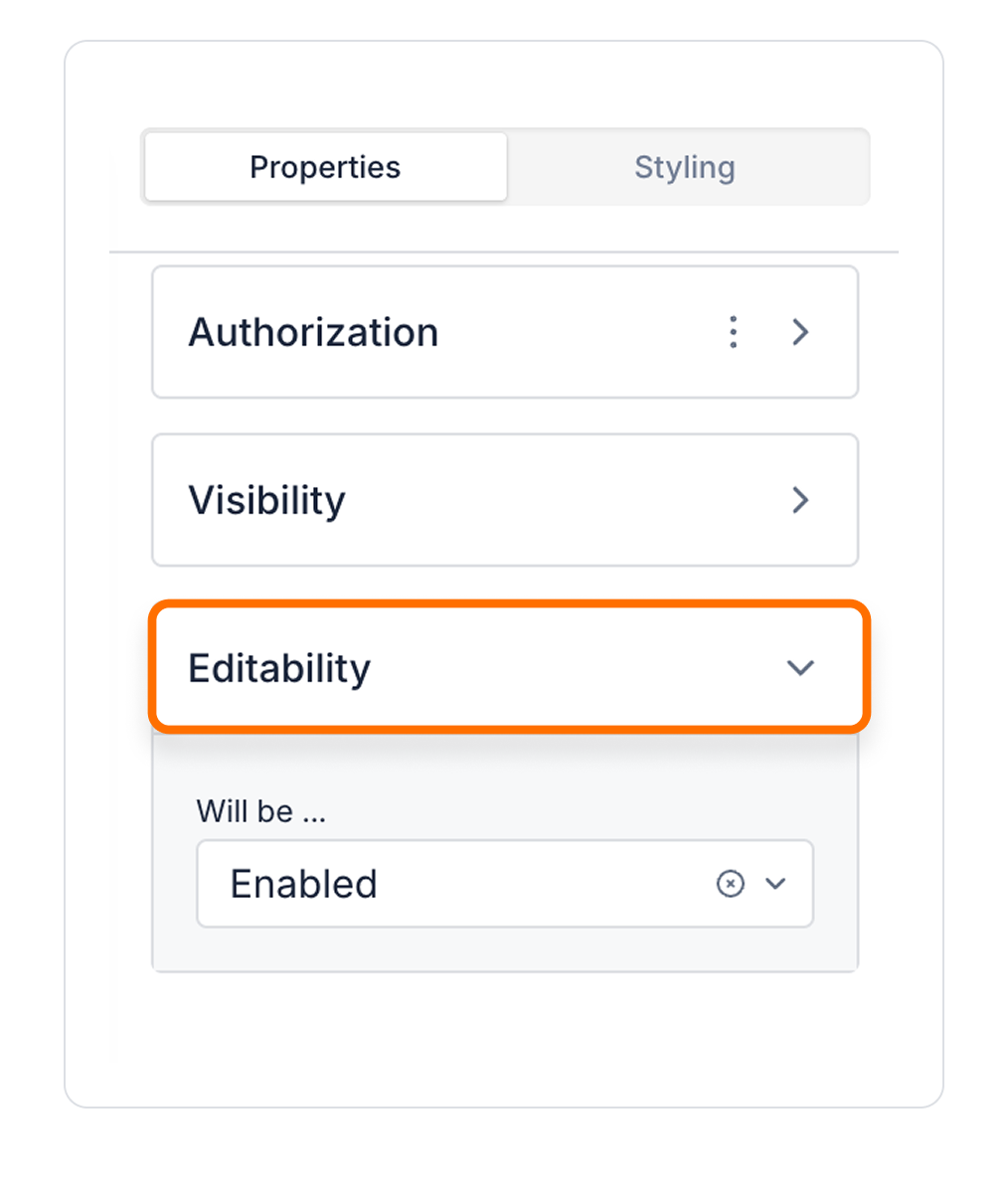
Unauthorized Behavior (Hide / Disable)
If the user does not have the required role, you can specify how the element should behave in the Choose field:
This setting is used to manage how unauthorized users encounter the element.
Visibility
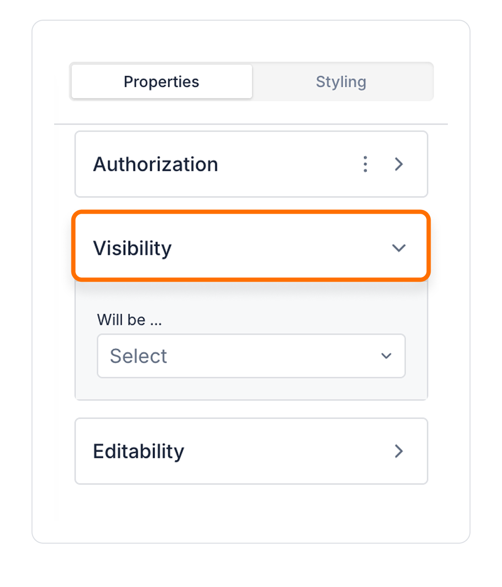
Always Visible: The element is always visible.
Hidden: The element is hidden.
Sometimes Visible: The element becomes visible based on specific conditions.
When Sometimes Visible is used, AND / OR groups can be added directly, allowing visibility rules to be grouped and more complex scenarios to be managed easily.
To configure the setting:

By customizing your elements with the Styling Panel, you can create impressive interfaces for your web and mobile applications. In this section, you can configure the following settings:
By following these steps, you can configure the Area Chart element to suit your needs.

