User Manual

Breadcrumb

30/6/25
Breadcrumb

The Breadcrumb element in Kuika is designed to help users easily track their location within a web application. With its dynamic structure, it works in harmony with your menu setup, enhancing the overall user experience. Thanks to this element, users can clearly see the hierarchy of the current screen and quickly navigate back to previous pages.

The Breadcrumb element is only supported in web applications.

This tutorial includes the following sections:

  • Adding a Breadcrumb Element
  • Breadcrumb Element Properties
  • Element Settings and Customization

Adding a Breadcrumb Element

  1. Log in to the Kuika platform.
  2. Select your project from the Apps screen.
  3. Navigate to the UI Design module.
  1. Select the Navigation category from the Elements panel on the left.
  2. Drag and drop the Breadcrumb element onto the workspace.

Breadcrumb Element Properties

The breadcrumb element marks the screen where the application is located as current (current page), while dynamically placing its top-level parent menus on the left side. It updates automatically based on the menu structure and works hierarchically without any manual intervention.

Main settings that can be customized via the Properties panel:

  • Options: Menu items are defined in this area. For each item, a label, path, and optionally an action (the operation to be triggered after clicking) can be defined.
  • Active Item Color: Determines the color of the breadcrumb item representing the current (active) page.
  • Title Field: This is the area where the titles to be displayed on the BreadCrumb are located.
  • Parent Key Field: Determines the parent (higher level) step of a step within the breadcrumb.
  • Link Field: Enables the NAVIGATE action to occur when clicking on steps on the breadcrumb. Screen names within the project should be linked to this field.
  • Key Field: Typically represents a unique value in the table, such as “Id,” and is used to distinguish each row.

BreadCrumb Connection Structure and Sample Scenario

For the BreadCrumb to work correctly, the connection fields must be configured appropriately in the data source (e.g., a table or API source). You can proceed by performing the following checks:

  • Key Field field: Must be a unique value such as “Id”.
  • Title Field field: Represents the titles to be displayed on the BreadCrumb.
  • Parent Key Field: Determines the parent step of a step within the BreadCrumb.
  • Link Field: Contains the screen names to which the user will be redirected after clicking.

Example Scenario: HomePage / Products / Technology

In this structure, the Link Field must contain the value “Products” so that clicking the “Products” button redirects the user to the Products screen.

For this feature to work correctly, the HomePage, Products, and Technology screens must be defined in the project.

Example Table Structure

At the most basic level, the table for BreadCrumb data should contain the following columns:

  • Id: A unique ID number for each row.
  • Page Name: The page name that will appear on the BreadCrumb.
  • ParentId: The Id value of the previous (parent) page.
  • LinkField: The name of the screen to navigate to.

Example structure:

  • 1 → HomePage
    • ParentId: None (first level page)
    • LinkField: HomePage
  • 2 → Products
    • ParentId: 1
    • LinkField: Products
  • 3 → Technology
    • ParentId: 2
    • LinkField: Technology

Thanks to this structure, the BreadCrumb element dynamically creates the hierarchy of the screen the user is on and allows them to return to previous pages.

Element Settings and Customization

Authorization

To manage access control at the element level, you can use the Authorization section in the Properties panel.

Access Types

Anonymous

Allows all users to view the element without logging in.

Restricted

Restricts access to only verified users or specific roles.

  • Everyone: When enabled, all logged-in users can access the element.
  • Roles: The roles allowed to access the element are selected here. To edit the role list, click the gear (⚙️) icon next to the Roles field to open the Role Management window. From this window, you can add new roles, create folders, or manage existing roles.

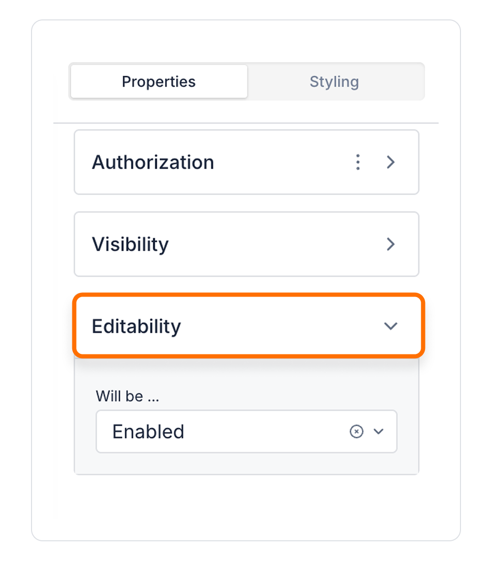
Unauthorized Behavior (Hide / Disable)

If the user does not have the required role, you can specify how the element should behave in the Choose field:

  • Hide: If the user is not authorized, the element is completely hidden and does not appear on the screen.
  • Disable: The element remains visible but becomes unclickable / unusable.

This setting is used to manage how unauthorized users encounter the element.

Visibility

  • Always Visible: Element is always visible.
  • Hidden: Element is hidden.
  • Sometimes Visible: The element is visible depending on a specific condition.

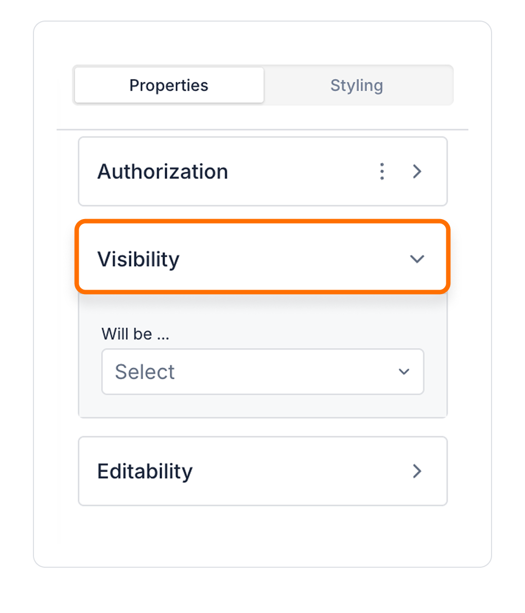
To configure the setting:

  1. Select the element on the screen.
  2. Open the Properties panel on the right edge.
  3. In the Visibility field, select an option according to your needs.

Editability

  • Enabled: Elements can be edited.
  • Disabled: Element cannot be edited.
  • Sometimes Enabled: The element can be edited or uneditable according to certain conditions.

Interface Design with Style Panel

By customizing your elements with the Styling Panel, you can create impressive interfaces for your web and mobile applications. In this section, you can configure the following settings:

  • Layout: Sizing, alignment and padding settings. Settings include Size, Min Size and Align.
  • Text: Font, style, color, size and spacing settings.
  • Fill: Customize the background with color or images.
  • Border: Add borders and corner radius settings.
  • Shadow: Add a shadow effect to add depth to elements.

By following these steps, you can configure the Area Chart element to suit your needs.

Other Related Content

No items found.

Glossary

No items found.

Alt Başlıklar